The Most Inspiring Interiors in Film, According to Top Designers
From a Stanley Kubrick epic to a Nancy Meyers romantic comedy, these films are visual feasts

Feeling like you’ve already watched all of Netflix? We completely understand. That’s why we reached out to some of the most creative interior designers in the field about what film sets have inspired their designs. Here, they share the movies that spark their imaginations and influence their designs.
From classic epics to modern-day rom-coms, each of these picks is a visual feast that could even be enjoyed with the sound off just for their stunning environments.
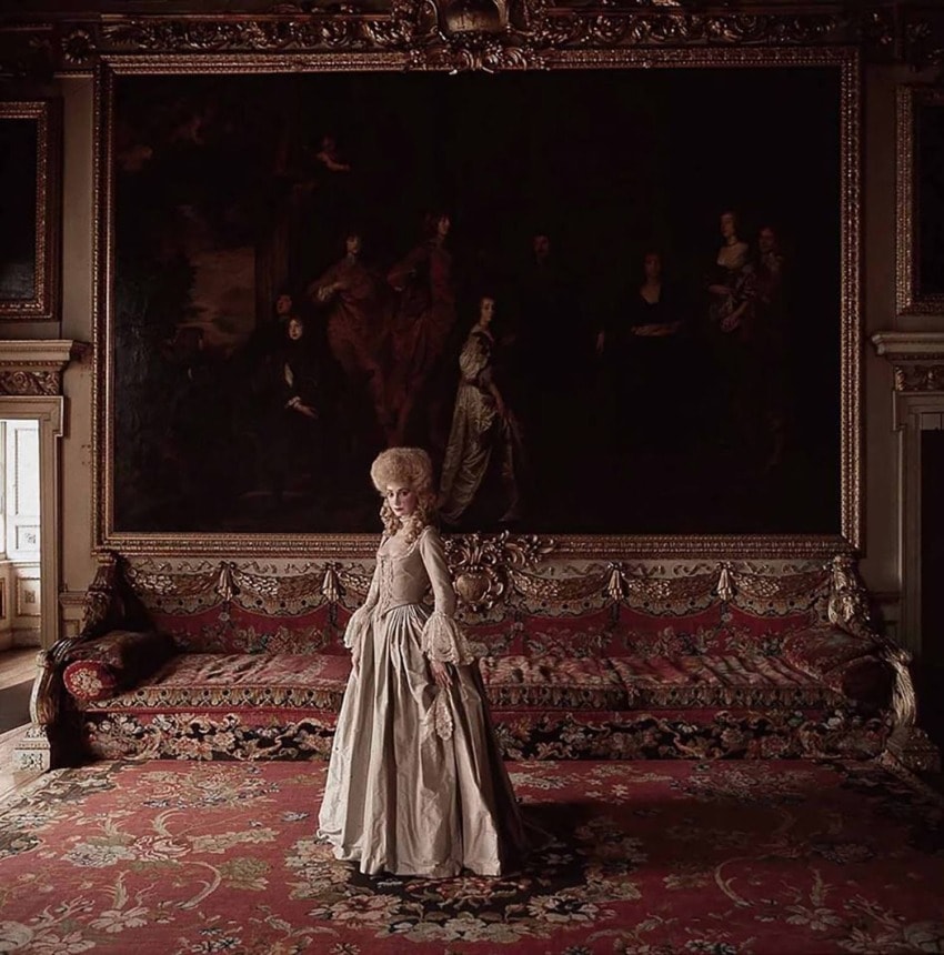
1. BRIAN SAWYER | Barry Lyndon (1975)
“In Barry Lyndon, every scene looks like a still life by the likes of George Romney, Joshua Reynolds, or Thomas Gainsborough. The director, Stanley Kubrick, must have been fascinated with 18th-century painting to pull this off. When I first saw it as a kid, it stuck with me and went straight to my heart. It was my first acquaintance with 18th-century English design and country houses, and it was so sumptuously rendered with all the sets, colors, and costumes. I’ve heard Ryan O’Neal and Marisa Berenson would endure 150 takes for just one shot, and it was filmed at Chatsworth House, Blenheim Palace, and Wilton House. I love to travel to visit these houses to study their details, and it all first hit me when I first saw this film as a child.”
Recommended: Designer Brian Sawyer Reveals What He Can’t Live Without
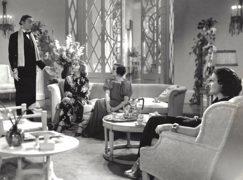
2. MADELINE STUART | My Man Godfrey (1936)
“A film I return to again and again for the sheer joy of it is My Man Godfrey. Set during the Great Depression and starring a divinely suave William Powell as Godfrey and a brilliantly charming Carole Lombard as Irene Bullock, it’s one of the best of the screwball comedies to emerge from that bleak time in history. The sets are spectacular—a combination of Deco decadence and Syrie Maugham–inspired restraint. The scale of the rooms is, of course, extravagant, and the detailing of the doors, window treatments, and upholstery are period-perfect and superchic. The movie is, not surprisingly, in black and white, so while I don’t know precisely what colors were used for the sets, I like to imagine the palette replicates Maugham’s own White Room. I wish I could design interiors like this, but it’s not quite the California look . . . darn. The closest I ever came to interpreting the style of this era was the work I did restoring and decorating the iconic Streamline Moderne Cedric Gibbons/Dolores Del Rio house. While it’s not exactly reminiscent of the interiors seen in the Bullocks’ New York home, I had an opportunity to explore and revel in 1930s decor—my favorite period of design in Hollywood film history.”
Recommended: Madeline Stuart Reimagines a Storied La Jolla Landmark
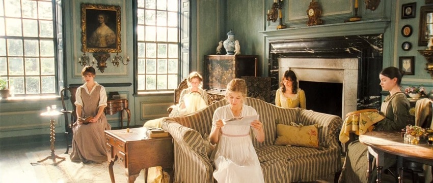
3. BUNNY WILLIAMS | Pride & Prejudice (2005)
“At a client’s request, we once matched the exact shade of blue that is used in the Bennets’ drawing room in the 2005 version of Pride & Prejudice. The movie had been filmed at Groombridge Place in Kent, but the original 1920s blue paint had since been stripped from the wood-paneled walls. We watched the movie endless times to pinpoint the precise shade, and ultimately achieved the right one with the help of master painter John LaPolla. The blue ended up being an incredible background for the client’s collection of contemporary art.”
Recommended: Bunny Williams Beautifully Updates a Dutch Colonial in the Hamptons
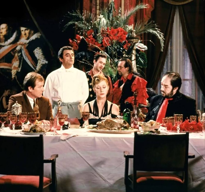
4. RAFAEL DE CÀRDENAS | The Cook, The Thief, His Wife, and Her Lover (1989)
“Peter Greenaway’s The Cook, The Thief, His Wife and Her Lover is the most exquisitely packaged, brutally violent film. It almost eschews genre. The very romantic and lush set production was inspired by Flemish Baroque painting. The Banquet of the Officers of the St George Militia Company, a 1616 painting by Frans Hals, prominently hangs in the restaurant where the majority of the story is set. Jean-Paul Gaultier designed the romantic costumes. Michael Nyman composed the hauntingly emotional music, which practically tells the story on its own. And in the scene to end all others, Helen Mirren’s character is in a white room in a white dress with a black hat. When she leaves the room, the camera follows her through the door into a red-lit room. Seamlessly, once she in the red room, her identical dress is red. It’s a quite beautiful scene.”
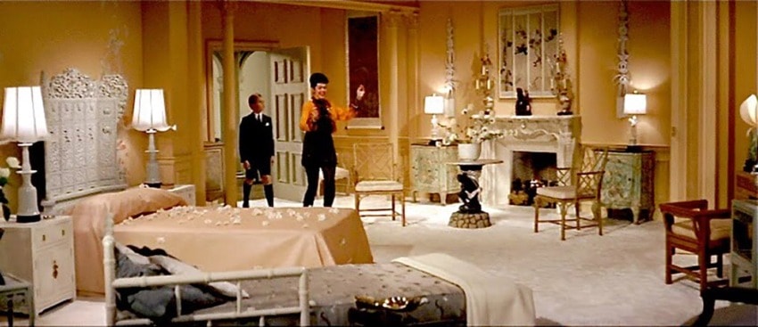
5. MARTYN LAWRENCE BULLARD | Auntie Mame (1958)
“My favorite movie, one that I watch over and over again and has always offered the most inspirational design moments, is Auntie Mame, the fantastical version with Rosalind Russell from 1958. The delight is that the lead character, Mame, constantly redecorates her Upper East Side apartment, in an evolution of styles and tastes to match her moods and circumstances in almost every other scene of the movie. It’s a wonder to behold from federal Americana to Ug Ogalou, her imaginary Danish midcentury designer, whose state-of-the-art interior inspired an interior I designed for Vidal Sassoon with chaises suspended from the ceiling of his library on movable pulley cords. Her last decor is an Indian fantasy with a magical painted scene of Hindustani temples on her dramatic stairwell that I later reimagined for an Indian couple’s home in Bel Air. I love seeing the decor evolve in different ways in the same space. It shows how design can truly change an interior and then bring energy and magic onto the same walls in such refreshing ways.”
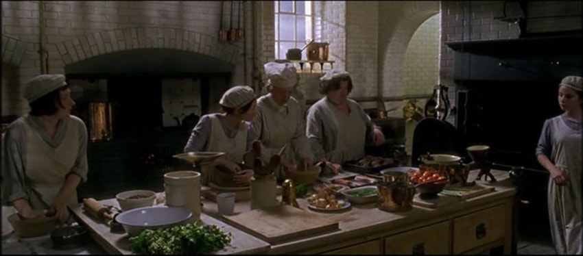
6. DAVID KLEINBERG | Gosford Park (2001)
“Not only was Gosford Park a visual cue for a recent townhouse project I worked on, but it is a recollection of a way of life of civility and domestic pleasures. The townhouse designed by Mott Schmidt in 1927 was in essence the American version of these times, which Robert Altman so brilliantly captured in the 2001 film. We were inspired by the look of the belowstairs, rooms in color that appear to be black and white, integrity of materials, in a limited palette ceramic tile, wood, and metal. The economy of detail and functionality of space are of particular note. And now perhaps more than ever, the idealization of domestic comfort is most essential. Gosford Park was also certainly the visual and emotional lodestar for what was to follow in Downton Abbey and the like.”
Recommended: David Kleinberg Revamps a Classic Park Avenue Apartment
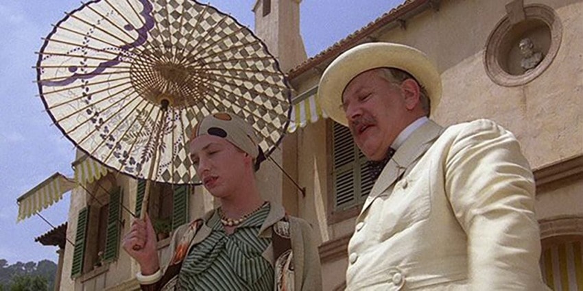
7. MICHAEL S. SMITH | Evil Under the Sun (1982)
“I am very influenced by the Agatha Christie film Evil Under the Sun, which was shot in Mallorca, although the movie is not set there. I have spent a lot of time on that island and am very influenced by its villas by the beach and the Italian neoclassical architecture. I love the tension and juxtaposition of this formal architecture and the informal island living. I’m such a contrarian in design and have been influenced by this concept. When I have done work there, I was also influenced by the colors and cheerfulness of the island.”
Recommended: Former White House Designer Michael S. Smith’s Home Work Space

8. PENNY DRUE BAIRD |The Holiday (2006)
“I love projects with atmosphere. One of the hallmarks of my firm, Dessins, is that I do every type of design. I feel that ‘the one size fits all’ approach does not work for all projects nor all clients. The Holiday, directed by Nancy Meyers, has two distinctly different looks: the Cotswold cottage outside of London and the contemporary chic of Los Angeles. They are both very well done. I had the opportunity to do several farmhouses, barns, and country places, in Bucks County and the Hamptons, and tried to capture that same Cotswold atmosphere in them. Similarly, my L.A. projects and certain Hamptons projects capture The Holiday’s contemporary vibe. In many ways that’s a metaphor for who I am and what I design, equally comfy in a ball gown and jeans, designing a modern Zen Malibu retreat, or a Bavarian ski chalet.”

9. STEWART MANGER | A Room with a View (1985)
“A Room with a View is a 1985 Merchant Ivory Production, based on the novel by E. M. Forester. While this is a love story, I was overwhelmed by the period sets designed to reflect the early 20th century. It was these designs that piqued my interest in interior design and led me to Los Angeles in the 1990s to try and work on movie sets. It was also when my love affair with Italy began, and I was curious to travel. From Italy to India and South East Asia, I continue to find inspiration for my design.”
Recommended: Stewart Manger Creates an Art-Filled Pied-à-Terre in Paris