OMA’s Shohei Shigematsu Redesigns Sotheby’s New York Headquarters
The $55 million expansion reflects the auction house’s ambitious new business model


Strolling through Sotheby’s pristinely revamped Manhattan headquarters, past the blue-chip art and soaring exposed-concrete columns, you’d never know that the whole project almost never happened.
Back in 2016, the distinguished auction house was set on relocating from its longtime Upper East Side home, a block-long behemoth composed of glass and granite that was designed in the 1980s and later expanded skyward. At the last moment, however, Sotheby’s CEO, Tad Smith, asked the prospective architects if they could do a quick sketch of how they might reconfigure the existing space, giving them a list of everything that wasn’t working. “I think his intention was to prove that we had to move,” recalls Allan Schwartzman, the company’s chairman of the fine art division. “But it was actually a really interesting exercise in relearning what this building is.”
The goal, as Smith says, was “to have great space on every floor so that there wasn’t a hierarchy, and we wanted to have a kind of flexibility where any particular sale could be installed in any specific space, depending on the property that that department has sourced for this particular season.”

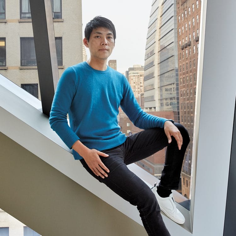
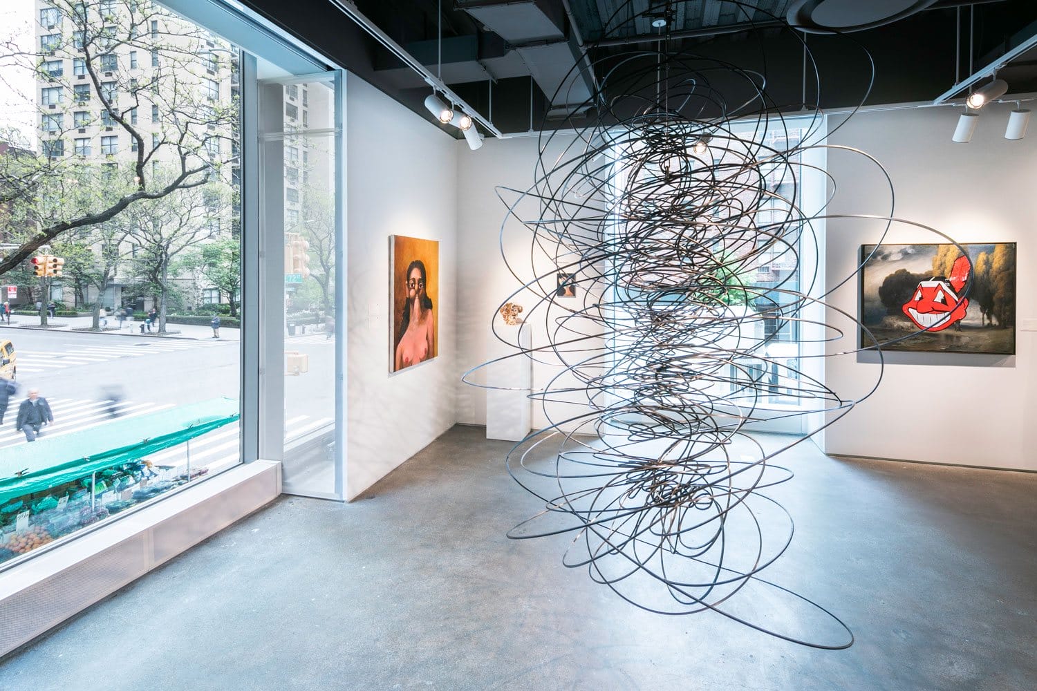
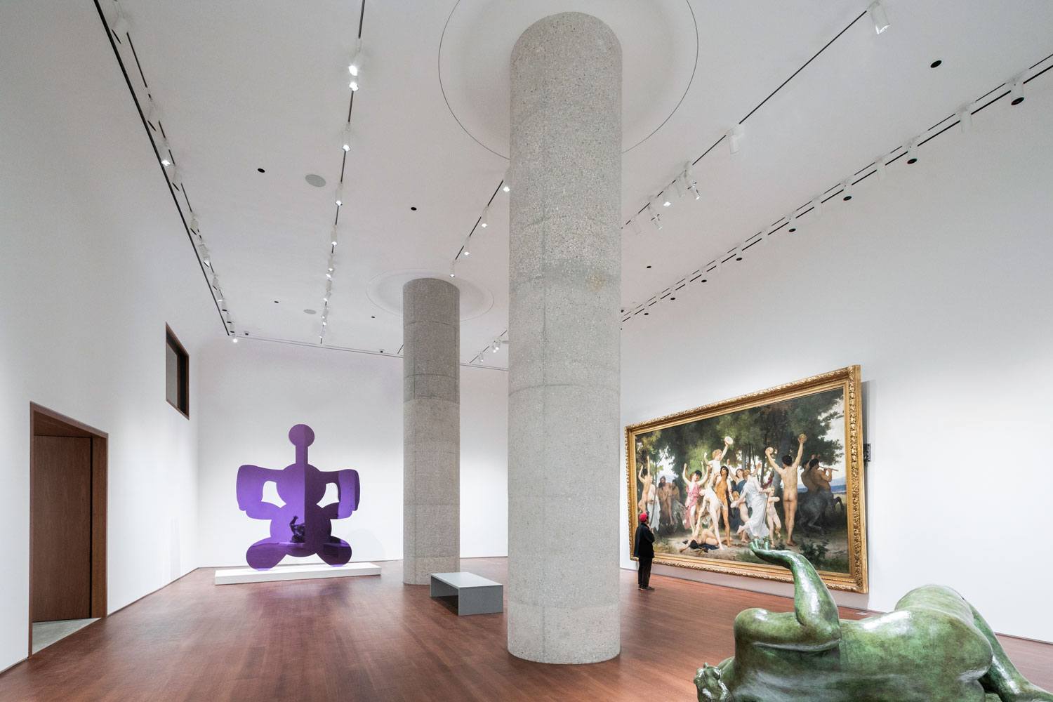
One of the architects who created a scheme was OMA’s Shohei Shigematsu, who is also one of Galerie‘s Creative Minds. “Shohei put everything we were looking for in a blender and came up with the vision for these four floors,” says Smith. That vision unlocked the potential of the building by reconfiguring some 40 public galleries to provide additional exhibition space and removing ceilings to create double-height rooms. Needless to say, Sotheby’s was sold on the idea and scrapped its plans to move.
Recommended: Victoria Hagan and Leroy Street Studio Create a Breathtaking Hamptons Home
Commencing last June, the $55 million overhaul was all about reflecting the company’s ambitious business model. “Sotheby’s is no longer just an auction house—it’s a multifaceted art entity,” says Shigematsu. The first order of business was restacking and consolidating spaces with similar programs, which previously had been sprawled across the structure’s ten floors in an inefficient manner.

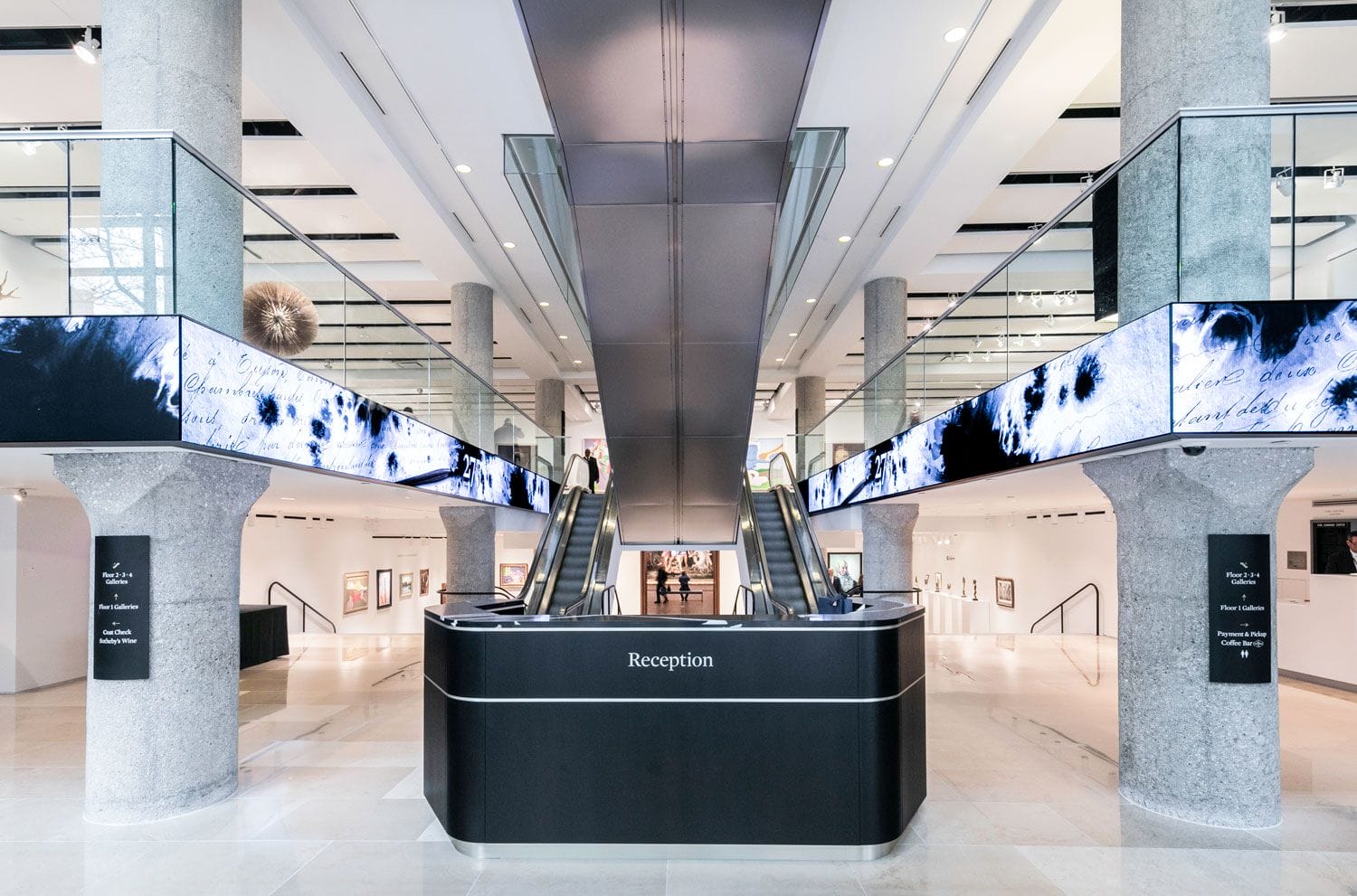
Now the client experience starts from immediate entry into the building, which features a sleek reception area lined with wraparound screens. The double-height space is a prime spot to see some of the top lots from the auction house’s upcoming sales, a deliberate decision to keep the public-facing spaces more accessible and inviting. The extra 23,000 square feet of gallery space comes from the relocation of the staff offices from the first four levels to the upper floors.

There are now 20 different room types encompassing 40 galleries and nine private sales salons, with the total exhibition space increasing from 67,000 square feet to 90,000 square feet. The smallest room measures 350 square feet, while the tallest measures 20 feet high. “I think it also corresponds to the diversity of artwork that they’re actually handling and dealing with,” says Shigematsu.
Recommended: Why These 4 Whitney Biennial Artists Are Making Waves
“Our aim,” he adds, “was to give the flexibility through diversity, which doesn’t really exist elsewhere in the current museum or gallery world.”