Tour a Glamorous Manhattan Aerie by Designer David Scott
The Upper East Side apartment is stylishly accented with artwork by Larry Poons, Jeff Zimmerman, and Nancy Lorenz

Interior designers often have a big influence on their clients’ lives. It’s expected that they might set the tone for someone’s lifestyle with the choice of fabrics or determine where a family spends time based on layout. But it’s almost unheard of that the designer is responsible for a major life decision. But that’s exactly what happened when New York designer David Scott suggested a couple leave their home in New Jersey, sell their pied-à-terre at the Ritz Tower in Manhattan, and move full-time to the Upper East Side.
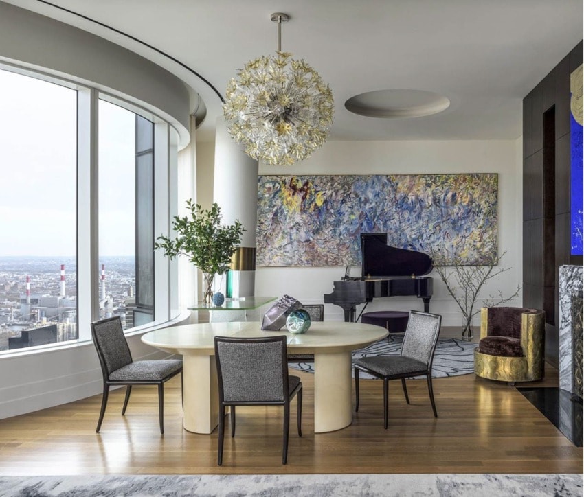
The interiors for the fashionable new building had been designed by Daniel Romualdez, but the clients really wanted to make the 60th-floor space their own. Scott worked with them to adjust the floor plan to meet their needs—taking out two of the six bedrooms and removing two baths to create one larger master bath adjoined to a more ample dressing room for her. “Moving from the suburbs they had enormous closets and rooms,” explains Scott. “We had to create that same feeling of spaciousness, so they could feel at home here.”
Recommended: Why Jamie Drake Loves His Home More Than Ever
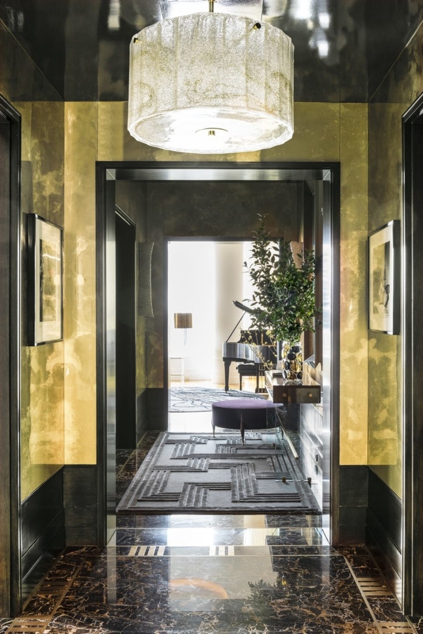
Another element the clients wanted to add was glamour, which the glass apartment’s high ceilings and spectacular view certainly called for. Scott started by creating gilded aluminum wall panels in the foyer, along with inset marble floors with a custom pattern, which is then repeated in a rug by Edward Fields. The library shares a similar shimmering approach but in cooler tones and is furnished with a Patrick Naggar sofa from Ralph Pucci and an ebonized-walnut wood cabinet plus faux bois walls hand-painted by Jennifer Hacker. He also used details throughout to play up the theme with Murano light fixtures, a crystal bowl from Studio Greytak, and bronze lamps from Bernd Goeckler. “Our clients really let us get into the details and indulge.”
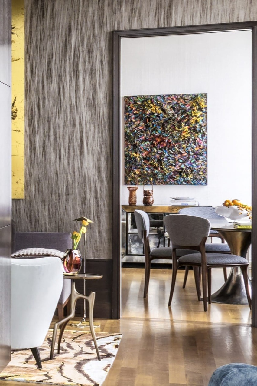
As for the art, the collection came together for the apartment one piece at a time. “The exuberant and happy Larry Poons is just like their personalities,” he explains. “They were attracted to the boldness and gestural quality. They don’t like things that are tame.” A bright blue Nancy Lorenz work and a bold Jeff Zimmerman piece fit right in with the statement-making pieces the clients are drawn to. The entire collection comes to life with lighting by Nathan Orsman.
Recommended: Top Tips on Lighting an Art Collection from Expert Nathan Orsman
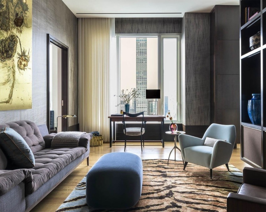
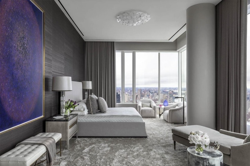
The apartment isn’t without its moments of calm. The monochromatic bedroom relies on sculptural furniture pieces to add quiet lines. “I like bedrooms to feel like they envelop you,” the designer notes, so he carved out multiple places for reading, relaxing, and sitting throughout the twinkling gray-beige space, which is carpeted in a luminous silk. “They told me they could live with the footprints,” he laughs, “which is ironic since the artwork is made of all thumbprints.”
All in all, the life change was for the best, and the clients couldn’t be more thrilled with the direction of their lives based upon Scott’s direction. “They called me the other day just to say how much they love to be in this space. My client said, ‘I’m lying on the chaise relaxing and reading. We’re so happy to be home and here all the time.’”