Go Behind the Scenes of Madeline Stuart’s Stunning La Jolla Renovation
Here are 12 key takeaways from the designer’s meticulous overhaul of a Spanish Revival landmark

Leading interior designer Madeline Stuart and Galerie‘s editor in chief, Jacqueline Terrebonne, recently sat down for a discussion at the Walters showroom in the D&D Building, highlighting Stuart’s dazzling update of a La Jolla landmark, which was featured in the magazine’s Fall 2019 Issue.
Stuart started off by giving a lively overview of her upbringing in Beverly Hills (her father directed Willy Wonka & the Chocolate Factory, and she made a cameo in the film) and how she built her career in interior design without any formal training. Delving into the project, she focused on key aspects of the renovation, citing inspiration from Hispano-Moorish influence.
Recommended: Madeline Stuart Reimagines a Storied La Jolla Landmark
Below are 12 key takeaways from the painstaking renovation:
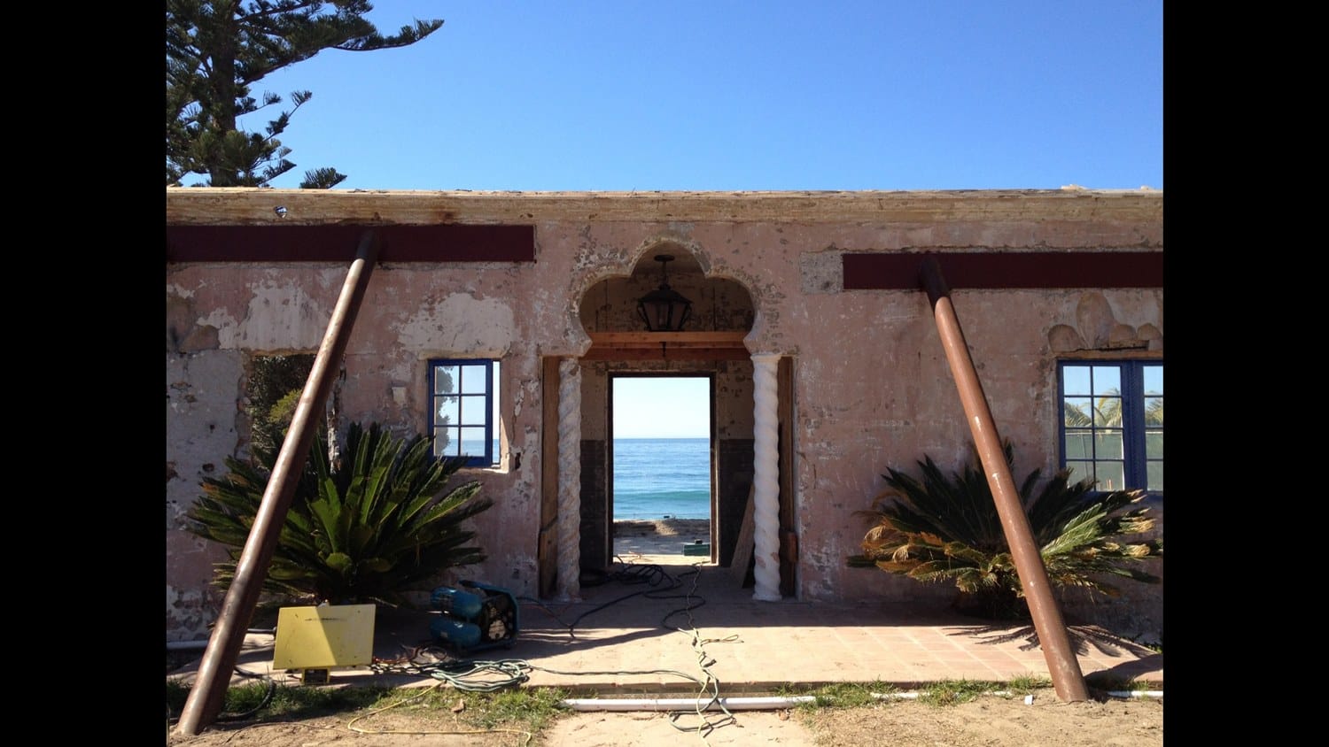
1. “The first steps for me are always my library. I don’t go to Pinterest because I don’t want to see the same images that everyone else is seeing. I was fortunate enough to have been to Morocco just prior to starting this project and had taken hundreds of photographs. I also took the pilgrimage to the Alhambra, to Grenada, to see the architecture in Ronda, Seville, and Barcelona. For me it starts by compiling a dossier, which is my own Pinterest. You find imagery that might suggest an idea, a pattern, a direction, and for us it was about hoarding imagery of ceilings, floors, doors, walls, windows, and tiles.”
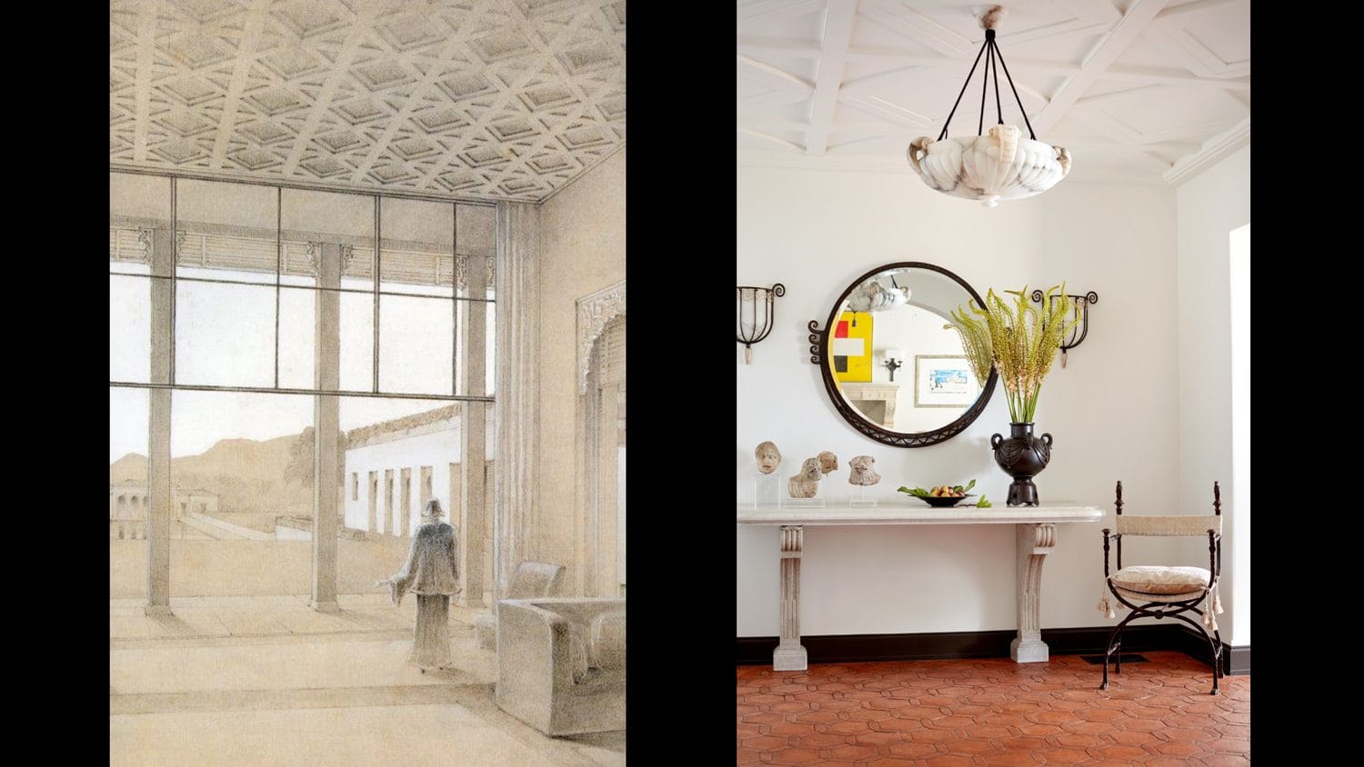
2. “The image on the left was created by Doris Duke herself for her Honolulu house, Shangri-La, which is one of my favorite houses in the world. She was very much involved in its design, and Tim Street-Porter immortalized it in his book on the house. In this case, the ceiling that you see in this image from Shangri-La is pretty much the ceiling of our entry. I so loved this idea that we actually had it done in hand-run plaster.”
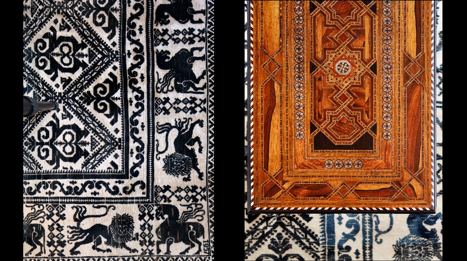
3. “The carpet was the first piece we bought for the project. It’s what they call a Spanish-Prado carpet and is actually dated 1957, it’s not an antique but it is vintage. It’s very unusual because it is black and cream, and you don’t often see Spanish-Prado rugs to begin with, let alone in this very limited color scheme. We wanted the interiors to be relatively quiet and not overly formal.”
Recommended: Grade Creates a Gorgeous Chelsea Apartment for an Art-Loving Brazilian Couple
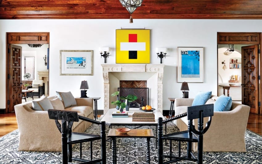
4. “We began this project with absolutely nothing in terms of art. The client’s other houses have primarily Western art, but this house was not made for Remington sculptures. He knew very little about contemporary art so we were able to guide him. I have a real passion for it so I was able to introduce him to artists such as Diebenkorn, Helen Frankenthaler, Warhol, in this case Hammersley. He bought some an extraordinary photograph by Richard Misrach, some Ellsworth Kellys. He was open, the last thing I wanted in this house was traditional art.”
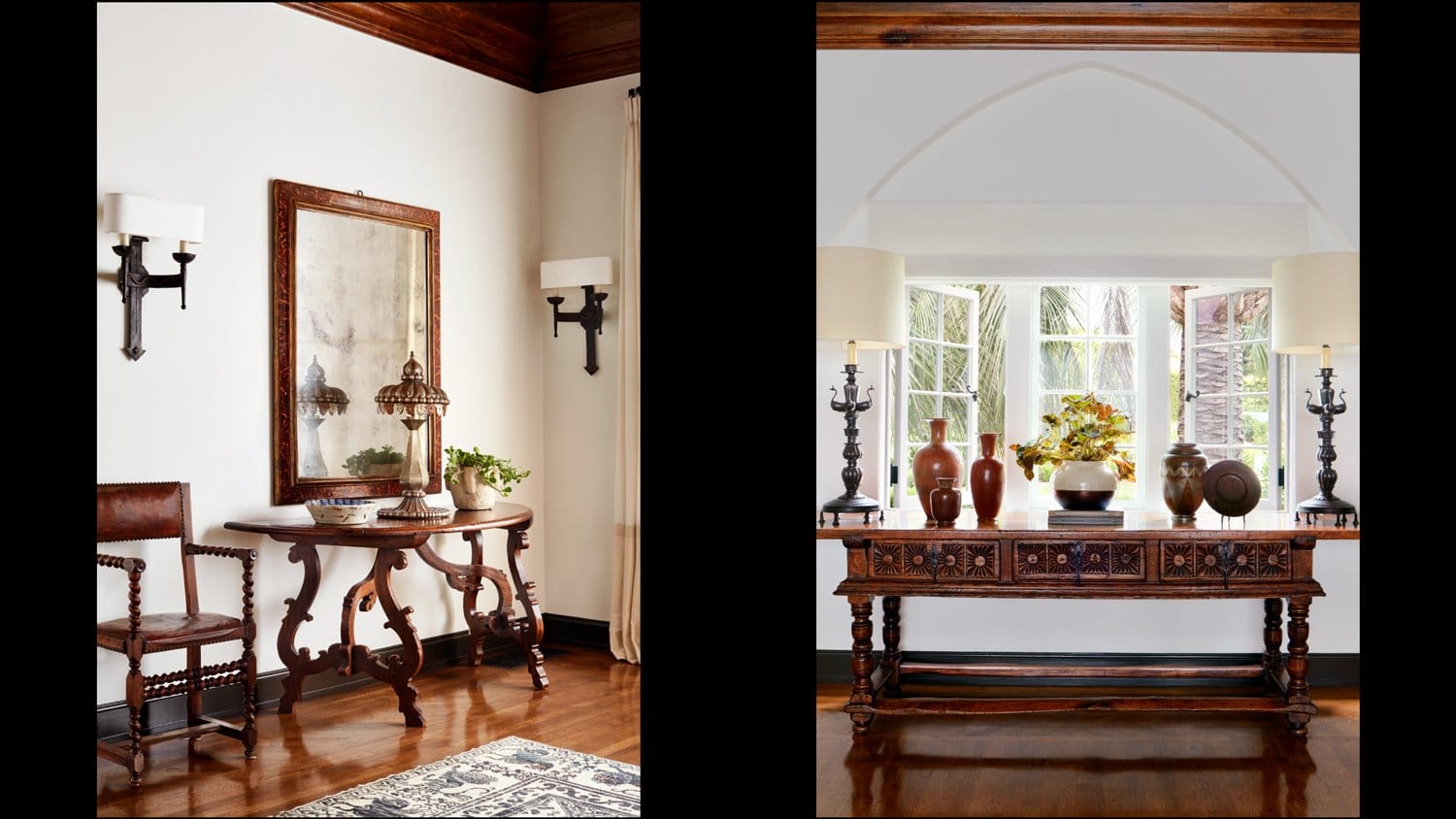
5. “There is something that I revere about combining antiques that have a patina with contemporary pieces. That balance makes an interior have a little bit more zip and zing than if everything’s an antique or if everything’s contemporary. It adds a real soul to the interiors.”
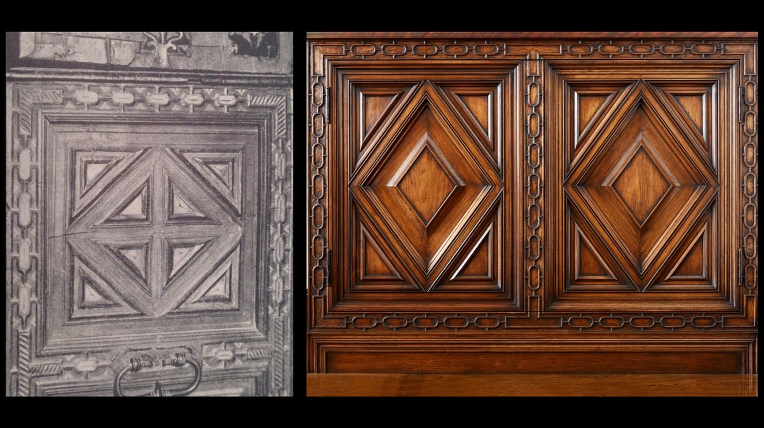
6. “In this case the image on the left came from a book written by Arthur and Mildred Stapley Byne. They were really the first people to go to Spain and catalogue Spanish architecture, design, and decorative arts. This piece happened to come from one of their books and we interpreted it for a cabinet in this gentleman’s library. We had it carved and you obviously can see the influence, but we put our own spin on it and made it a little bit different.”
Recommended: Madeline Stuart Reimagines a Storied La Jolla Landmark
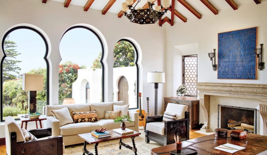
7. “Our aim was not for this to be Moorish in an ironic sort of way, we wanted this house to look like it was built in the 1920s and not that we had taken a kit and created a Frankenstein’s monster from all these disparate ideas.”
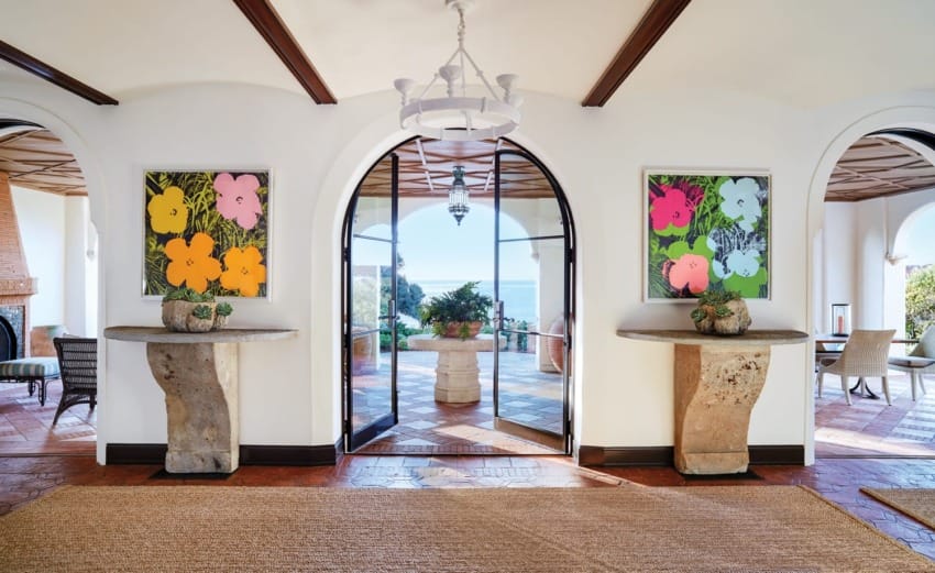
8. “The gallery really represents everything I love about this house. It has air and light and a spirit of openness. The consoles were the last thing we found after looking for almost four years. In this case I was at Chateau Domingue, which is a beautiful resource for antiquities and fireplaces, and I was looking at their paint collection and was so struck that I knew instantly they would be right.”
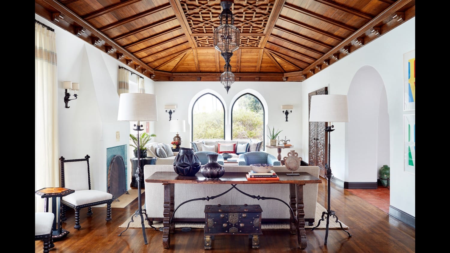
9. “You have these two very strong planes, the floor and the ceiling. This ceiling was inspired by an image that we had, and we created our own pattern from Islamic pattern books. The idea is not that everyone should walk in and look up. You have the sense of the ceiling without actually commanding attention.”
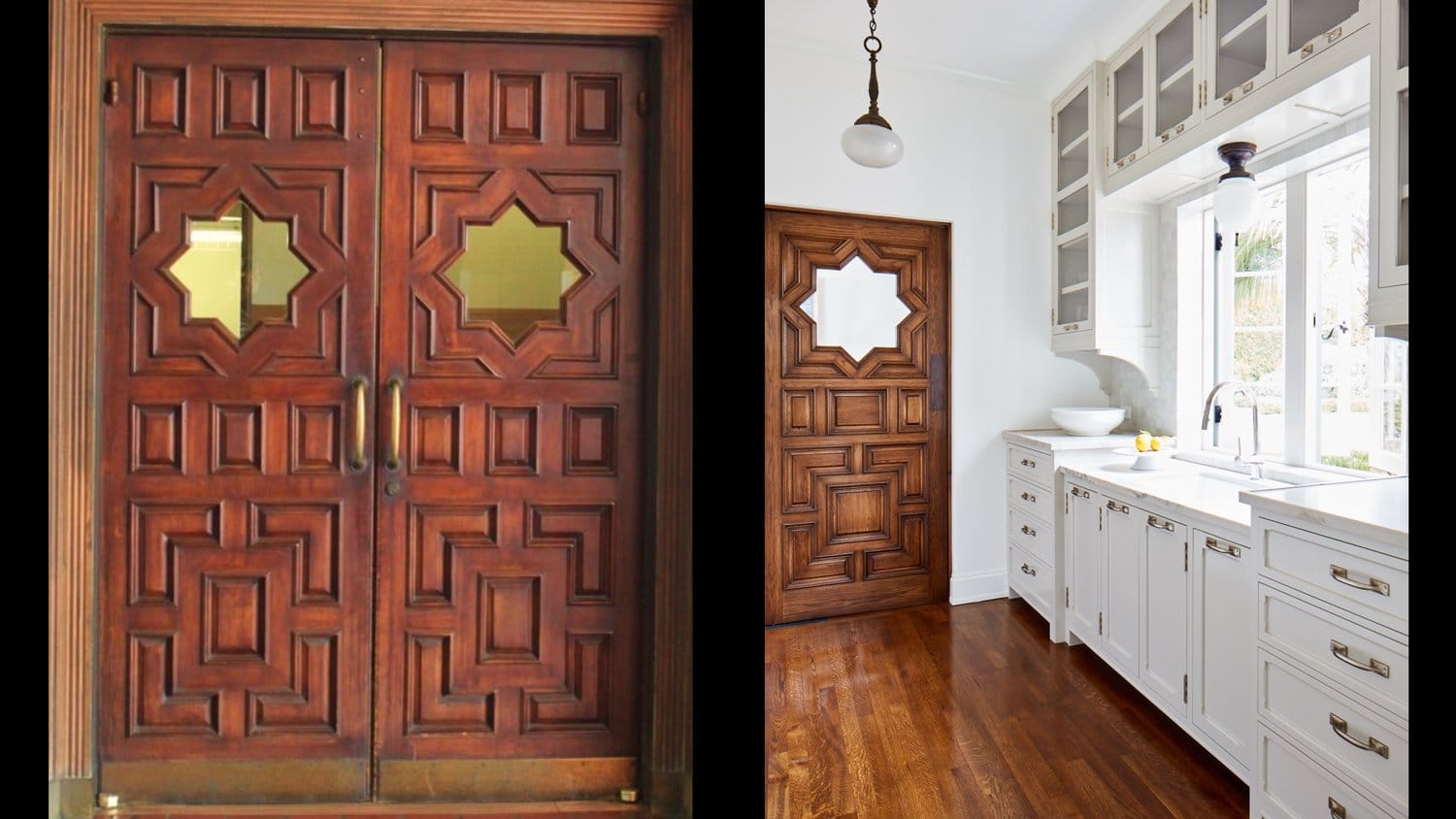
10. “These doors are at Union Station in Los Angeles, which is one of the great wonders of the world. It’s a perfectly intact Art Deco train station with a Spanish Revival twist. During one of our trips there we just happened to take a picture of these doors—and there you go. It works perfectly as the door to the butlers pantry leading to the dining room.”
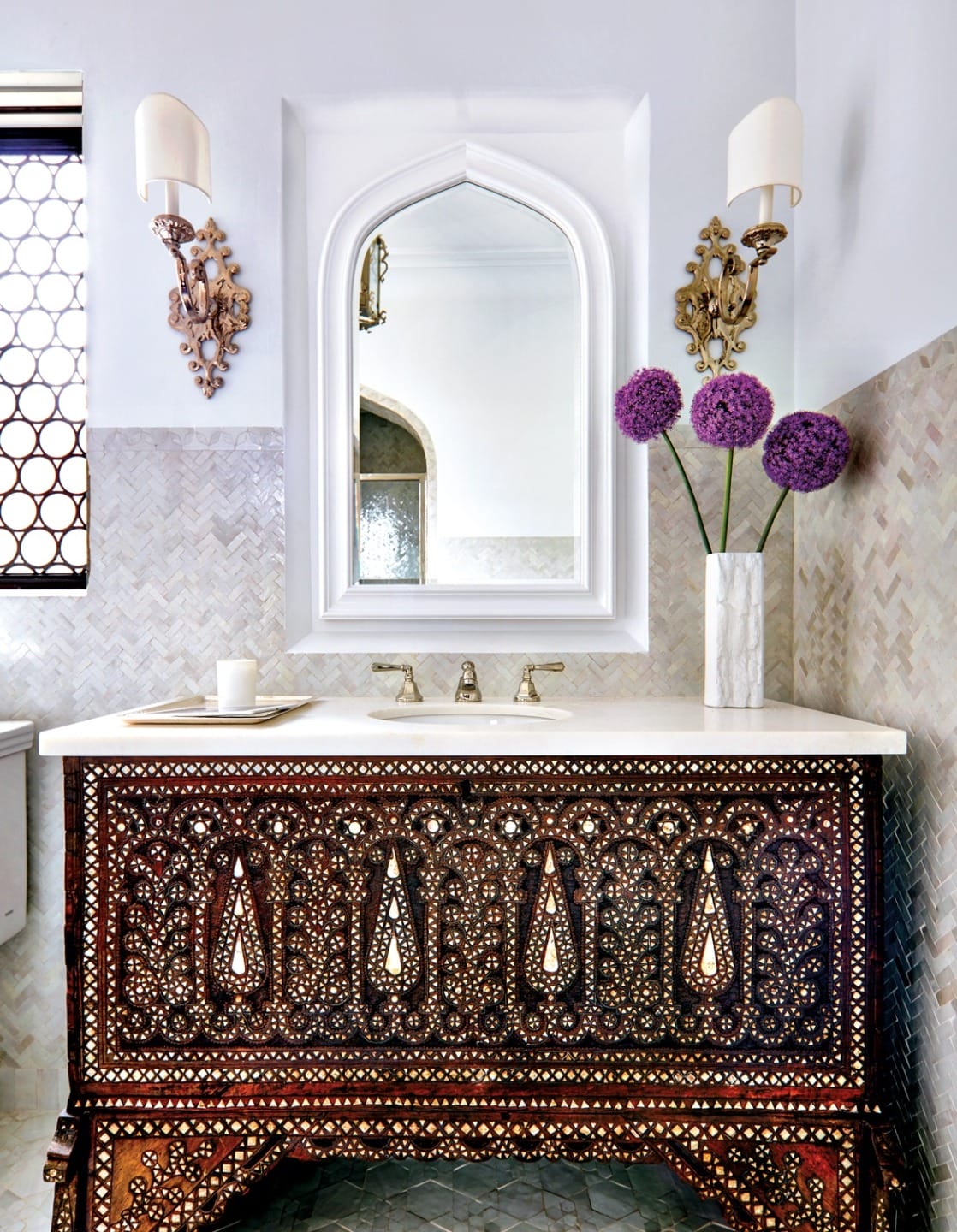
11. “We found a Syrian chest and turned it into a sink cabinet. And on the floor you see the pattern we found in a book on Islamic design, and we had a company make zellige tile based on that motif.”
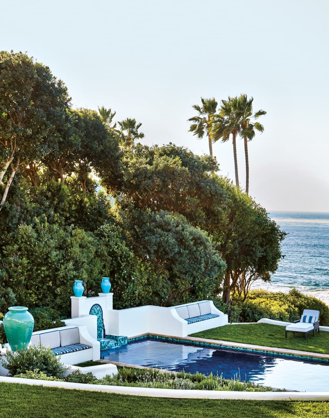
12. “As beautiful as the ocean is the clients love being in this spot in the pool with family and friends. That’s why we created this house; it is meant to be lived in and enjoyed. The greatest testament to the work I do is that these houses are really houses that people enjoy.”