Tour the Kips Bay Decorator Show House 2018
Each spring, design aficionados flock to the Kips Bay Decorator Show House for inspiration and awe

“The longer I participate the more fantastical I feel prepared to go,” says designer Alexa Hampton, and for this year’s Kips Bay Decorator Show House she is certainly not alone, as a multitude of talented designers harnessed their amazing creativity to transform the 15,000-square-foot space at 110 East 76th Street in New York. From the home spa perched at the very top of the townhouse to the basement media room, every square of inch has been thoughtfully decorated and renovated with imagination and talent. “There’s something for everyone, and there isn’t a closet or nook or cranny that isn’t done,” says Bunny Williams, who has chaired the event since 2012. “Plus, every designer comes to the table with a new product or source. There’s such a sense of discovery, whether you’re a professional designer or just thinking about ideas for your own home.”
The 46th annual Decorator Show House opens to the public on Tuesday, May 1, and will be on view through the end of the month. A must-see event every year, the house raises critical funds for much-needed after school and enrichment programs for New York City children. Tour the spectacular rooms below.
Drake/Anderson

“Our inspiration was to create an elegant space that was chic and glamorous but also embracing,” says Jamie Drake. For the room he designed with partner Caleb Anderson, a color story of saffron, curry, and caramel envelops the room in an amber glow, while the bar cuts through it with a strong gesture in black with flecks of gold. Standout pieces include a sculptural gilt bronze lamp in the corner by Atelier Van Lieshout from Carpenters Workshop Gallery, which adds an unexpected twist and a chandelier prototype resembling a magic carpet by Mathieu Lustrerie. drakeanderson.com
Sasha Bikoff
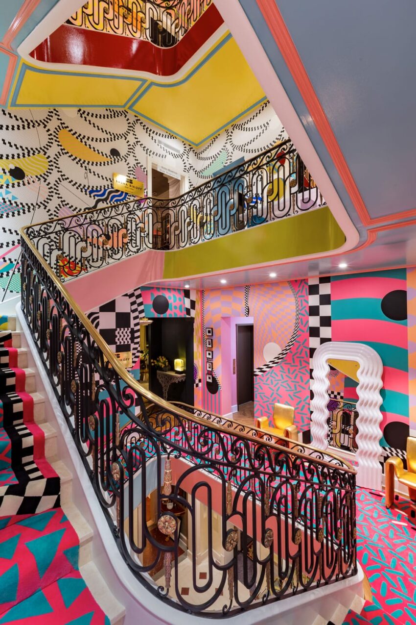
Never one to go for a quiet moment, Sasha Bikoff went for the wow with her design for the staircase. Inspired by the zig-zags, polka dots, and squiggles of the Memphis movement, the technicolor dream packs lots of punch thanks to custom rugs by The Rug Company and wallpaper from Voutsa. sashabikoff.com
Juan Montoya Design
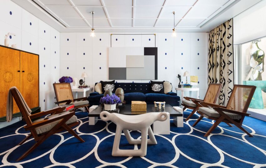
When planning his room, Juan Montoya wanted to recall Vienna in 1903. Looking to Josef Hoffman’s influence on architecture, he updated those theories to transform a characterless basement into something with spirit and personality. Important pieces include the Wendell Castle bench and the Saint Clair Cemin stainless steel bird sculpture, of which a wooden version was in his last Kips Bay Show House room. Montoya designed the coffee table himself, and the bold rug is from his new collection with Stepvi. juanmontoyadesign.com
Mark Hampton LLC

A self-proclaimed neo-classicist, Alexa Hampton pulled out all the stops for his campaign tent folly. For her first ever collaboration with de Gournay, she envisioned gentle folds of fabric with the help of artist Chuck Fischer. The result is a white room with depth and dimension. And as one would imagine, she didn’t stop there. The room is enlivened with drunken, punchy colors and a museum’s worth of treasures collected during its occupant’s life well lived. One would imagine no less than an emperor passing the time in this sumptuous space. And most of all, what’s a tent without a view? Here it’s provided through an artwork by Celia Rogge. alexahampton.com
Branca, Inc.
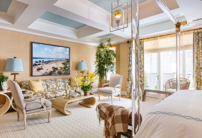
“Who could imagine—the chick who digs red would create this oasis?” asks Alessandra of her bedroom design. Through a wonderful mix of materials and textures, she has succeeded in creating a serene combination of warmth, sunshine, and peace. From the art (Tina Barney, Wayne Pate) to the furniture (Karl Springer, Régence), the room is filled with disparate things coexisting without losing their distinct personalities. “Contrasts are wonderful as long as they exalt each other,” says Branca. “They’re like dinner partners, and interiors are no different.” The Bernhardt acrylic and bronze bed stands out as a showpiece, channeling 70s and 80s glamour without the flashiness and dressed with her Casa Branca for Sferra bedding, especially when paired with an inlaid Moroccan bench from John Rosselli, a surreal Stephen Antonson chandelier, and a sofa covered in a tree of life Braquenié fabric from Pierre Frey. In the spirit of bedrooms being personal sanctuaries, she says, “I’ve included a little Gio Ponti as a nod to my Italian roots.” branca.com
Pavarini Design
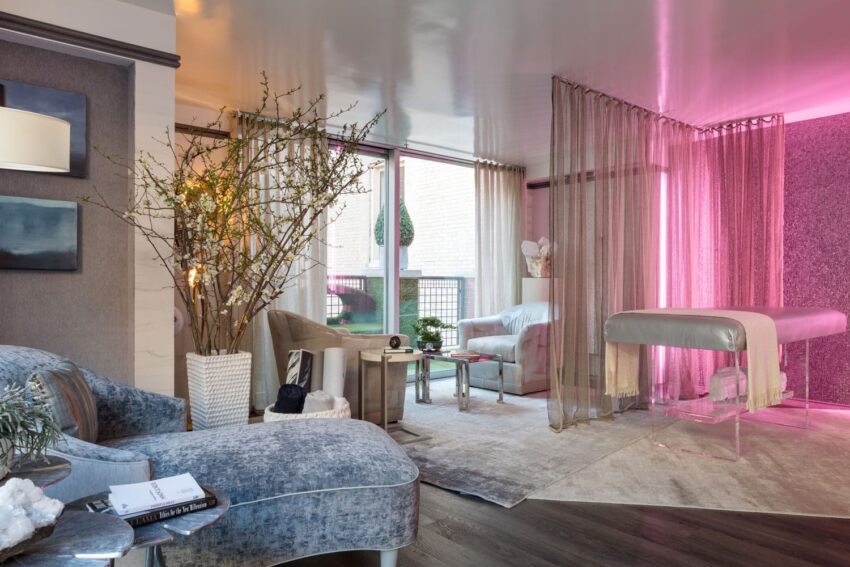
For his sixth year of participating, Charles Pavarini III conjured a soothing wellness retreat for meditation and massage. The top-floor room incorporates Ayurvedic elements and crystals to energize the space, including a monumental table by Robert Kuo paired with a pendant light by Frida Fjellman as well as a travertine-inspired wall covering by Fromental. Light therapy plays a role in calming the room, as does the sound of trickling water played through a Devialet sound system. pavarinidesign.com
Bunny Williams Inc.
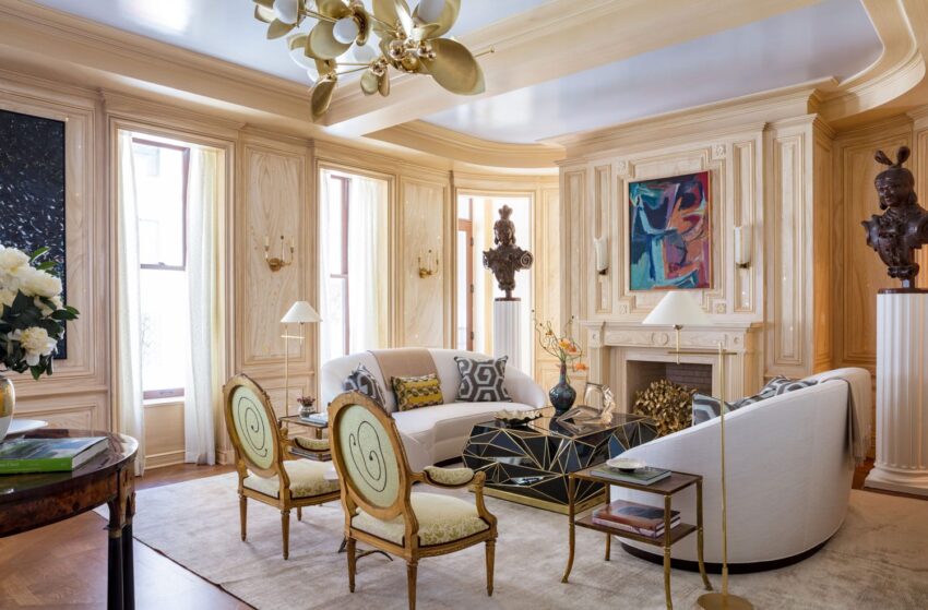
“Something that was important to me is showing that you can mix beautiful modern pieces with antique pieces,” says Elizabeth Swartz, partner of Bunny Williams in Bunny Williams Inc. “Young people don’t gravitate toward antiques, but when mixed with white sofas and pieces like the cocktail table from Newel, it feels collected and interesting.” Fantasy faux-bois walls created by decorative painter by Bob Christian adorn this this period-defying room, which is beautifully illuminated by a Laurel Blossom custom-made chandelier by Rosie Li. bunnywilliams.com
David Netto
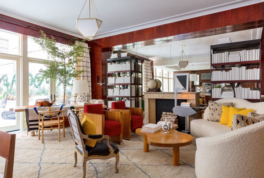
A Drawing on his memories of the Kips Bay Show Houses he saw as a child, native New Yorker David Netto was compelled to create a grand New York space. “So many of those rooms from my own past, it seemed to me, were red, so I started my design with a red and tortoiseshell ode to Mario Buatta and Mark Hampton.” He then filled the room off the kitchen with pieces that are “a bit more me” such as the Lalanne bird table and ceramic lamp from the lighting collection he did with Los Angeles artist Jennifer Nocon. davidnettodesign.com
Dan Fink Studio
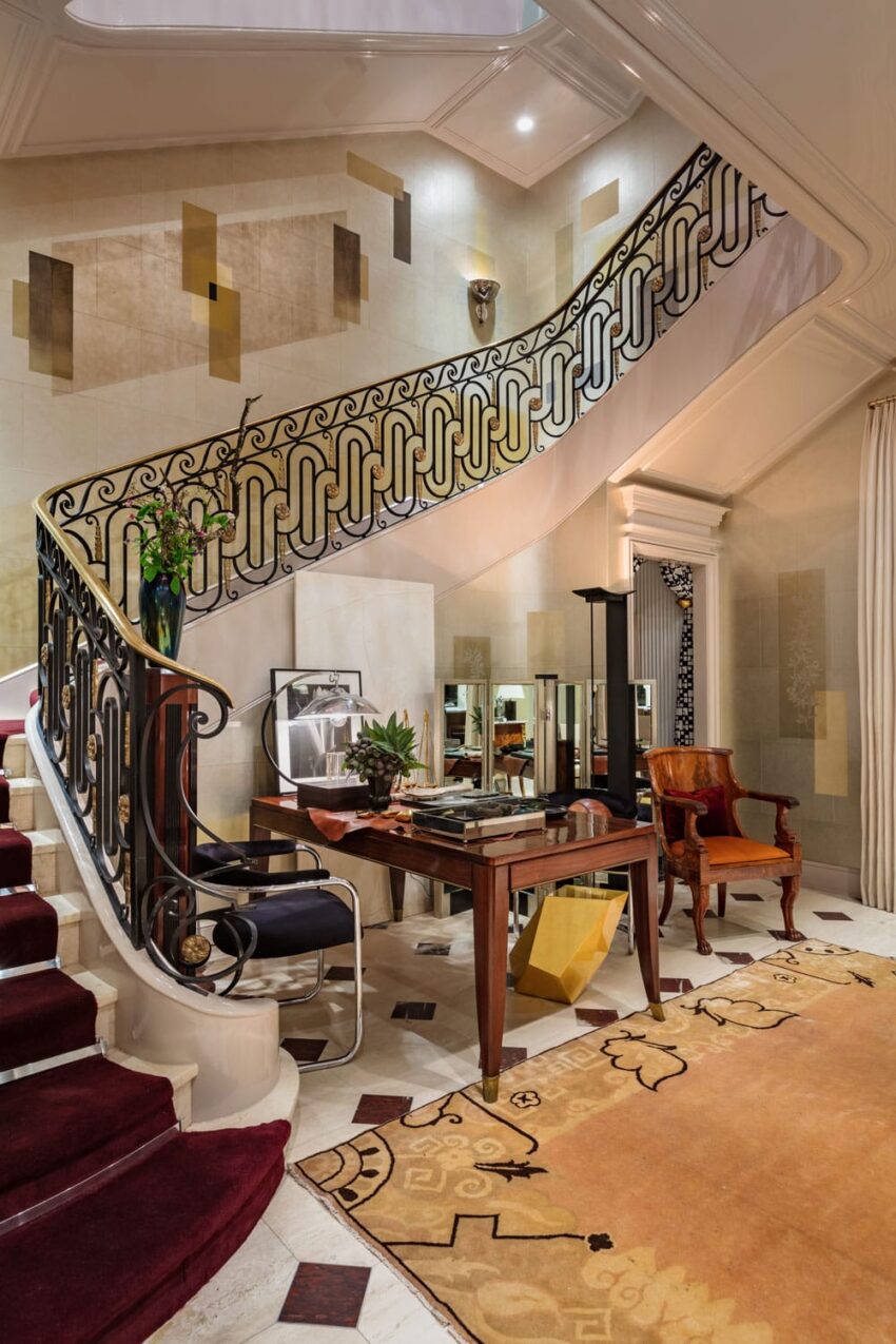
“I love classical things, so I was thrilled when I was assigned this stair hall with its exquisite rail,” says Dan Fink. To make the space modern, he added a custom Gracie gilded wall covering that gives the room a sense of composition and architecture along with a rug by Doris Leslie Blau. He also included a plaster relief of Diana the huntress, which he feels adds “a quiet strength and glamour.” danfinkstudio.com
B.A. Torrey

B.A. Torrey’s room certainly lives up to the theme of “After Party.” A swanky bar made of Cambria’s Hollinsbrook Matte gets an extra dose of cool with a Kehinde Wiley portrait hung behind it and decked out with barware by St. Louis. batorrey.com
Katie Ridder Inc.
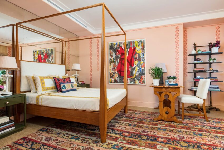
For an unabashedly feminine guest room, Katie Ridder created a cheerful oasis filled with shades of pink, starting with a special pink of the walls by Farrow & Ball enlivened with red stenciled borders by Ridder’s favorite decorative painter Chuck Hettinger. She commissioned the four-poster bed by Anthony Laurence Belfair. katieridder.com
Mark D. Sikes
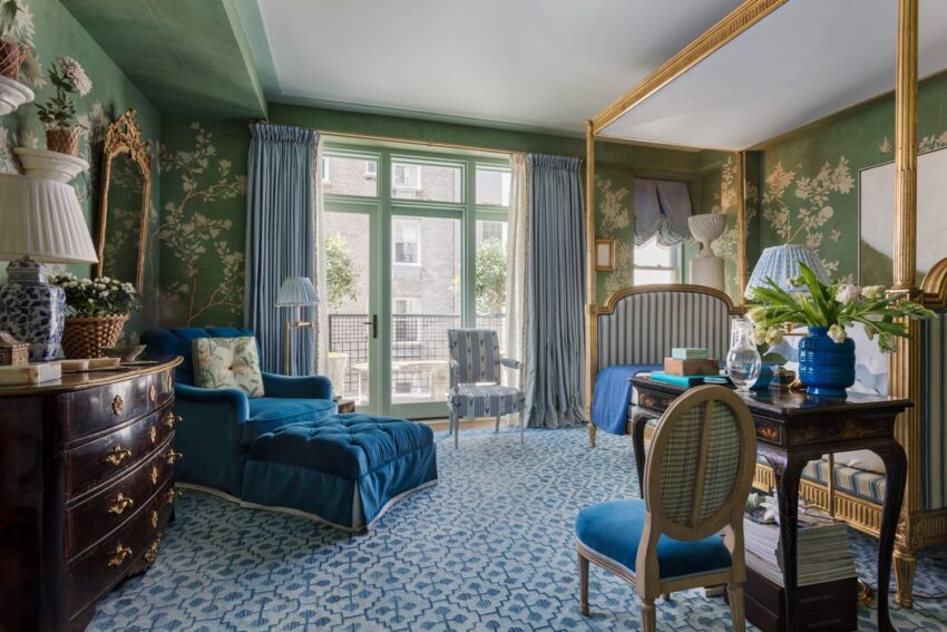
Renowned for his love of blue and white, Mark Sikes was true to form in the regal boudoir he conjured up. Antiques that once belonged to C.Z. Guest and Bunny Mellon are at home with exquisite pieces from Carlton Hobbs and porcelain flowers by Vladimir Kanevsky. markdsikes.com
Nievera Williams Design
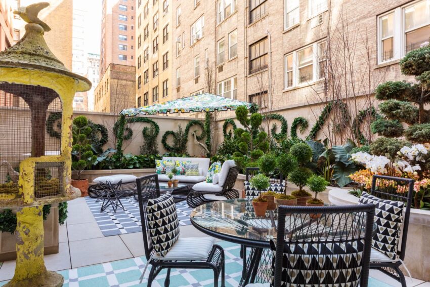
The design of Nievera Williams’s garden terrace was inspired by Schumacher’s Citrus Garden fabric by Josef Frank. The loose, jungle-like plantings are in contrast to the modernist outdoor furniture. The addition of the bird cage and topiary plantings add a sense of whimsy to the urban oasis. nieverawilliams.com
Michael Herold
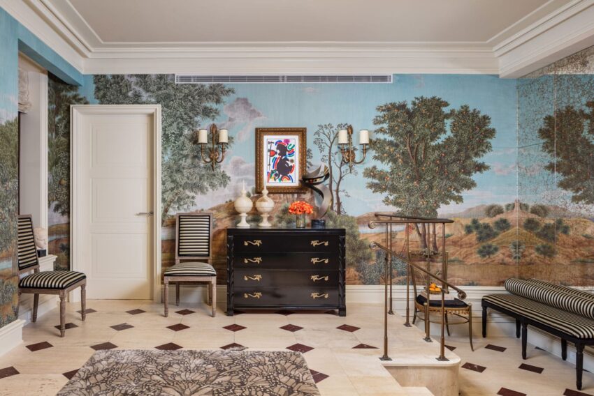
For the entry, Michael Herold used an Iksel paper inspired by a Nicolas Poussin landscape filled with citrus trees. A wall of mirrors gives the illusion the garden goes on forever, while graphic touches such as Juan Miró lithographs and bold black-and-white upholstery remind visitors they’re still in the city. Herold chose the butterfly rug from The Rug Company‘s collection with Alexander McQueen to symbolize the metamorphosis of the show house every year. mydesignermichael.com
Philip Mitchell Design

For the drawing room, Philip Mitchell put the focus on an eclectic mix of art. These personality-packed pieces, including a sculpture by David Duncan, a photo of Lee Radziwill by Mark Shaw, and a photo of tulips by Nancy Richardson, are held together by the expert architectural detailing of the space. He thinks his mother would be in her element entertaining in this space. philipmitchelldesign.com
Brian Del Toro
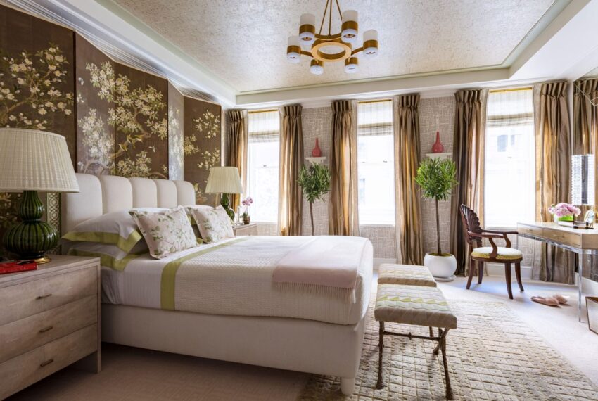
For “Laura’s Bedroom,” Brian del Toro used a vintage, hand-painted Robert Crowder screen to inspire the rest of the room. For a more contemporary counterpoint, del Toro installed a graphic print from Quadrille on the walls and an acrylic dressing table in the recess next to the window. Glints of gold are at play throughout the room, including in the soft cork wallcovering with gilded accents from Innovations used on the ceiling. briandeltoro.com
Marcia Tucker Interiors
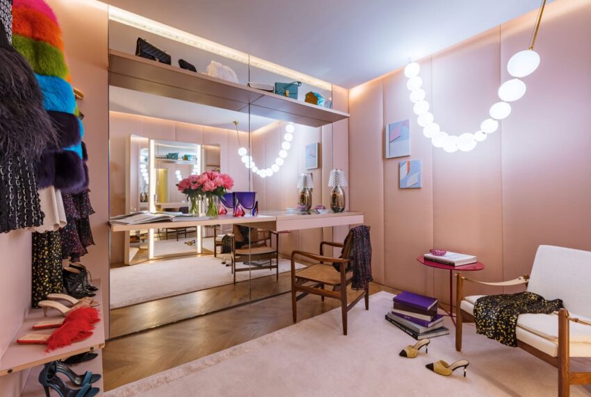
For a dressing room inspired by Barneys Fashion Director Marina Larroude, Marcia Tucker covered the walls in Dedar fabric and outfitted the room with a custom chandelier reminiscent of a pearl necklace by Semeur D’Etoiles. marciatuckerinteriors.com
Scott Sanders LLC
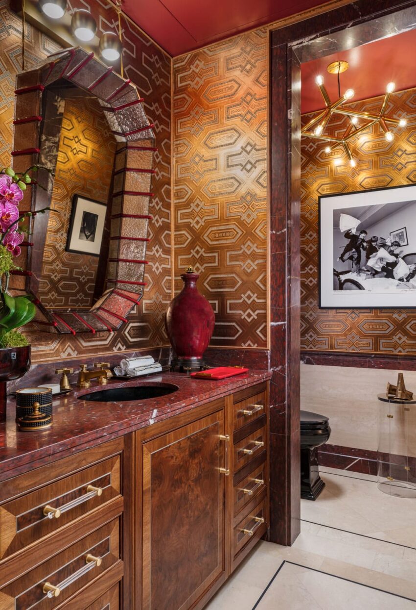
In the powder room, Scott Sanders channeled the sophistication and tailored details of a gentleman’s library by using Kohler fixtures in dramatic black with pinstriped fittings along with textured Labrado wallpaper by de Gournay. As any good powder room does, this one features a wonderful mix of art including a pair of Goya etchings and a Harry Benson photo of the Beatles. scottsandersllc.com
Steilish Interiors & Architecture
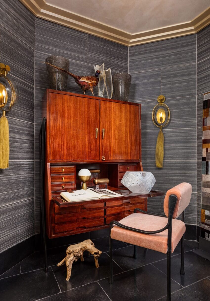
Stefan Steil transformed this windowless, L-shaped space into an ode to the romance of Italy. For the difficult task, he deployed an oversize Markus Brunetti photograph of the Cattedrale di Santa Maria Assunta in Siena to function as a window. Created by piecing together thousands of images, this artwork sparked the room’s color palette of blush, pink, gold, and black. steilish.com
Wesley Moon Inc. Design & Decoration
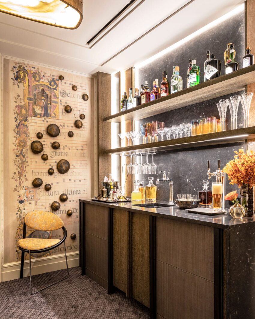
Instead of just one room to design, Wesley Moon was challenged with creating three spaces—the butler’s pantry, the wet bar, and the elevator landing. He gutted the area to create wider opening, and he added new cabinetry, flooring, and fittings. The bar is covered in a dark Belgian bluestone, which is framed by eglomise glass. Cerused-oak and horsehair cabinetry paired with digital wallpaper Moon created using medieval hymnals from the Metropolitan Museum of Art make this a lively experience even when it isn’t cocktail hour. wesleymoon.com
Clive Christian

Each piece of walnut cabinetry in the kitchen was handcrafted by Clive Christian’s U.K. workshops. The townhouse setting is referenced with exceptional details such as the geometric, hand-set marquetry above the hearth, the pair of dazzling Baccarat chandeliers, and the countertop in Cambria’s Brittanicca Gold. clivechristian.com
Barbara Ostrom

Barbara Ostrom channeled her love of visiting museums and galleries into a truly artful space. “When I was given the dining room to design for Kips Bay this year, I decided to transform the room into the vivid sense of color and excitement I felt when viewing a great painting,” she said. barbaraostrom.com