Office Hours: Inside Eric Egan’s Fully Maximalist Milan Office
The designer’s apartment and office are located in the same dazzling Italian landmark

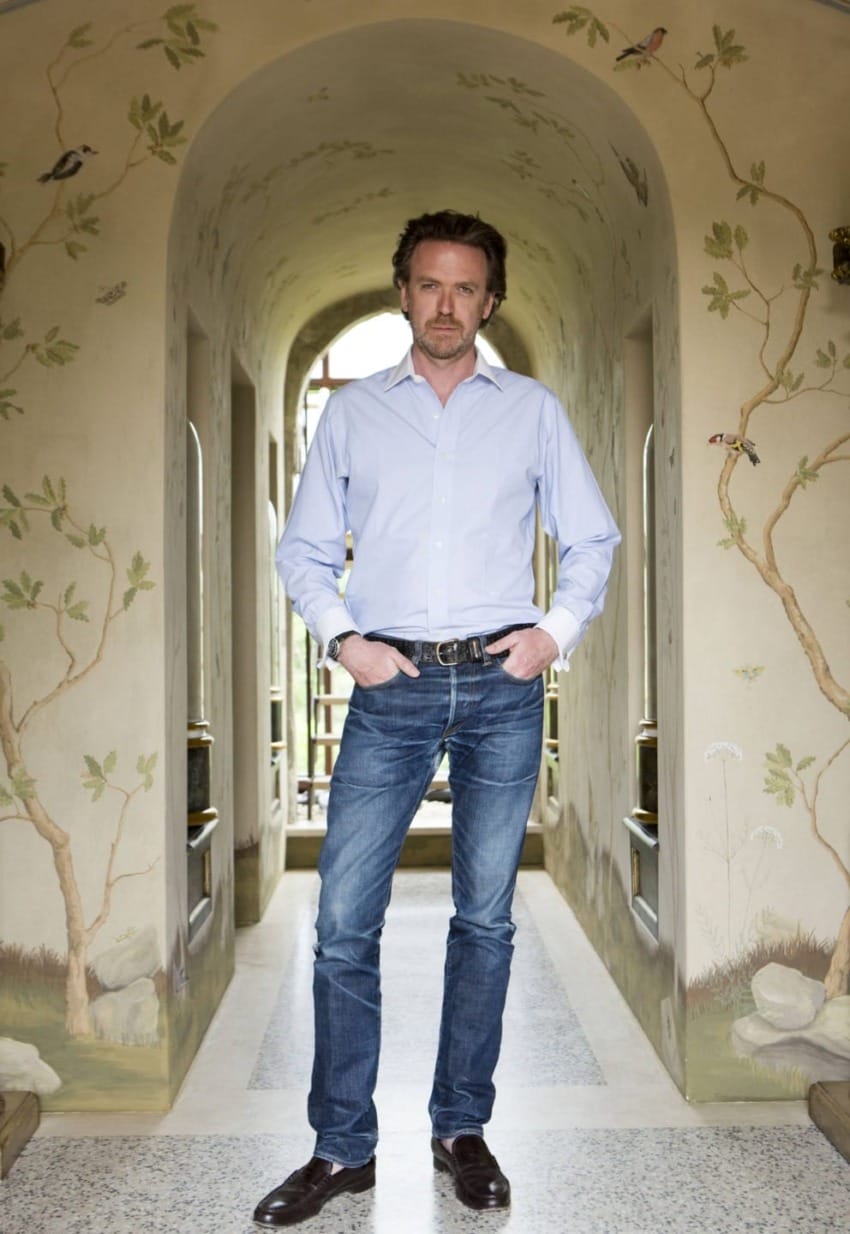
Renowned for his layered, glamorous interiors, designer Eric Egan knows how to perfectly combine American sensibility with Italian style. Having lived in Milan for several decades, he has developed a magical touch that comes with absorbing the country’s lifestyle firsthand. Right now, that also means he hasn’t left the Milanese piazza where he resides for over a month. But work must go on, and luckily his office is located just several doors down in the Piazza Castello, which is well within the government-mandated 200-meter confinement area.
“I come to the office every day,” says Egan. “I planned it to live like this—being so close to the office. Now I’m realizing how important that decision was.” It’s the perfect setup for him to conceive projects for private clients as well as some of the famed hotels in the world, including a new private villa at the Belmond Caruso in Ravello, the Gritti Palace in Venice, and the upcoming renovation of Milan’s Mandarin Oriental.
His office captures that perfect state of elegant decay, where nothing is too precious. “I’m not interested in perfect at all,” he says. “In Italy you can’t be decadent. It means falling down. You must embrace the decay. That’s what everyone loves about Italy.”

OLD AND NEW
“Piazza Castello was designed by Luca Beltrami, an architect at the turn of the century. The buildings are newer than they appear and are all historic revival from 1890. He built the first one and then real estate developers completed the others with super grand faces and atriums, but then inside there was nothing built out, similar to Place Vendôme. Our interpretation of that was to do ‘modest grand.’ The stone floors we brought in are paved, not marble. We have a herringbone parquet but not a fine herringbone. It’s a carefree elegance. I just noticed the stone top has cracked in the kitchen . . . and I’m like, Great, now it looks old.”
Recommended: Jeffrey Bilhuber Shares His Work-from-Home Dining Room in Manhattan
BIDDING INSPIRATION
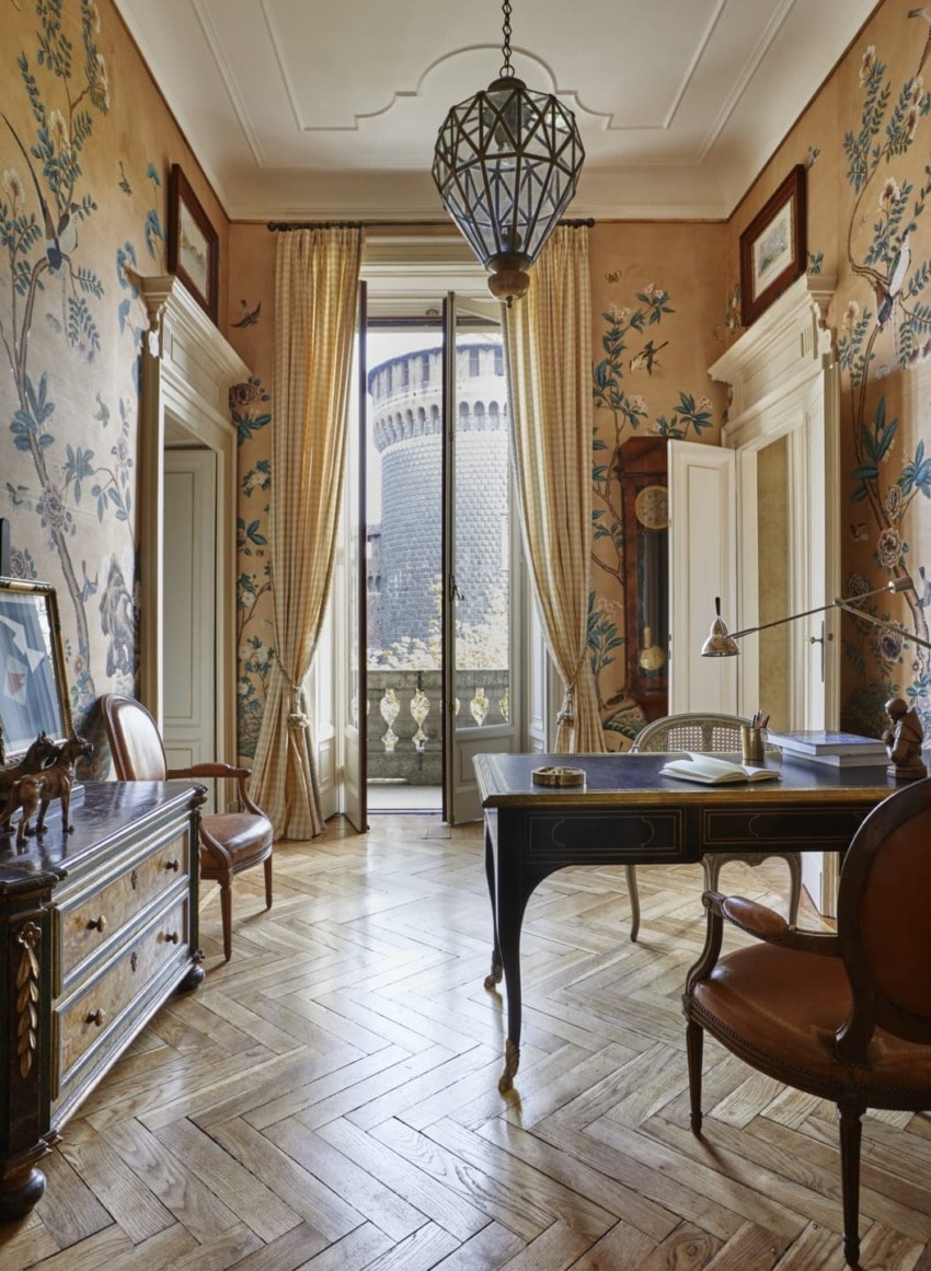
“Cleaning up today I found the auction catalog that was a jumping-off point for this. There was an Italian socialite, Evelina Schapira, the Nan Kempner of Milan. I met her when I was young. She had died recently, and I tried to make this like a glamorous grandmother’s apartment where she might reside. The difficulty is, how do you do traditional without being stuffy. We tried to show there’s a bit with a wink. For example, in the chinoiserie room by Fromental, there’s a Tom of Finland guy. I wanted this place to feel like Renzo Mongiardino had just gone out for a cup of coffee.”
SITTING PRETTY
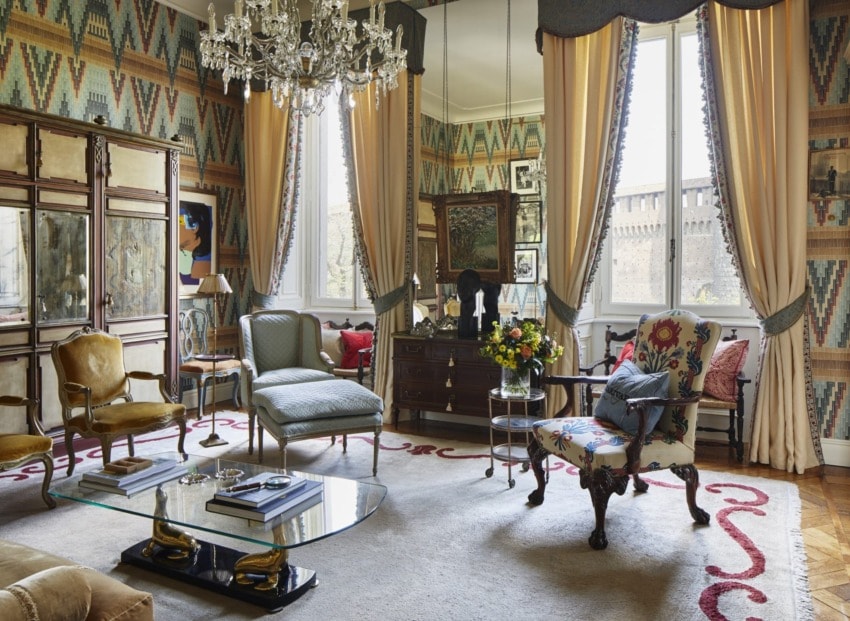
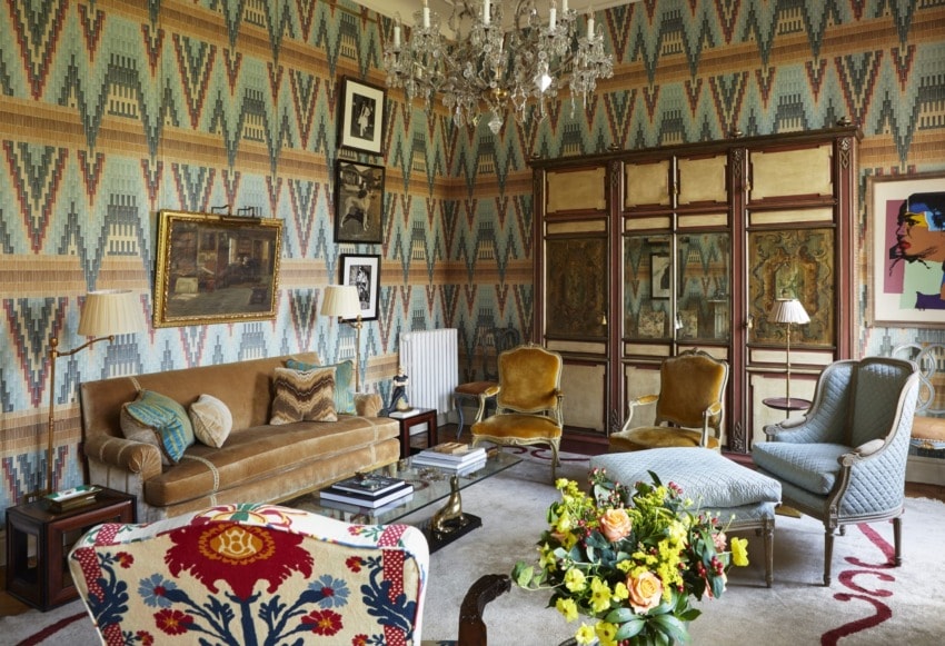
“In the main sitting room, it’s an accumulation of stuff that wasn’t planned—a Jansen rug from Buenos Aires, where I also have a house; an English armchair upholstered in Le Manach with a pillow made of my old Charivari jean jacket from when I was in school; an Impressionist painting by Paul-Émile Pissarro, the son of Camille; Braquenie fabric on the walls; and a silk velvet sofa. Too much is never enough.”
PRINTS, PLEASE
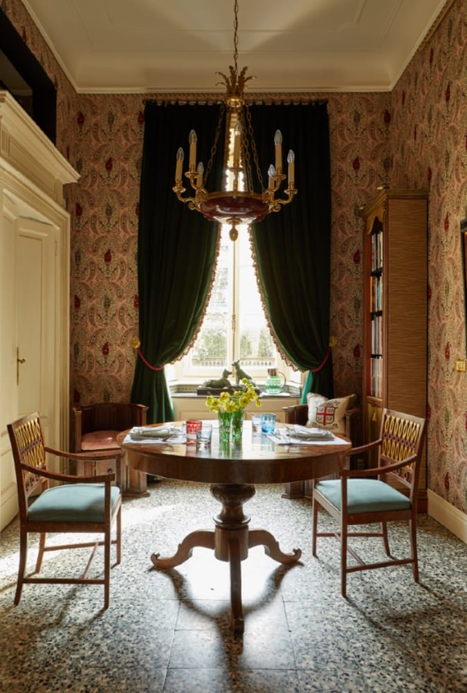
“As decorators, we go through our career hoarding things. The cashmere room with an old vintage Rubelli print is an homage to Dino Franzine, who was Mongiardino’s antiques dealer. He would throw very popular dinners at his home, which was naturally designed by Mongiardino, and Andy Warhol’s last public outing was at one of them. When the mill went out of business, I bought every meter they had, then kept it for 15 years waiting for the right moment to use it. To get around the room, we had just under a foot of fabric left. I just adore that room.”
TRIM UP
“We have a lot of trims on all the curtains. I love a granny fringe on curtains. Because I buy so many of them, the representative for Houles—which is sold through Samuel and Sons—reached out, and now we’re working on a collection that will hopefully come out in January. The ones I order are soft updated colors or quirky oddball colors. I prefer them to be soft to the hand, so I like cotton mixed with the silk. Silk alone would be too fancy.”
WARHOL ROOM
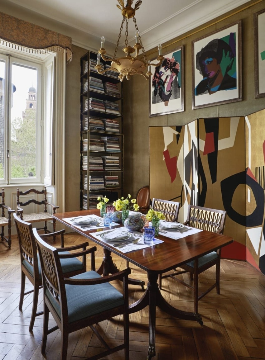
“The Warhol Room is inspired by a room in Sophia Loren and Carlo Ponti’s Rome apartment, where they had Francis Bacons on velvet walls. The idea of the corduroy walls came from there. During 2008, I started to buy the Warhols from his 1975 “Ladies and Gentleman” series of black transvestites. They were originally printed in Milan, so they would come up in house sales, and because of the subject matter it didn’t appeal to the local taste.”
SIMPLE PLEASURES
“I’ve sat everywhere in this office, but I prefer the simple, white room in the back that isn’t as decorated when I work. The woman who had it before died at 93, and she spent her days there sewing. It faces south with wonderful light. You know a lot of designers say they work best in a place that’s antiseptic and doesn’t influence their thoughts.”
ONGOING PROJECTS
“We’re working on a 12,000-square-foot, ground-up house in Hong Kong with exteriors based on Villa Necchi, so an Italian 1930s exterior and interiors that are French ’30s and ’40s. We’re wrapping up the second phase of the Mandarin Oriental in Lake Como and just waiting until we can install.”
FOREVER AND A DAY
“It’s been a month that I’ve been in here seven days a week alone, and it’s such a pleasure to be here. When I’m old I’ll keep this office just to read the newspaper. If clients ask what my style is, I say, Come over and you’ll see. If you like it, great. If not, there are other people who can do your hotel or home.”