
8 Top Designers Reveal How to Create the Perfect Home Office
For these global design talents, a functional and fabulous home office falls under business as usual
As more and more people adapt to working from their residences, they’re recognizing the importance of the home office and planning their interiors accordingly. Whether it’s tucked into a quiet nook or inhabits a wing of its own, this space needs to both inspire creativity and uphold a level of functionality. “If you’re doing a home office for a client, you have to decipher what they need, so you can get to the heart of what will make them happy,” says Markham Roberts, who maintains a richly layered study in his New York country home as well as a carriage house turned studio nearby. Here, design experts share what it takes to execute the perfect plan based on a few key elements.
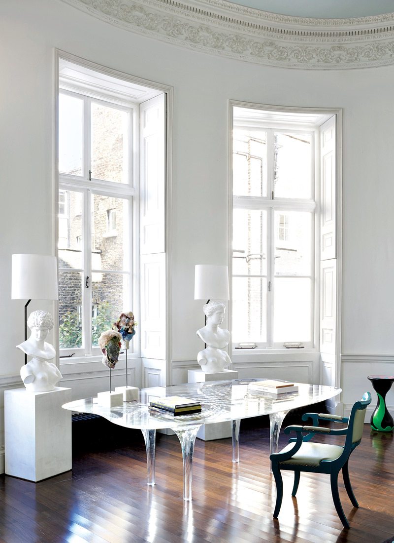
A striking Zaha Hadid table in the London home of Francis Sultana. Photo: SIMON UPTON
Furniture
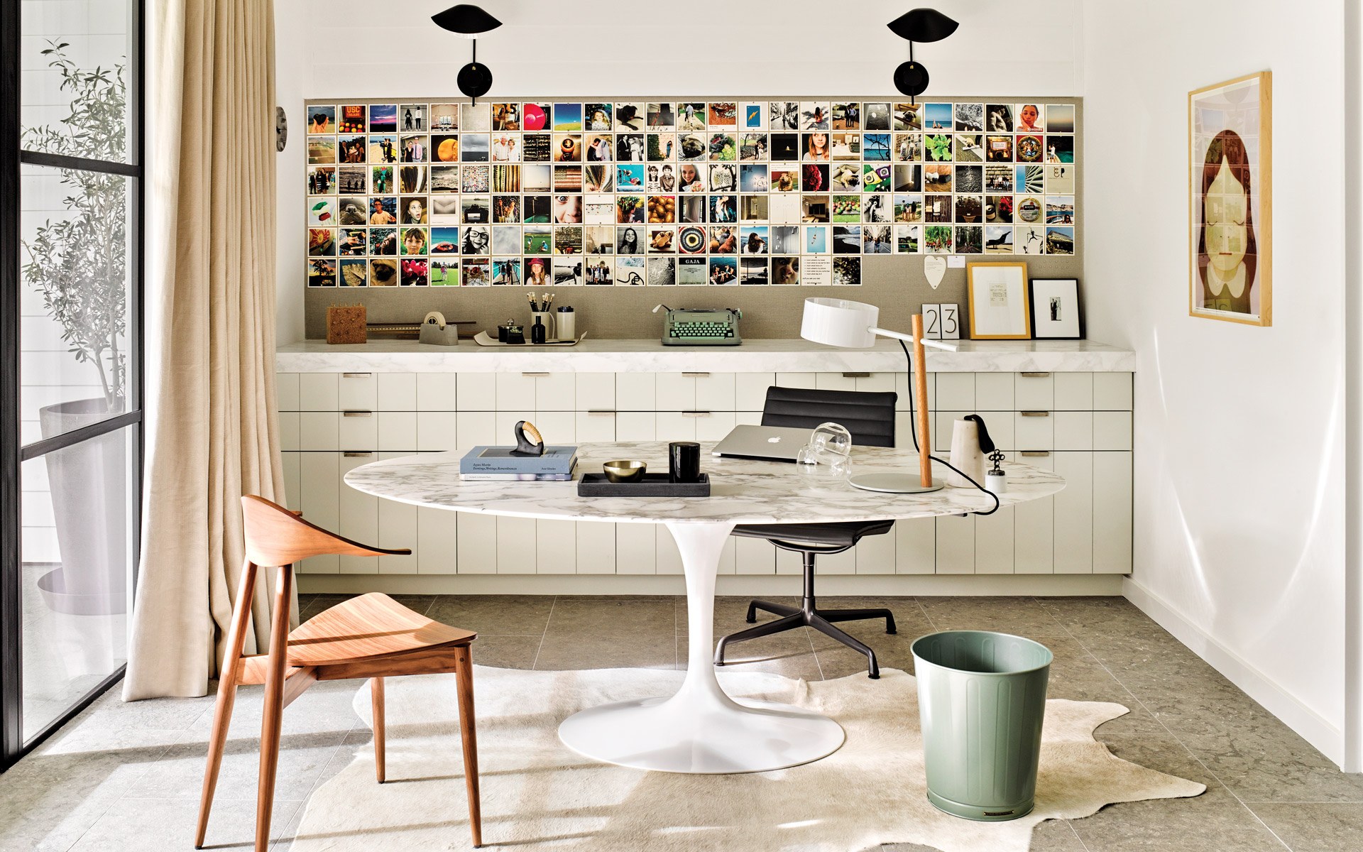
Obviously, most offices focus on the desk, whether that’s a classic design such as an Eero Saarinen Tulip or a Jean Prouvé Trapèze table or a striking showpiece such as the Zaha Hadid limited-edition one used by Francis Sultana. “I wanted something by her in this room somehow for sentimental reasons, as she was a very dear friend,” says Sultana. “This was the best option in terms of proportions and design. I was looking for a large desk but didn’t want it to feel too heavy in the room.”
To enliven a writer’s New York office, designer Katie Ridder placed a desk in a bold shade of robin’s-egg blue alongside a row of vibrant raspberry-lacquered cabinets. “We like to have all the rooms flow into one another, so those colors are picked up in the surrounding areas,” explains Ridder. “There’s no rule that says an office must be brown wood. It can be highly functioning and still be decorated.”
“There’s no rule that says an office must be brown wood. It can be highly functioning and decorated”
Katie Ridder
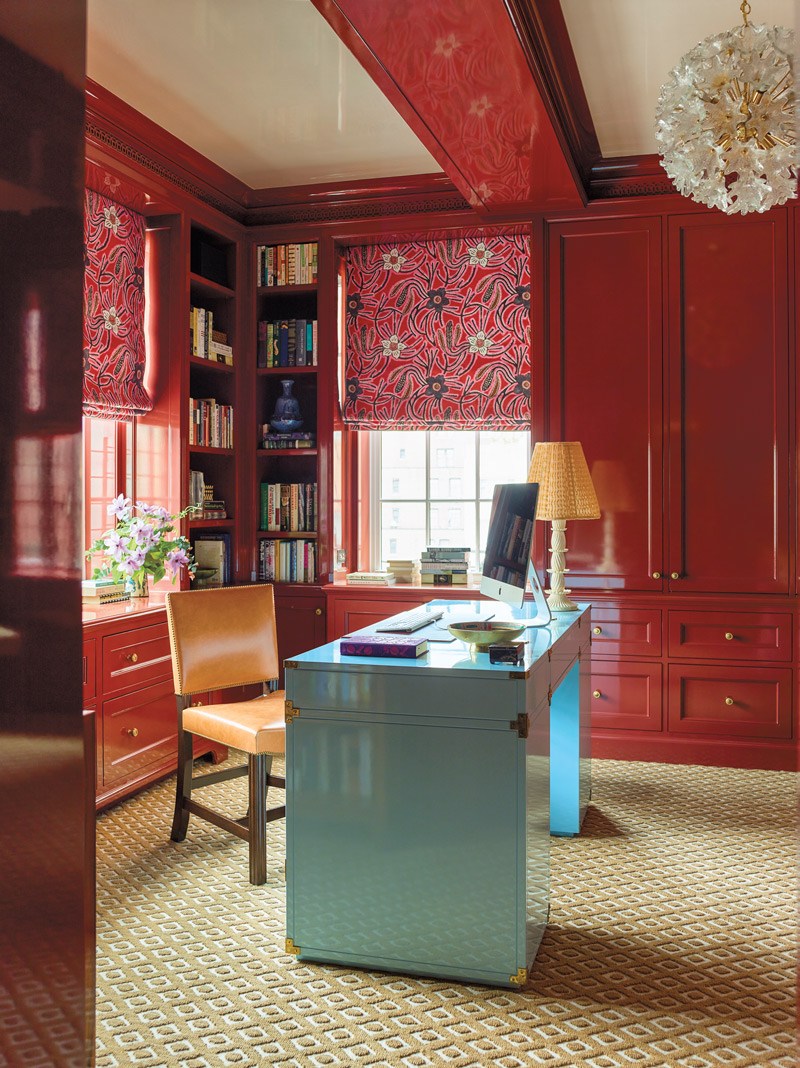
Designer Katie Ridder used bold colors, light-reflecting lacquer, and a vintage chandelier to create an inspiring work space for a New York writer. Photo: ERIC PIASECKI
Additionally, properly situating the furniture is vital to a room’s success. “Nobody likes being punished in a corner, and facing a wall is not ideal either,” says Reinaldo Leandro, half of the New York design team Ashe Leandro, which has conceived remarkable spaces, from a Nantucket compound to a Caracas hotel. For artist Rashid Johnson’s home office, the duo designed around an iconic George Nakashima desk. “In that particular scenario, it is positioned completely open to the expanse of the room, receiving natural light from behind but open to the space and facing the door to welcome thoughts, ideas, or visitors.”
Seating is also a critical piece of an office’s interior. While Eames styles and George Nelson desk chairs are easy wins, James Huniford, whose book James Huniford: At Home (The Monacelli Press) is out this November, chooses ones that make an impact. “I like chairs that are sculptural in form and shape,” says the designer. “They have to be practical, not too big or heavy.”
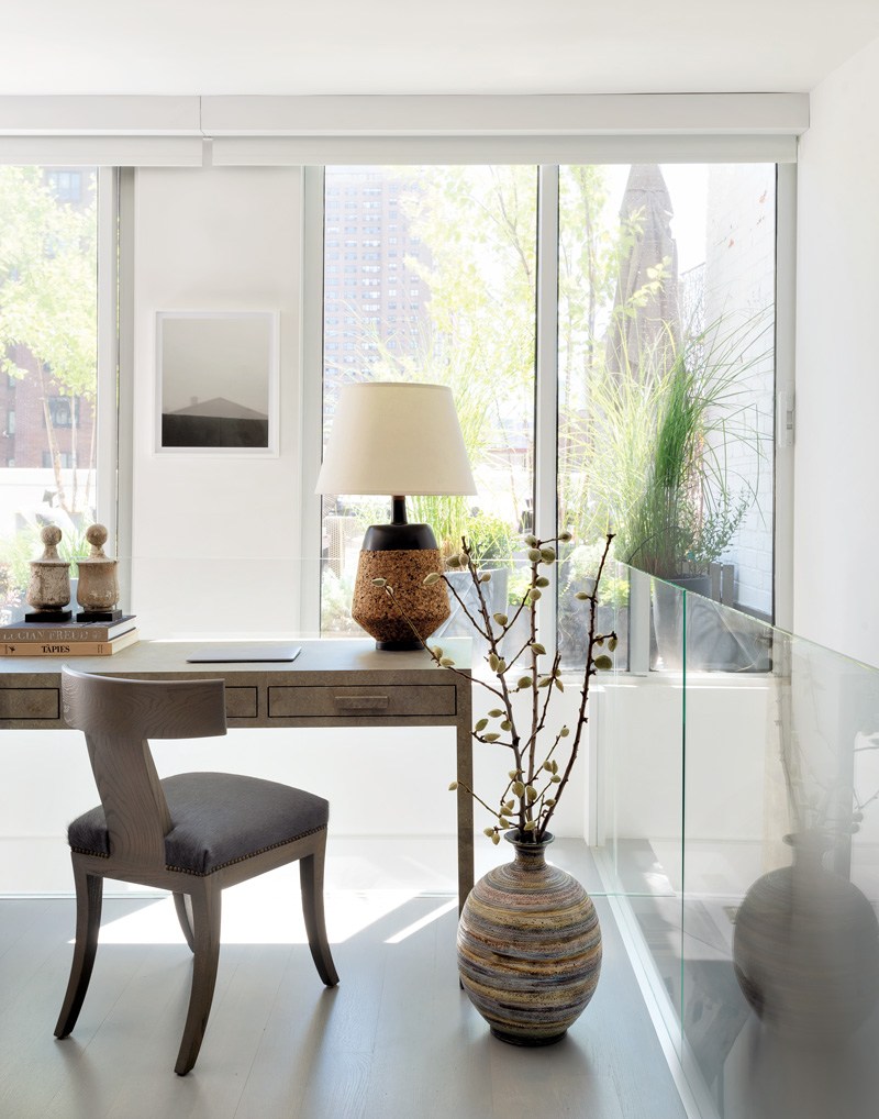
James Huniford gravitates toward seating that is both practical and refined, like this Barrow chair from the designer’s own collection. Photo: MATTHEW WILLIAMS
Lighting
One of the elements that can alleviate a home office of an institutional aesthetic is lighting. “Natural light in a working environment is so important. It’s linked to your productivity and mood,” says Leandro. “The closer you can get to that natural light source, the healthier your mind will be.”
Often, repurposing an underused area as a home office can mean natural light is a luxury, so it’s up to a properly orchestrated array of table and floor lamps or overhead fixtures to illuminate a room. “A table lamp that looks good from all angles is a great way to interject a sculptural element,” says the Archers’ Richard Petit, who is known for his flair for mixing underappreciated design treasures from decades past. “The Franco Albini and Franca Helg AS1C table lamp can either light up a whole room or cast a soft glow depending on the setting.”
According to San Francisco–based designer Nicole Hollis, a unique chandelier not only creates an dramatic visual moment but also opens up available desk space. “Offices inherently collect clutter even for the most organized person,” says the designer, whose book NicoleHollis: Curated Interiors (Rizzoli) is out October 6. “Adding a decorative light fixture creates a sculptural element that draws the eye up.”
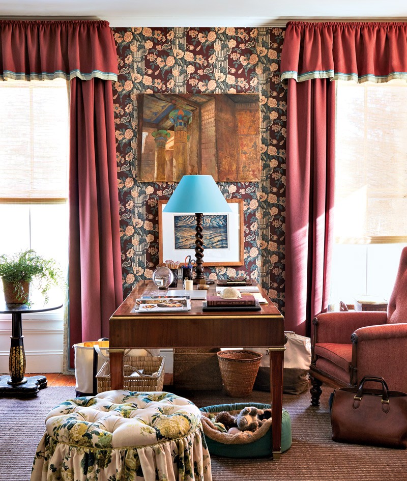
Markham Roberts’s home office incorporates a now-discontinued chintz wall covering from Clarence House the designer had saved for decades. Photo: MIGUEL FLORES-VIANNA
Organization
The necessities of doing business, such as papers and electronics, often make a home office visually unappealing, but repurposing high-design items can preserve the aesthetic. Lacquer, brass, or bone trays and boxes can be beautiful catchalls, while Roberts turned several wicker stools into a drop zone for papers, avoiding an unsightly recycling bin. “Things can add character to a place and still be functional,” says the designer, whose second book, Markham Roberts: Notes on Decorating (Vendome), is out this month.
Shelving too can provide storage but also offer space to display a collection or inject personality—something of particular importance in today’s videoconference culture. “Art, hobbies, and mementos can be selected and displayed in highly personal ways,” says Petit, who installed Sterling Ruby’s 2014 work SP294 to introduce a jolt of color in an otherwise muted interior. “A sound-absorbing wall of books can do the same job.”
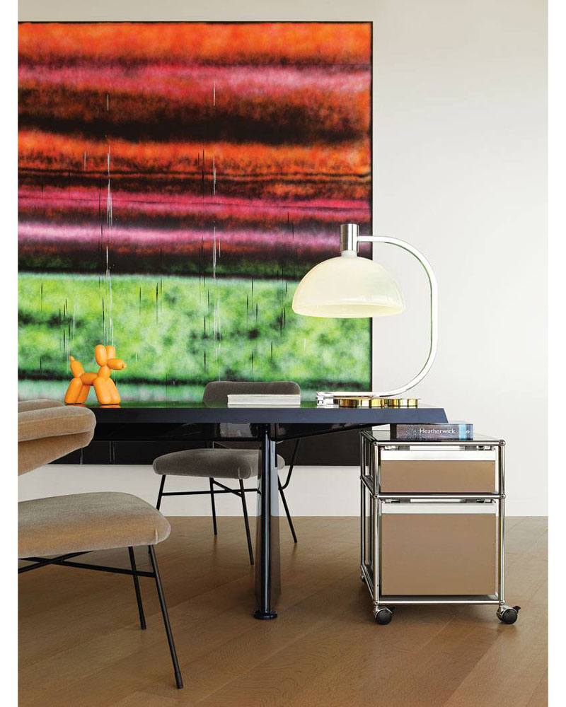
Sterling Ruby’s work SP294, installed in an office designed by Richard Petit. Photo: RICHARD PETIT
“A table lamp that looks good from all angles is a great way to interject a sculptural element”
Richard Petit
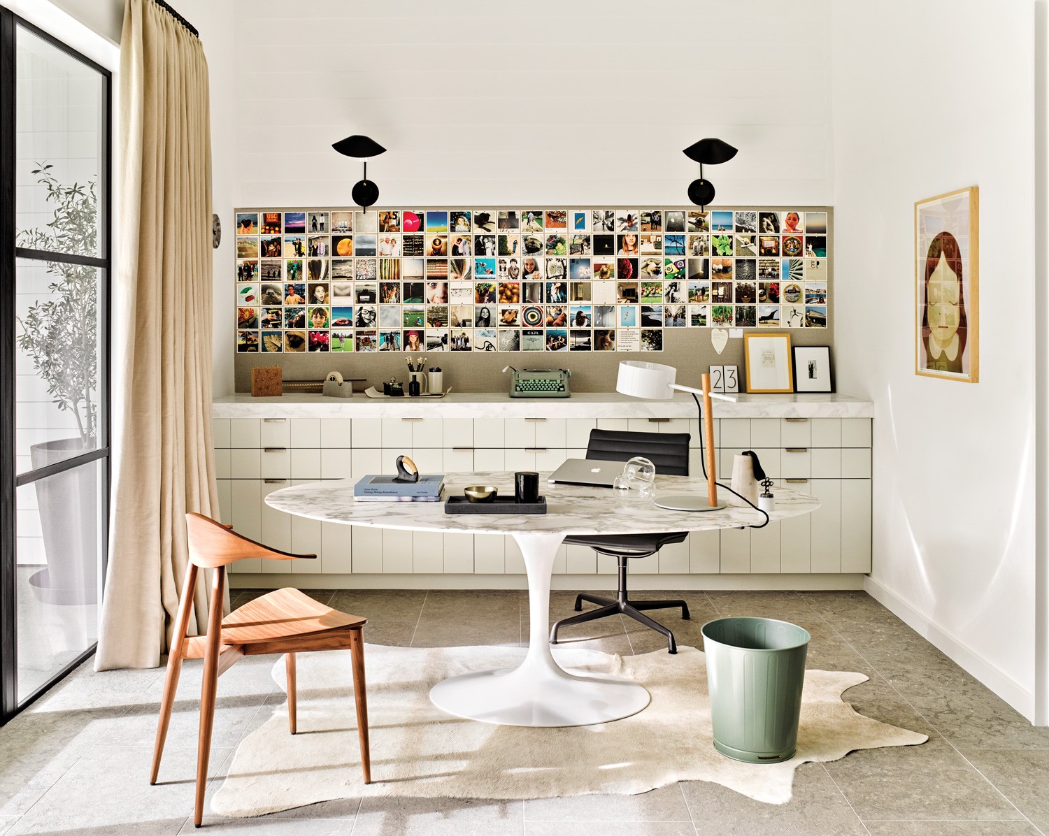
Inside a Thousand Oaks, California, home office, Nicole Hollis installed a magnetic wall to display family photos, as well as artwork by Yoshitomo Nara. Photo: DOUGLAS FRIEDMAN
Anyone who has scanned a colleague’s shelves during a Zoom call knows it’s these accoutrements of life that signify this work space is an extension of home. “The client of our project in Russian Hill, a tech exec who frequently works by videoconference, requested a space that was moody and thought-provoking,” says Hollis. “We found a bold skull graphic rug by Eddy Bogaert for Marc Phillips that adds the perfect edge.”
“My desktop is ‘me’—from my notebooks (I always use the same orange ones from Hermès) to my pens, pencil holder, the odd box, trays, and even sculpture,” says Sultana. “The more items on it, the more personality.”
A version of this article first appeared in print in our 2020 Fall issue under the headline “Office Hours.” Subscribe to the magazine.

