
Step Inside the Exuberant Upper East Side Apartment of New York Art Adviser Erica Samuels
The ongoing collaboration between Samuels and designer Fawn Galli has produced one of their boldest projects yet
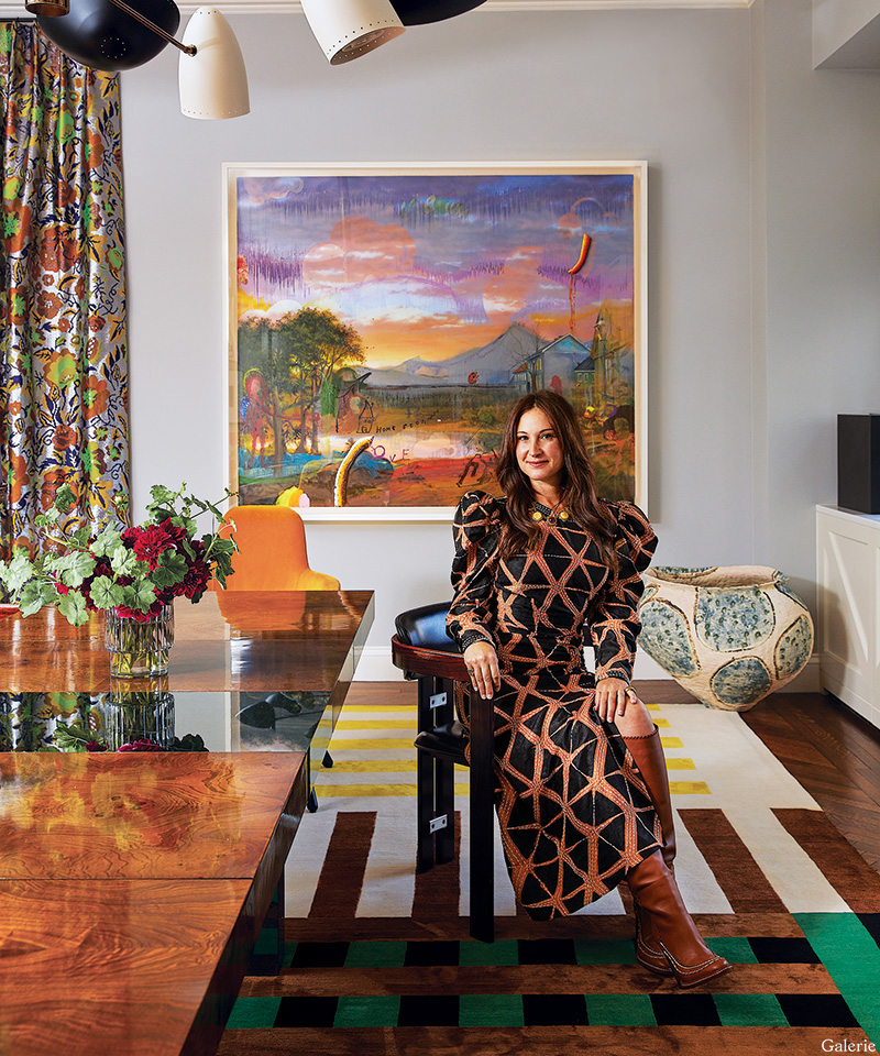
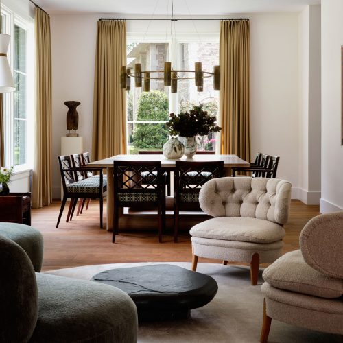
Erica Samuels is seated in one of the vintage rosewood chairs that surround the dining room’s vintage table; behind her, a work by Friedrich Kunath hangs above a large ceramic vessel by Kazunori Hamana. Photo: Genevieve Garruppo. Styled by Lili Abir Regen
There are many different ways to renovate a home, of course. One approach is the pedal-to-the-metal, sledgehammer-swinging overhaul that sprints to completion in a cloud of drywall dust. Another is a more meandering journey, where various elements are changed over time, creative experiments are encouraged, and few things are set in stone.
For the past 12 years, Erica Samuels, founder of the Manhattan-based art advisory Samuels Creative & Co., has embraced the latter tack with her longtime friend designer Fawn Galli in the Upper East Side apartment where Samuels lives with her husband and two daughters. “Given what I do and the amount of things I see, I’m constantly cycling things in and out,” Samuels says. “We’ve gone through several iterations since the day we moved in, because I don’t really sit still.”
She routinely shuffles her art collection, which includes works by Ed Ruscha, Damien Hirst, Yayoi Kusama, Laura Owens, and Thomas Houseago, in order to experience the pieces in new settings. “I like to keep it fresh,” she says. “Art can really alter the feel of a room, so as I move things around, the space changes.”
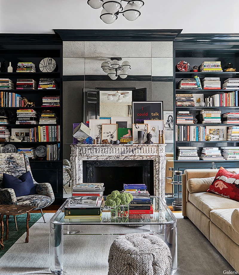
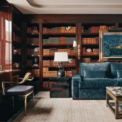
In the library, an Egg Collective sofa covered in a Clarence House mohair faces a Lucite table by Charles Hollis Jones. The Gino Sarfatti ceiling fixture is reflected in the mirrored fireplace surround, the pouf is upholstered in an alpaca bouclé by Rosemary Hallgarten, and the rug is a custom design by Fawn Galli Interiors made by Doris Leslie Blau. Photo: Genevieve Garruppo. Styled by Lili Abir Regen
That, in turn, inspires more changes in furniture and finishes, ensuring Galli stays at the top of Samuels’s favorite-contacts list. When they were both starting out in their careers, the two women shared an office in the West Village, where they discovered they frequently saw eye to eye on matters of style. “It was like art and design, fabrics and daybeds, all colliding,” says Samuels. “It was a really fun time and incredibly collaborative.”
That collaborative spirit has continued at the art adviser’s home, an effort Galli describes as “definitely more spontaneous and less formal” than many interior design jobs. “We tried different things and found she has a minimalist-maximalist aesthetic,” she says, referring to her client’s taste for high-impact art and furnishings in eye-catching colors, all cleanly presented so that individual pieces have room to shine. The mix, however, has grown bolder and denser in recent years. “Over time, the apartment evolved to become something a lot less pared down than it was.”
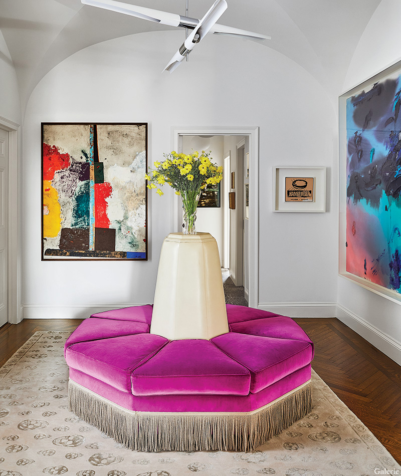
A David Weeks Studio light fixture is suspended above the bespoke octagonal bench in the entry gallery, which displays artworks by (from left) Sterling Ruby, Andy Warhol, and Laura Owens; the rug is by Alexander McQueen for The Rug Company. Photo: Genevieve Garruppo. Styled by Lili Abir Regen
Now visitors arrive at a vaulted, gallery-like entrance hall anchored by a custom octagonal ottoman clad in purple velvet, with a striking X-form David Weeks Studio light fixture overhead and an Alexander McQueen Skull rug underfoot. As they remove their shoes they can take in canvases by Sterling Ruby, Andy Warhol, Karen Kilimnik, and a video work by Christian Marclay. “That ottoman isn’t a wimp in the context of the strong architecture and art,” Galli explains. “It holds its own.”
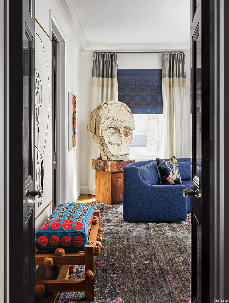
A Thomas Houseago sculpture in the living room of art adviser Erica Samuels’s New York apartment. Photo: Genevieve Garruppo. Styled by Lili Abir Regen
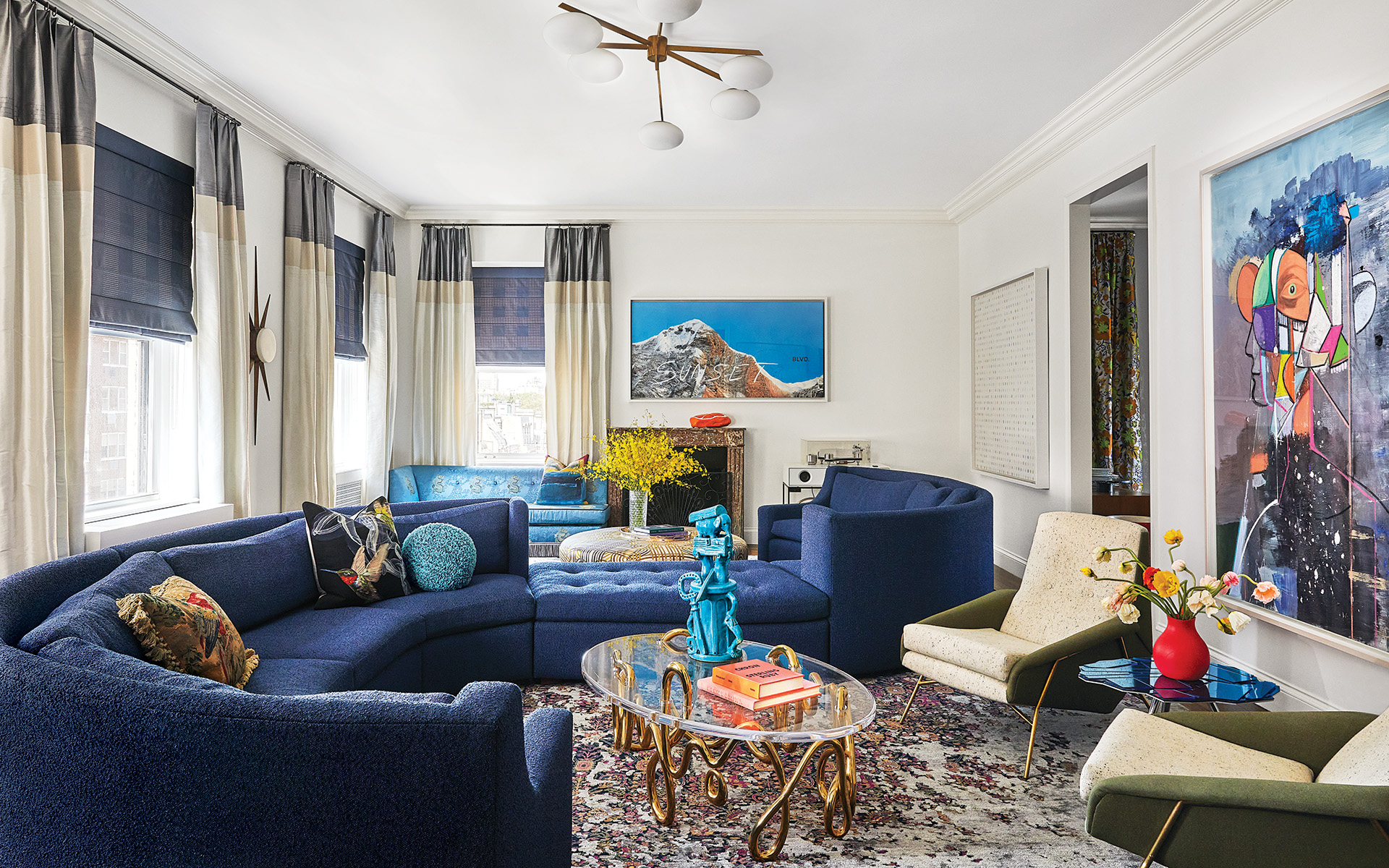
Indeed, where some designers create white-box rooms for collector clients, Galli was intent on engaging in a dialogue with Samuels’s attention-grabbing art, choosing colors, patterns, and forms that are just as potent. In the long living room, conventional wisdom might have suggested breaking up the space with a couple of distinct seating areas, but Samuels and Galli conceived a massive serpentine sectional sofa that snakes across the center of the room and ties everything together. “I’ve had some 60 people sit on the sofa,” Samuels says, “and it’s very comfortable.”
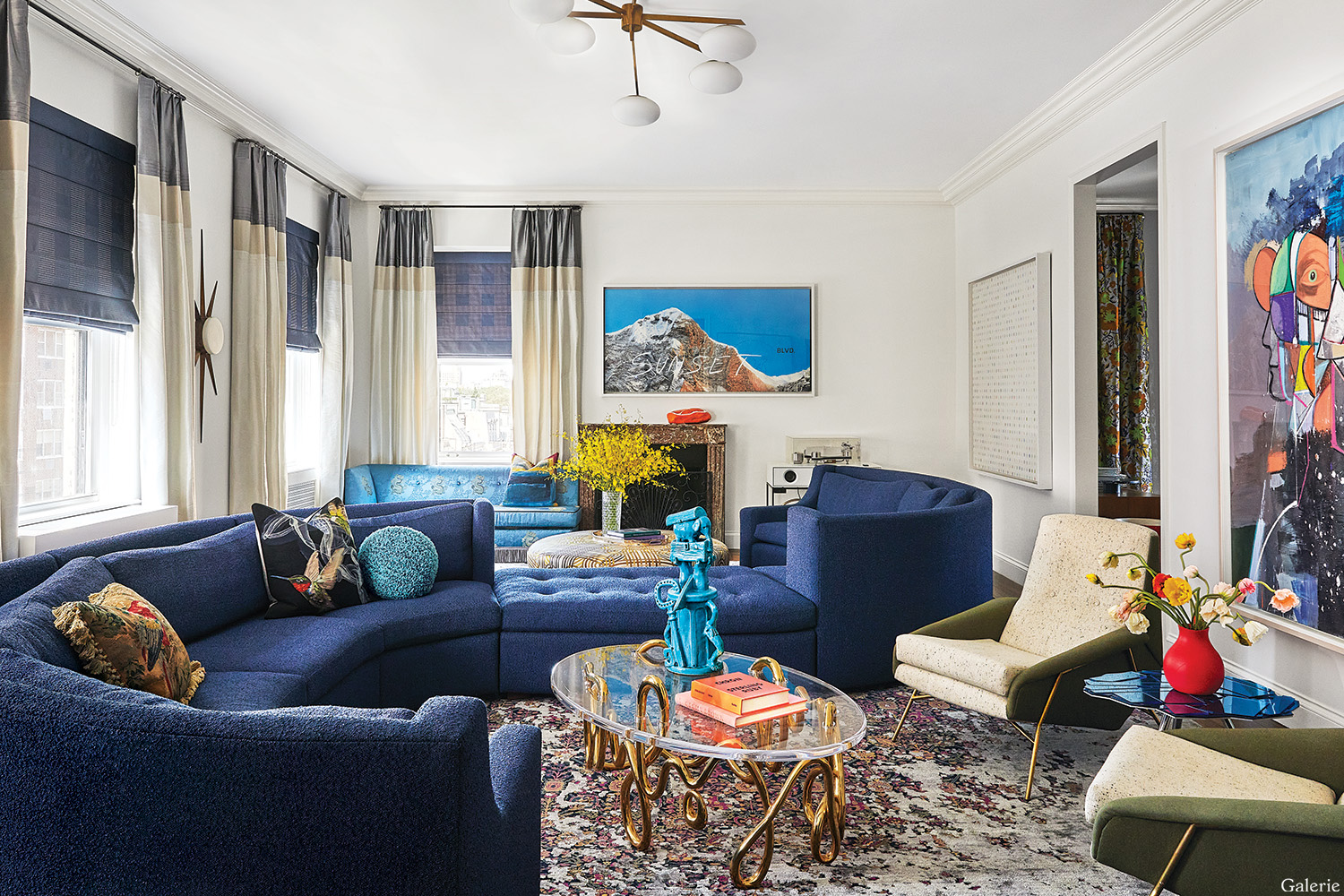
A custom-made serpentine sofa anchors the living room of the Upper East Side apartment art adviser Erica Samuels shares with her husband and two daughters. A George Condo painting overlooks a pair of 1960s Italian lounge chairs and a Mattia Bonetti oval table topped by an Eric Croes ceramic sculpture, while a work by Ed Ruscha is mounted above the mantelpiece and a Damien Hirst “Spot” painting hangs on the adjacent wall. The Gio Ponti sconce is from Lost City Arts. Photo: Genevieve Garruppo. Styled by Lili Abir Regen
“I like to keep it fresh. Art can really alter the feel of a room, so as I move things around, the space changes”
Erica Samuels
Even in the primary bedroom, where many people would opt for calm, the pair installed a graphic carpet of black and white triangles, complemented by curtains in a punchy motif of silver and black cubes. The custom-designed bed, which features an undulating asymmetrical headboard upholstered in a nubbly bouclé, sits beneath a cheeky bum painting by Elana Bowsher.
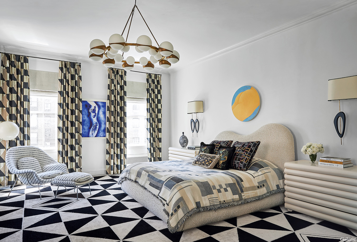
Graphic punch rules the primary bedroom, thanks to the Pierre Frey cubic-pattern curtains, the stripe-clad Eero Saarinen chair and ottoman, and the triangular-pattern carpet by Chused & Co. Bold pattern continues with the Dedar fabric coverlet on the custom-designed bed, which is flanked by Steven Bukowski nightstands and Diego Mardegan sconces. The Stilnovo-inspired chandelier is from Adesso Imports, the artwork over the bed is by Elana Bowsher, and an Yves Klein silk screen hangs between the windows. Photo: Genevieve Garruppo. Styled by Lili Abir Regen
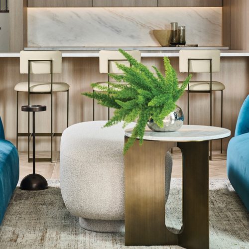
One of their latest projects for the apartment was a gut renovation of the kitchen, where Galli put in a spirited terrazzo floor and devised cabinets with alternating panels in two shades of bluish gray. She also added shimmering brass trim and details throughout. The result reinforces an idea that pervades the entire apartment: This is what interior design looks like when two friends with impeccable taste decide to have some serious fun.
“As a kid I moved around a lot, and this is a way for me to keep moving without actually packing,” Samuels says. “And, no, I definitely don’t think we’re done.
A version of this article first appeared in print in our 2023 Collectors Issue under the headline “Upping the Ante.” Subscribe to the magazine.


