3 Must-See Shows with the Most Striking Exhibition Design
From a show designed by buzzworthy architects Charlap Hyman & Herrero at Tina Kim to a conceptual feast at R & Co.

Exhibition design can make or break a show. And while the white cube aesthetic is most favored by galleries, these exhibitions prove that transforming the space sets the most powerful stage. Here, we rounded-up three dynamic displays in New York that are as enjoyable as the art and design objects within them.

1. “Uncrated” at R & Company
Through August 22
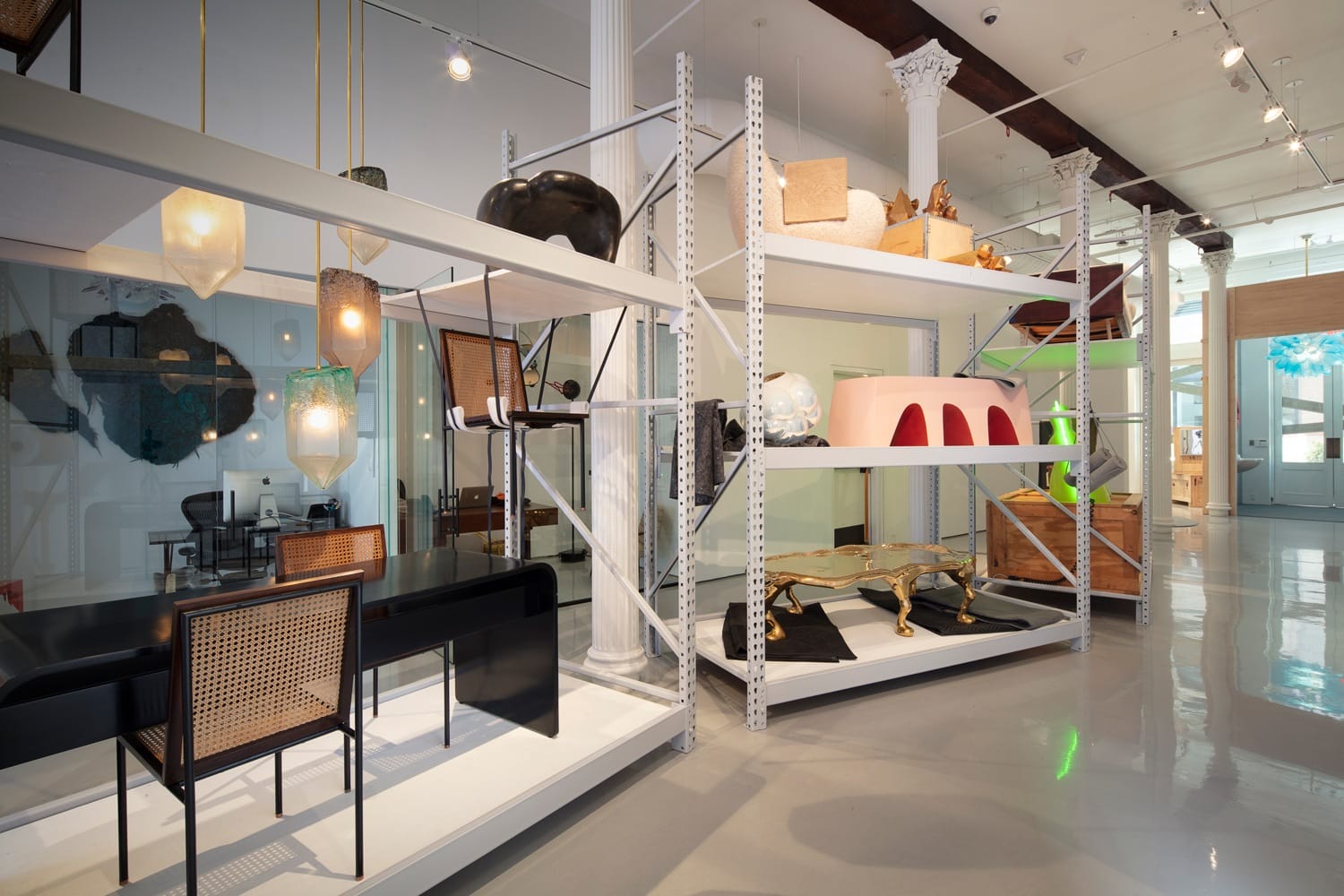
The oft-hidden process of interior design—from the discovery and sourcing to final installation—is the concept behind this must-see exhibition at R & Company’s sprawling Tribeca gallery. Organized by guest curators from the interior design firm Pembrooke & Ives, the adventurous exhibition features furniture, objects, and lighting by 20 contemporary artists and designers, including the Haas Brothers, Rogan Gregory, Katie Stout, and Jeff Zimmerman—all of whom show with the gallery.
The show begins with a selection of art and design objects presented on shelves and in shipping crates and ends with a staged living room, offering a glimpse of how one may live with the pieces. Stout’s hand-built ceramic Plaid Lamp, with its pyramiding geometric forms glazed with Tartan fabric colors, sits shyly atop a crate in a window display, while her erotic Double Girl Lamp glows in a container lined with silver corrugated wrapping material in one of the inner offices.
On a metal shelving unit, a group of teak and mahogany stools by the Haas Brothers rest on sheets of gray foam in an open crate, with a classic lime-green neon floor lamps by the late designer Wendell Castle making a statement above. A second metal shelving unit holds the Haas Brother’s wildly legged brass Hexarkansas coffee table placed on quilted wrapping blankets, and Jeff Zimmerman’s Biomorphic Bubble Crystal Cave, a mystical hand-blown glass vessel with interior applied crystals, perched on wool packing felt.
In the staged home section of the show, a selection of Zimmerman’s crumpled colored-glass vessels, beautifully hand-blown, sit atop Castle’s glorious gel-coated White Edition Big Table. Hanging above, visitors will find Rogan Gregory’s illuminated sculpture Fertility Form floating like a sci-fi chandelier, as mirrors by Sergio Rodrigues and the Haas Brothers line a nearby wall. A playful array of chairs by several different designers surround the table, while Massimo Vitali’s large color photo of a lively beach scene in Portugal reminds us that this exhibition is a bit of summer fun.

2. For Mario at Tina Kim Gallery
Through August 23
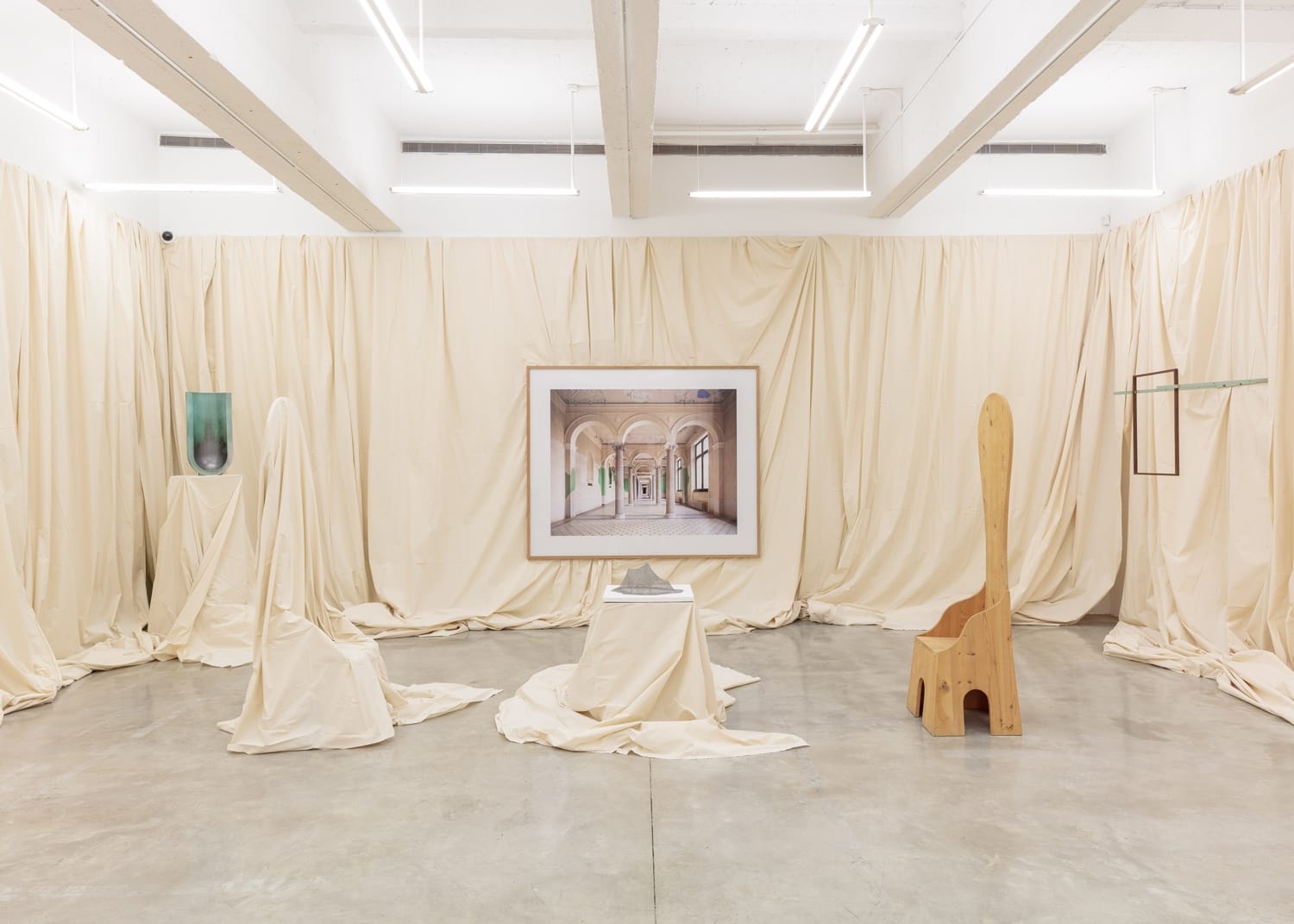
Equally playful in its presentation of art and design, “For Mario” at Tina Kim Gallery constructs an imaginary narrative via a dialogue between domesticity and autobiography in what is essentially an homage to Mario Praz, an Italian art critic who wrote the 1958 non-fictional The House of Life, in which he talked in depth about his possessions in relation to his passions. Curated by the Los Angeles and New York-based architecture and design firm Charlap Hyman & Herrero, the exhibition employs muslin drapery throughout the gallery to suggest a house that’s been closed up or, somewhat more poetically, frozen in time.
Assembling a group of 24 modern and contemporary artists and designers, the curators set up visual storylines that viewers can complete. Sam Chermayeff’s triangular bed, with a copy of Praz’s book resting on it, plays a central role. Titled For the Nuclear Family and Its Opposite Together, the bed is identical to the one the German architect has in his own Berlin loft. In a similar train of thought, Carlo Mollino’s nearby photo of a female nude reclining on a day bed was shot in the Italian architect and designer’s eccentrically decorated Turin apartment. His secret stash of some 1,200 Polaroids of femme fatales shot in staged settings was found following his death.
The baby-blue palette of a Louise Bourgeois sculpture depicting an embracing couple, which the artist fabricated from terrycloth towels, draws parallels with Thomas Berger’s Love Me, Protect Me Chair, featuring found furniture and painted paper pulp forms. Surrealism is echoed in a pair of Mario Ceroli’s pine wood Fratina chairs, inspired by a high back chair in Giorgio de Chirico paintings. The chairs confront one another, one veiled in muslin and the other fully exposed, while Candida Hofer’s neighboring photo of never-ending arches in Berlin’s Neues Museum extends this sensational show into infinity.

3. Aldo Bakker: Slow Motion at Carpenters Workshop Gallery
Through August 23
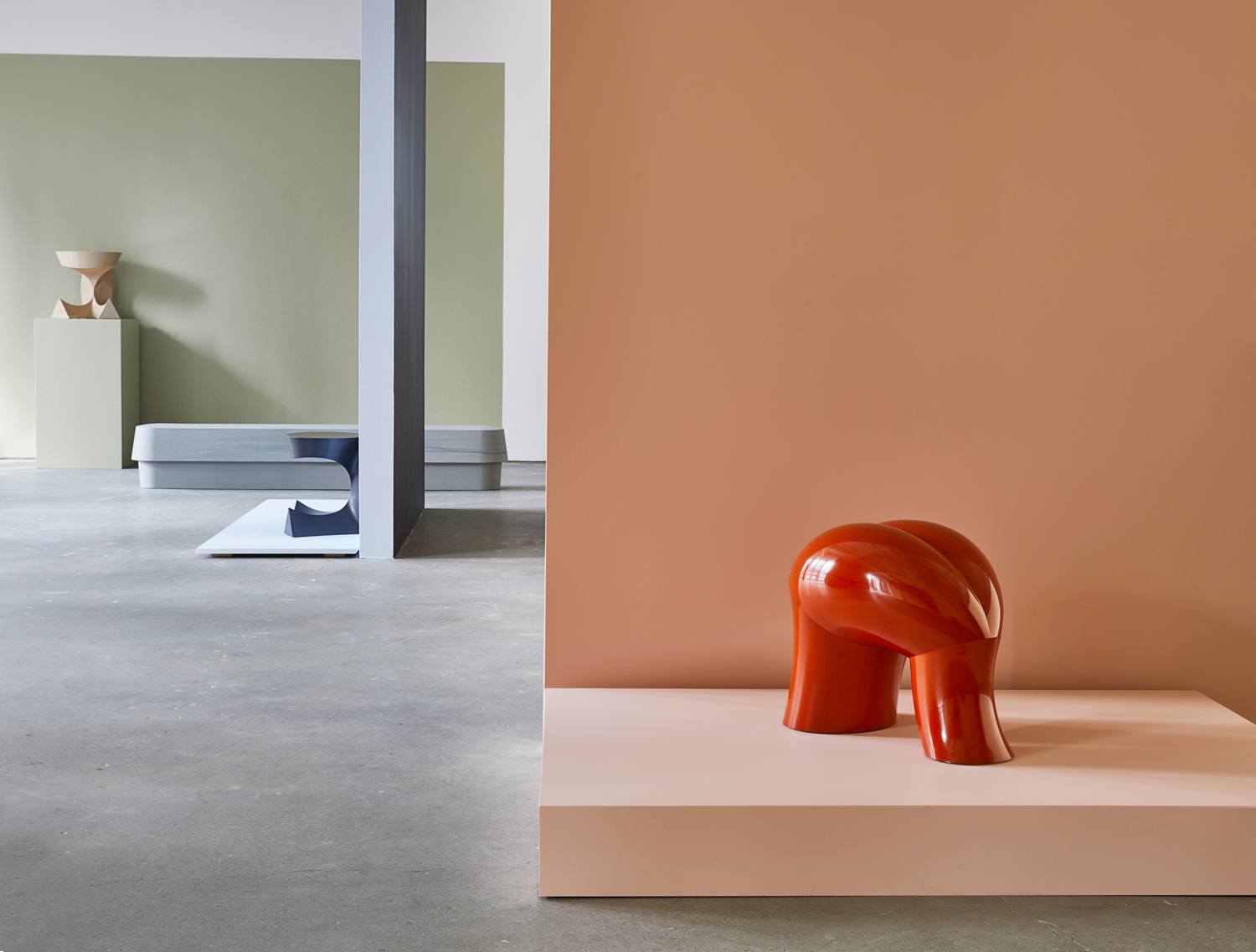
A solo show of objects and furniture by the innovative Dutch designer Aldo Bakker, “Slow Motion” presents a spellbinding selection of his stools, tables, and vessels, including 10 new pieces that have not previously been shown. With a background in jewelry design, Bakker has expanded that rigorous practice through a deliberate exploration of craft and materials to make unique and limited edition objects. A master of display, the designer has created a sumptuous, abstract installation using colored walls and pedestals to provide visual stages for the objects that they beautifully present.
His gold-plated, pitcher Pivot rests on an angular shelf that’s painted the same color brown as the wall, so that it appears to be floating at the perfect angle. In front, his Flat Brown bench, constructed in sculptural aluminum and painting in a striking Japanese style of lacquering known as urushi, is presented on a rectangular brown platform. The bench’s undulating surface creates a wave-like form that cleverly reinforces the notion of Pivot’s buoyancy.
Bakker designs for the tables and stools are repeated in different processes and materials throughout, which alters the way one sees their forms. For example, his 4PRT stool, which looks both like a protruding tongue and a bare buttock, comes in a veiny marble version and a red lacquered foam rendition, while his crown-like Sitting Table is available in luscious black marble and a beige urushi edition.
It is one of the subtlest plays in the space, however, that provides the most satisfaction when your eye catches it. Riffing on the color of the building’s dramatic red columns outside, Bakker placed his whimsical porcelain Pipe pitcher on a tall circular plinth that’s painted in matching tones. Bringing the city into the space, and into dialogue with his work, the designer shows that he’s ready to embrace New York in a peaceful yet powerful way.