8 Insights into the Set Design of Southern Gothic Thriller ‘Sharp Objects’
Production designer John Paino speaks with Galerie about creating the troubled town of Wind Gap

Who would’ve thought chinoiserie wallpaper could ever seem as menacing as it does lining the grand foyer of Adora Crellin’s Victorian manor on HBO’s miniseries Sharp Objects? With the thrilling Southern gothic murder mystery wrapping up this weekend, Galerie spoke with the show’s production designer, John Paino, to discuss how he created the insidious world of Wind Gap.
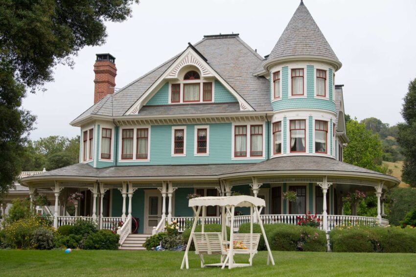
1. Adora’s house was built on a soundstage
“We looked at every Victorian house in and around Los Angeles and there was nothing that had the feeling of sitting on a palatial estate,” says Paino, who also designed last year’s smash hit Big Little Lies. They eventually found a Victorian house in Redding, California, that had the perfect exterior, but the inside was completely modernized and wouldn’t work for the show’s needs. Using the house in Redding as a guide, Paino’s team went to work building the interior of the house on a soundstage. Some exterior scenes were shot at the real house and digitally spliced with scenes where characters enter the house.
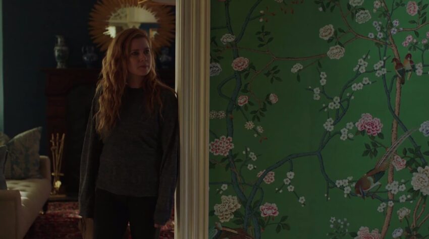
2. That green wallpaper is a metaphor
“I had seen a photo of this debutante lounging in her boudoir, surrounded by chinoiserie-covered walls, and it felt to me like a swamp,” Paino says. Inspired by that image, he found a print from de Gournay that felt like a perfect choice for the grand foyer in Adora’s house. “It has all these beautiful hand-painted flowers, but they’re on top of this poisonous shade of green. It’s the color of arsenic. I thought, This is a perfect metaphor for Adora and her sort of putrid sense of wealth. It encapsulates a lot of themes that are prevalent in the show.”
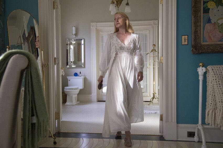
3. The ivory floor is really linoleum
Paino’s team did a ton of research and couldn’t find any examples of ivory floors, which Adora supposedly has in her queen-like bedroom. “They don’t really exist,” he says. “Sultans never even had ivory floors.” They did drawings and renderings, trying to imagine what an ivory floor would look like. “It’s a plot point, that floor. We had to figure out how we could make it look like it was made from the bones of elephants and whales and walruses, but it still needed to look appropriate in a Victorian house.” He ended up having a very detailed photo of ivory printed on linoleum, even going so far as to make it look inlayed at certain spots. “That’s the thing I’m most proud of in the show.”
Recommended: 6 Secrets from the High-Flying Set of Crazy Rich Asians
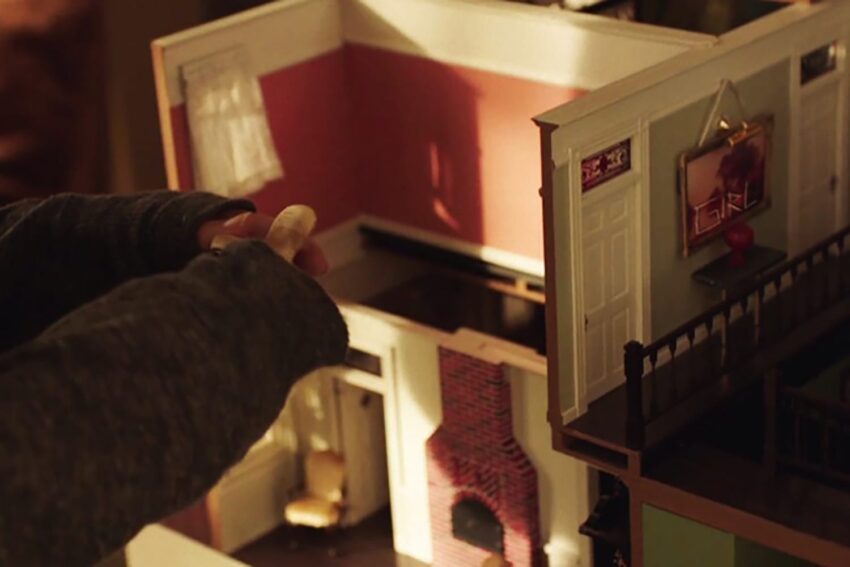
4. The dollhouse was built as the set was coming together
Amma’s dollhouse, a freakily precise replica of her own house, was made while the actual set was still being built. Paino cites getting the dollhouse finished and making it look exactly like the rest of the house as one of the hardest parts of the show.
5. They used clutter and neutral colors to show class distinction
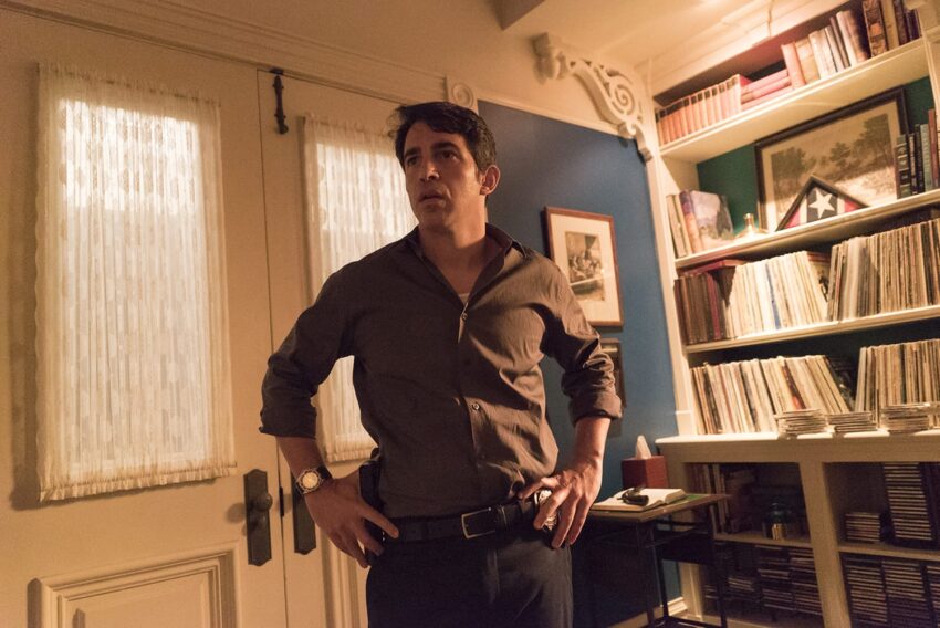
For the homes of less wealthy Wind Gap residents, like the Nash family, Paino wanted to convey a more blue-collar lifestyle. “There’s clearly been a downturn in the local economy, where people used to be able to keep their heads above water and maybe they can’t anymore.” Looking for subtle ways to suggest economic disparities, Paino came to an interesting conclusion. “It’s the clutter. A house uncluttered is strangely more affluent. Clutter can often feel like a grasp at material wealth, where someone who actually has material wealth doesn’t need to showcase every knickknack.” They also used more vibrant colors in Adora’s house, versus the putty-colored walls at the Keane’s house.
6. Adora’s daughters rooms are indicative of her relationship with each of them
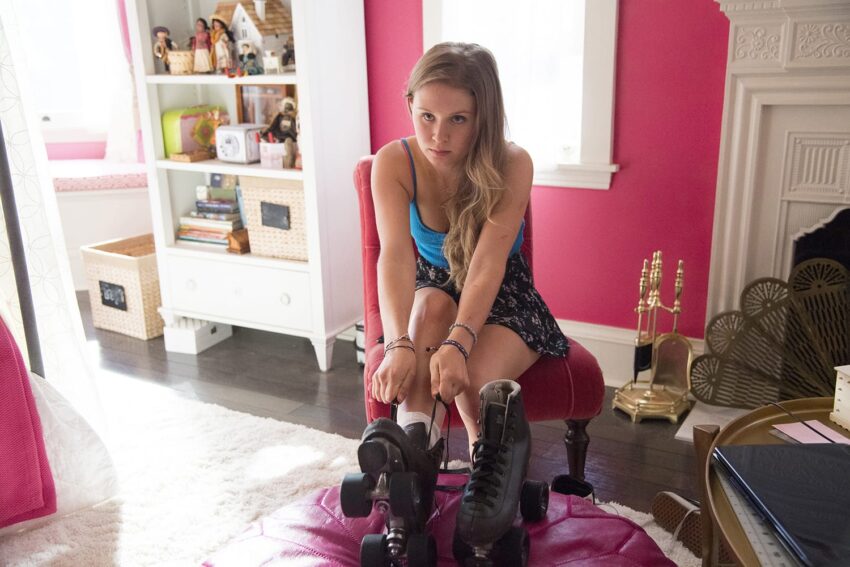
“Adora has tried and failed to codify her daughters,” Paino says, “and that comes through visually in their rooms.” For Marian, who died as a child, her room has become a sort of museum, kept exactly as it was when she died, down to the eerie hospital bed. “She was basically supposed to be a China doll for her mother and her room reflects that. It’s arrested like it’s in amber.” Camille’s room feels a bit neglected, with outdated wallpaper and cracked paint on the ceiling. And then there’s Amma, Wind Gap’s resident wild child. “Amma’s room was my last experiment. I wanted it to feel more connected to the rest of the house than Camille’s and Marian’s rooms. It’s a little hot and over the top and very Pottery Barn. We wanted to push that pink color because it’s a nod to what Amma is really like when her mom isn’t around.”
7. Paino was inspired by midcentury photographers
In searching for inspiration for the show, Paino looked at the work of a lot of photographers who shot small towns and everyday people in the 1950s and ’60s. Paino names Saul Leiter, Sally Mann, William Eggleston, Diane Arbus, and Fred Herzog as artists whose work shaped his vision for Wind Gap. Of Herzog, Paino says, “His saturated beautiful colors from the ’40s. He was great at picking up the archaeology of towns.”
8. They made the town look rundown
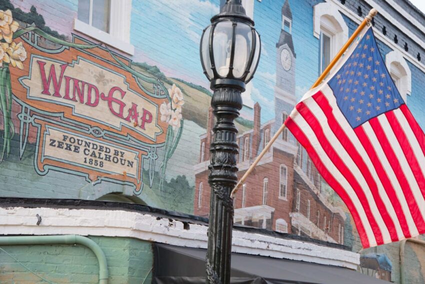
Barnesville, Georgia, doubled as Wind Gap for the filming and needed to look a little shabbier. Paino’s team boarded up shops and sprayed some painted surfaces down, so they would look dull. They also added murals and faded advertisements to the sides of buildings throughout the town. “We wanted to capture a sense of rot and decay permeating things,” Paino says. “The faded billboards and the paintings on the sides of buildings, that links back to a time of prosperity that’s gone by the wayside. And there’s also loaded and coded imagery in these old ads of what women should be like and how they’re commodified and owned by men. There’s a lot of subtext in everything on this show.”