
Liaigre’s President Reveals Why Opening the Brand’s New Flagship Was the Best Move
Christophe Caillaud tells us what he loves about the NoMad showroom
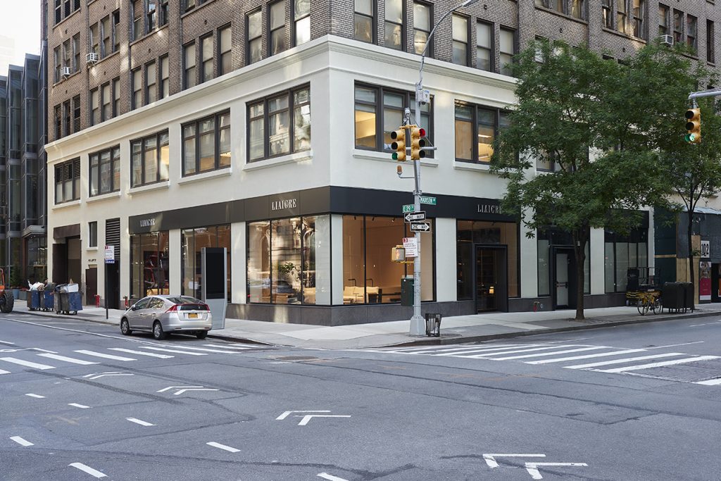
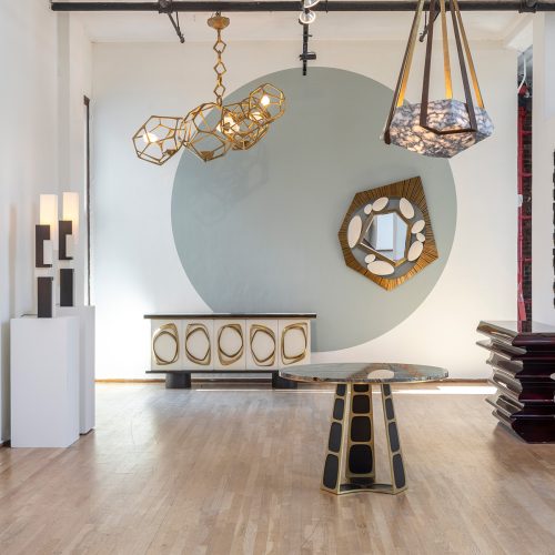
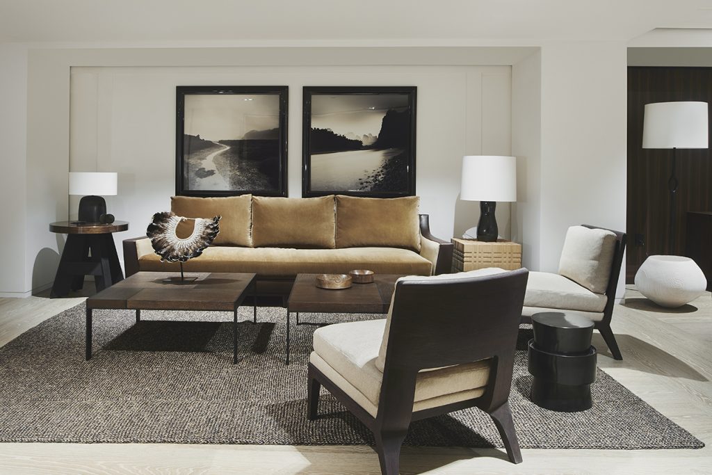
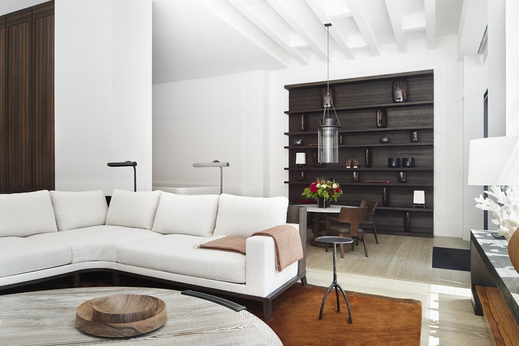
This month marks the debut of French design brand Liaigre’s latest flagship, a perfectly tailored 6,000-square-foot showroom in the trendy NoMad neighborhood, which straddles midtown and downtown Manhattan. With soaring ceilings and windows facing Madison Avenue, the new location—which serves as a counterpoint to the furniture maker’s Upper East Side outpost—has already capitalized on its increased visibility. Galerie caught up with Christophe Caillaud, president of Liaigre Holdings, to tell us about the process of finding and creating the gorgeous space.
Galerie: Why did you pick this neighborhood for the new space?
Christophe Caillaud: Our first New York showroom, on the Upper East Side, is a classical-style townhouse, which I like a lot, but it’s more of a destination building. Year after year I realized that there were people in the south of Manhattan that we were missing. So we went looking at different locations further downtown, in places like the Meatpacking District and SoHo. After three to four years, we saw that NoMad was becoming a hot area for design and furniture, so we felt like it would be a really good spot for us. I personally visited eight to 10 different spaces, but when I saw this one, I knew it was the one. The location is exceptional; there’s lots of light, and it’s very visible when going up on Madison Avenue. Besides this store, there was no other space that I liked.
Tell us about the transformation.
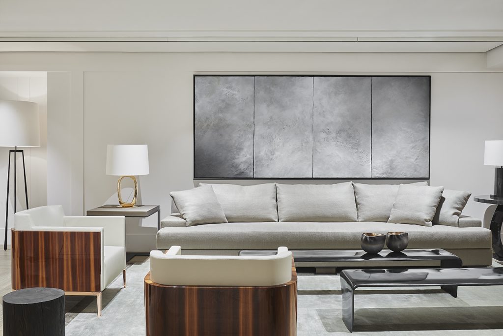
The lease was signed two years ago, and we’ve been working on the design for almost a year. It was overseen by Liaigre’s Creative Director, Frauke Meyer, who’s completely restructured the space, which has a 2,000-square-foot ground level and 4,000-square-foot basement. The previous tenant had a huge mezzanine, taking up half the floor. It was difficult to foresee how it would look without it.
Recommended: Christian Liaigre’s Luxe New Furniture Line
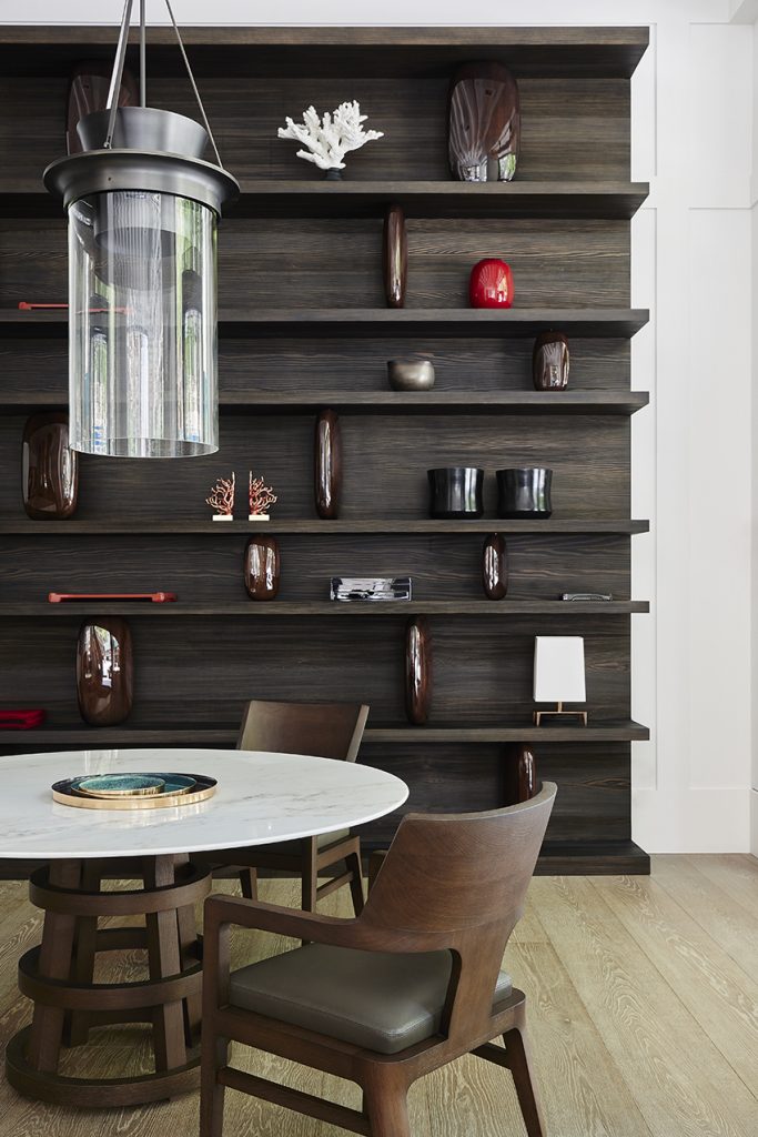
Leading downstairs, we wanted the new staircase to be a big part of Liaigre and to create somewhere that people would want to stay and sit. There are no windows down there, so we had to bring a sense of continuity to the interior architecture—not just a white box. We installed smoked-oak paneling to contrast with white walls and also recreated ceiling beams instead of having a flat surface, which gives a structure to the room. Plus, it’s a great way to integrate our lighting in a nice manner.
What has the response been?
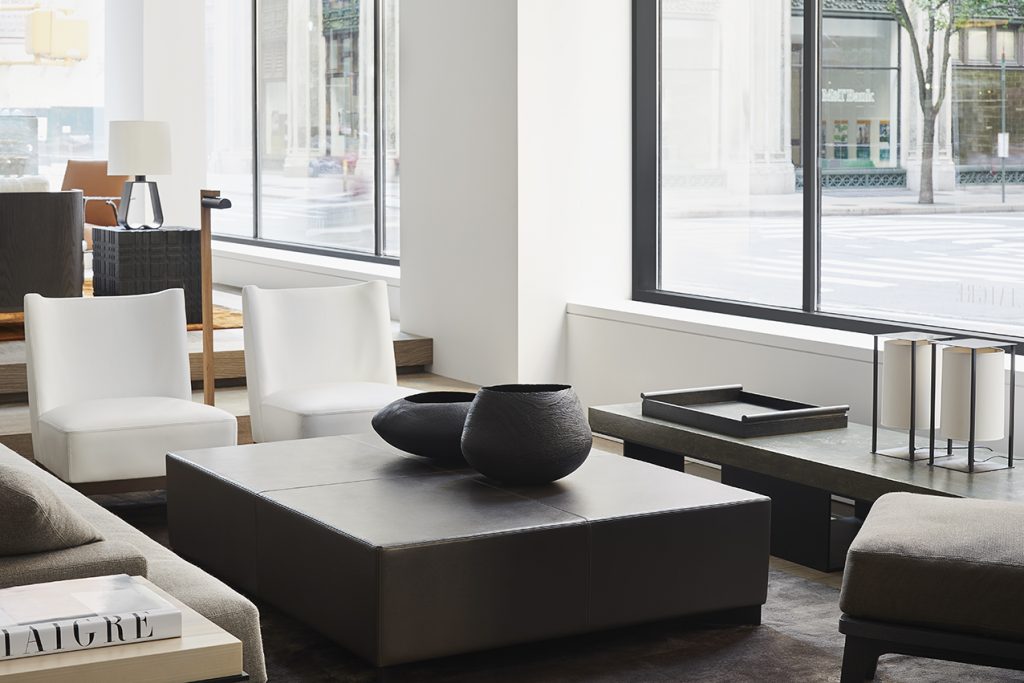
It’s a completely different setting compared to the townhouse. There’s lots of light, big windows, and high ceilings. We opened two weeks ago, and it’s amazing to see the difference in foot traffic. There’s three times more traffic than the 61st street location. We have people coming in who do not know much about the brand, but they’re intrigued because you can see so much from the outside. It’s great news.
What do you hope new customers take away?
I hope the team is able to convey what the brand is and how each piece has been designed to go with another. It’s more than just a showroom of furniture, it’s meant to be consistent. There’s a strong link between the interior architecture and furnishings. I’m especially hoping new customers feel like there’s a Liaigre art of living.
Recommended: 20 New Design Products Offer Stylish Solutions
What’s your favorite part of the space?
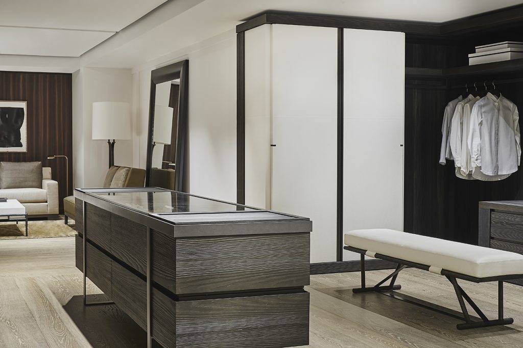
Clients had been asking why we do not have walk-in closets in the showrooms. So for the first time we are showcasing our walk-in closets here that can be completely customized. I’ve been pushing this from the beginning of the project because it’s an interesting way to show customers how far we can go. There are three layouts: L, I, and U-shaped. Each is special, and we’ve been working with artist Pierre Bonnefille to create these beautiful finishes. He’s made a white tulle for us. And everything is custom-made, down to the hinges and handles. It’s a traditional and very high-end project that illustrates a specific response to the needs of our clients.
What’s next for the brand?
By the end of the year we will debut a specific library that can be completely customized, and we’ll introduce a fireplace in bronze with Eric Schmitt. We want to give a specific, dedicated, and personalized experience to clients. We are opening a new showroom in Paris by the end of the month, and the fireplace will be there. The new space is located opposite the Bristol Hotel, and it’s four floors. It’s not only about selling furniture, but going further to showcase how Liaigre is always a step ahead.
