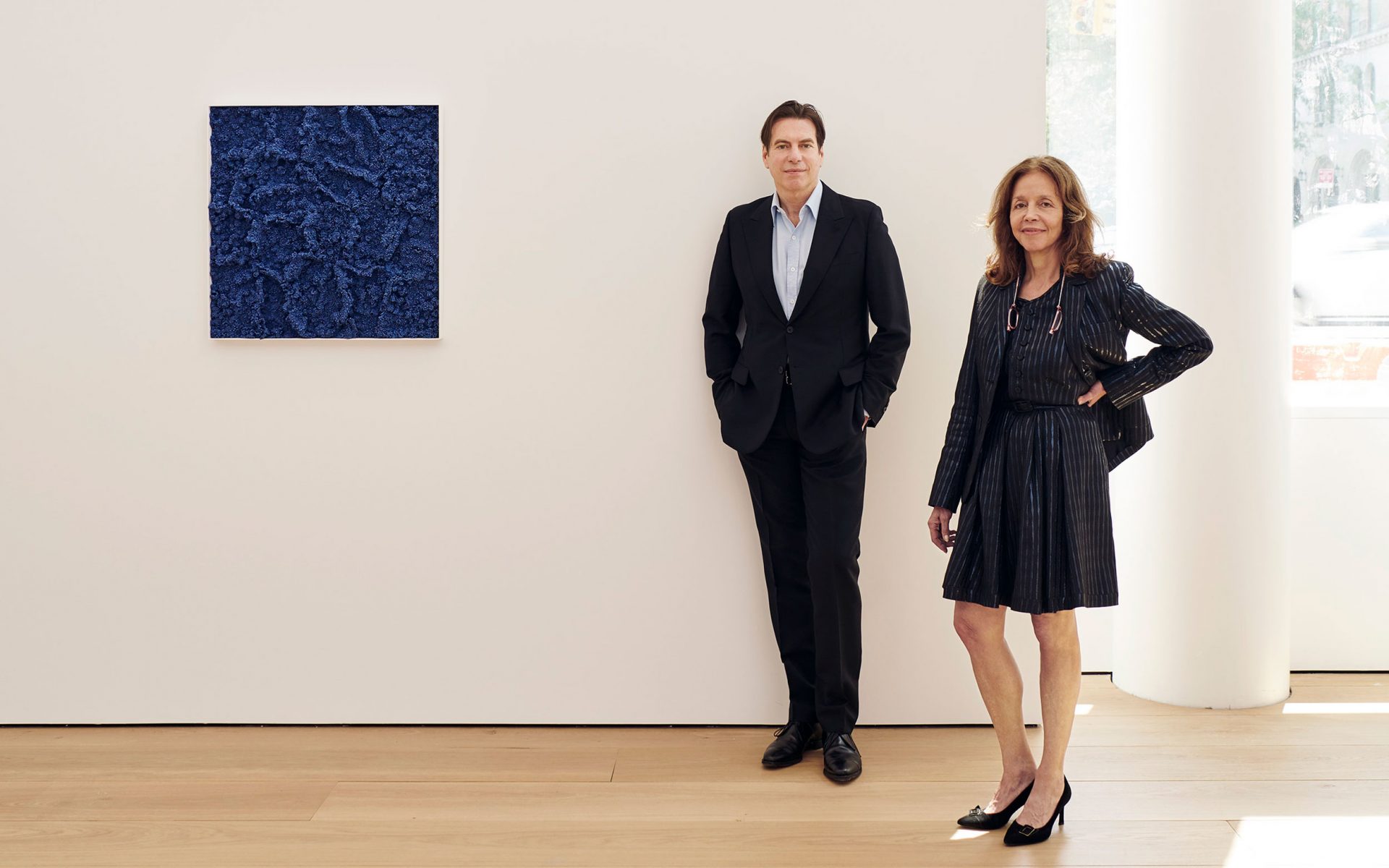

Take a Look Inside Lehmann Maupin’s New Peter Marino–Designed Gallery
Opening September 6, the space isn’t just another streamlined, black-metal-clad, marble-and-glass emporium
For two decades, Lehmann Maupin has championed some of contemporary art’s most beloved luminaries, such as Do Ho Suh, Juergen Teller, and Mickalene Thomas.
Founded by Rachel Lehmann and David Maupin in 1996, the gallery has had multiple homes around New York, as well as one in Hong Kong and another in Seoul to match its growing profile. Now it occupies the former site of the Getty—gas station, that is—which was an indelible landmark in New York’s Chelsea neighborhood. As of early September, Lehmann Maupin’s space is in a mixed-use residential building developed by the Victor Group, fittingly dubbed the Getty.
Designed by Peter Marino, the gallery isn’t just another streamlined, black-metal-clad, marble-and-glass emporium, the signatures of Marino’s glam vernacular. For starters, it’s white and columnless, with an echo of industrial rawness. “The walls being painted white doesn’t make it a boring box,” says Marino, who designed the entire building and recently announced plans for his own art foundation in Southampton, New York. “For all my projects, lighting and natural lighting are an essential consideration. But for a gallery, it’s paramount.”
Recommended: Star Architect Peter Marino to Launch Hamptons Art Foundation
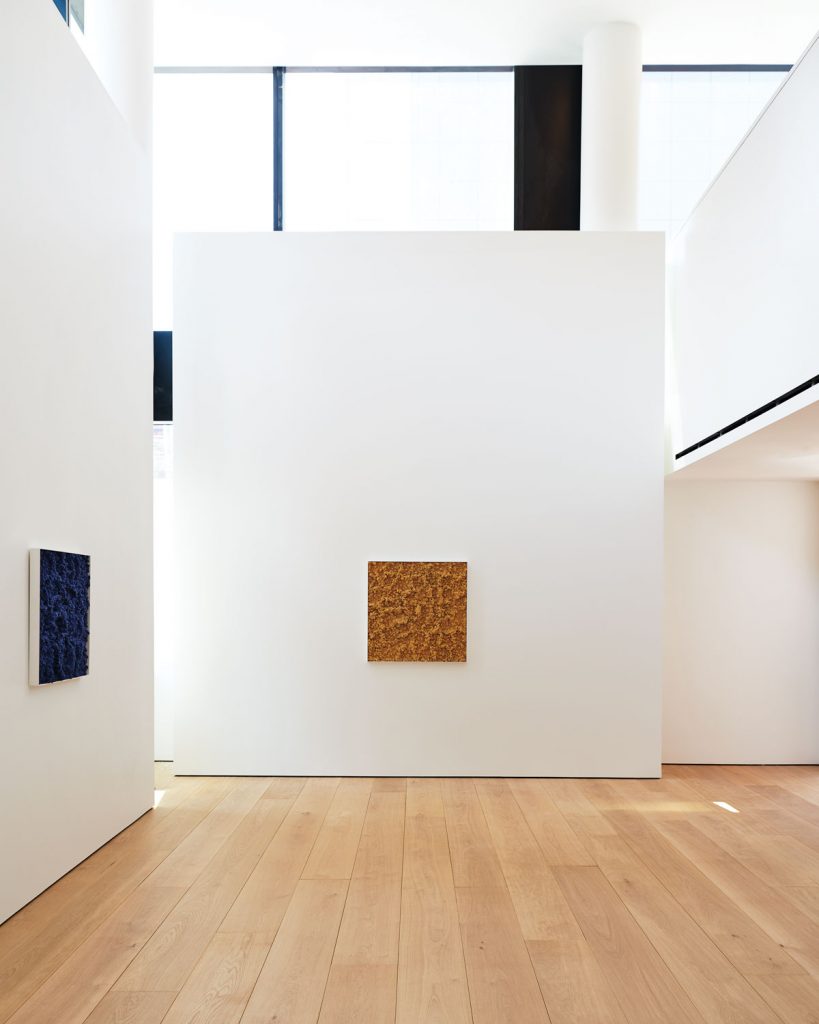
For the dealers, it’s a hoped-for project realized. “For most of our locations we have moved into existing gallery spaces, which we customized to the best of our ability,” says Maupin, “but it had always been a dream of mine and Rachel’s to build a space from the ground up.”
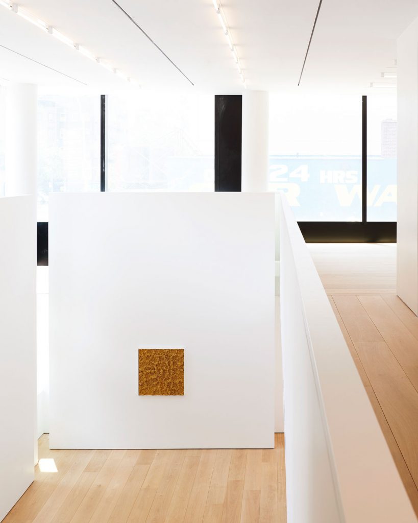
This new, trilevel gallery is 8,900 square feet with 22-foot ceilings and its own designated entrance (which is also shared by the soon-to-be-opened Hill Art Foundation). It was designed, according to Marino, with a range of lighting “opportunities,” such as solar shading to adjust the daylight and several options to “precisely light the artwork itself, creating no shadows whatsoever.”

Peter Marino Architect devised the space to contain four distinct sections: one with an east-facing floating wall, another flooded with natural light, a third as a black box, and the last with unobstructed views of the High Line park. “We always want to allow our artists to expand their practice,” says Maupin. “And having space designated for different types of media only enhances this.”
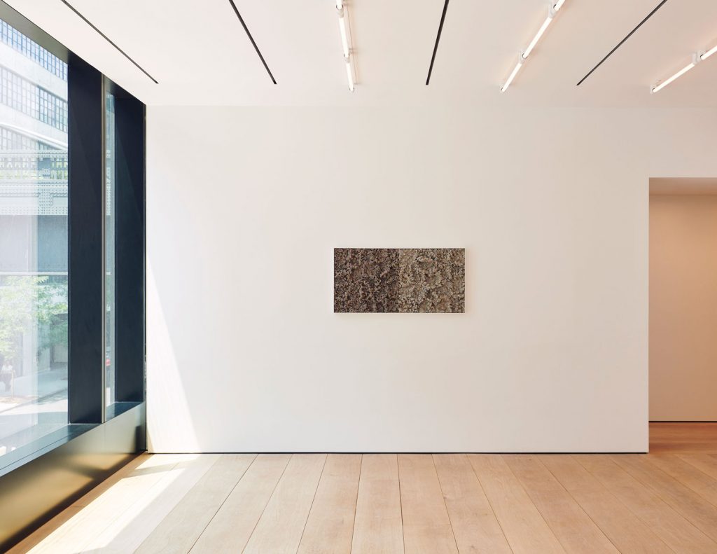
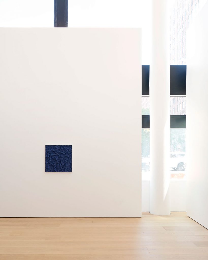
Having a first go at the gallery is Los Angeles painter Liza Lou, who for her exhibition has returned to investigating sculptural forms. “This is a space for our artists to accomplish ambitious exhibitions,” says Maupin, “and for our visitors to experience that in the fullest capacity.”
A version of this article first appeared in print in our 2018 Fall Issue under the headline Light Fantastic. Subscribe to the magazine.

