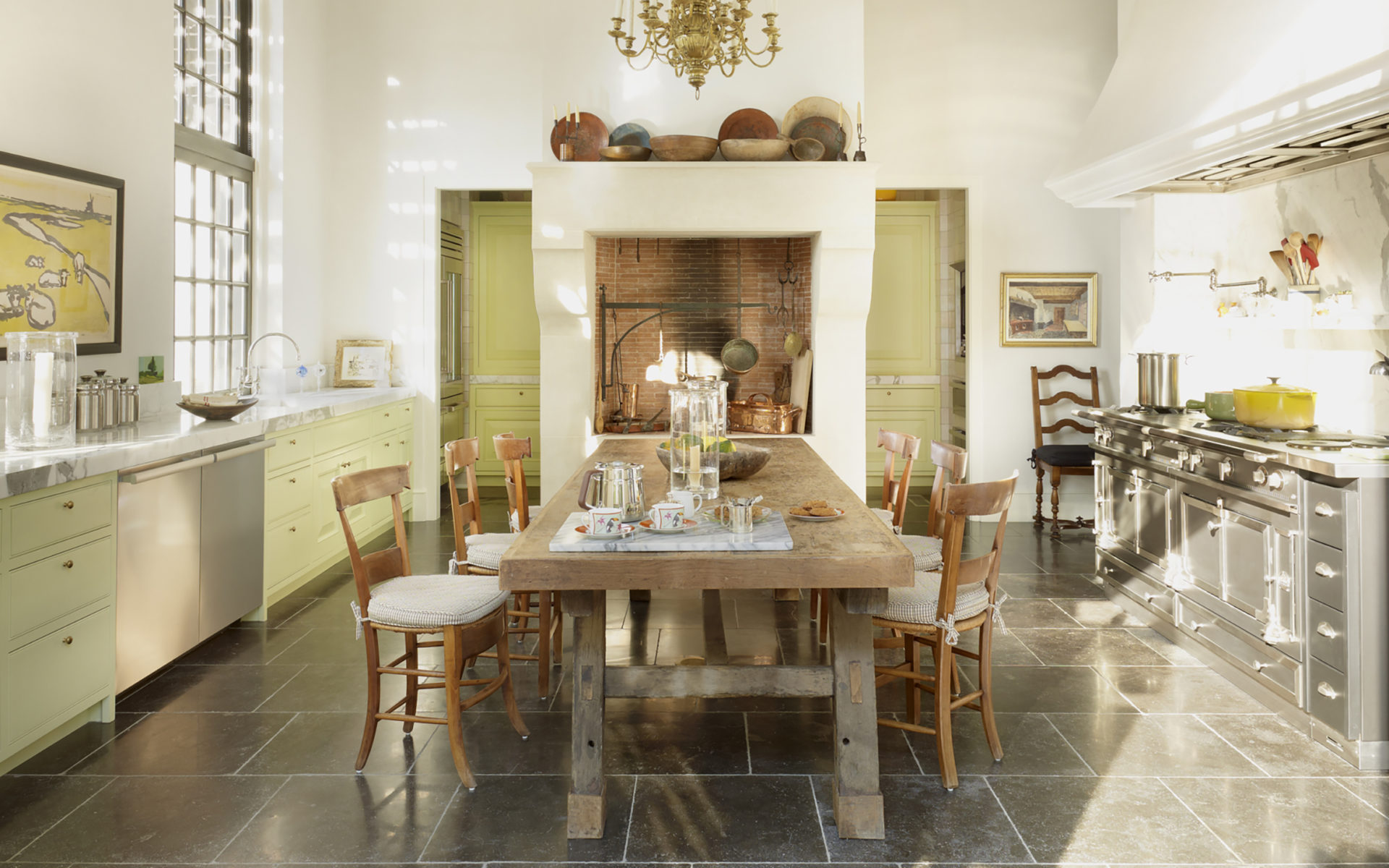
A Baton Rouge kitchen designed by Bobby McAlpine.

A Baton Rouge kitchen designed by Bobby McAlpine.
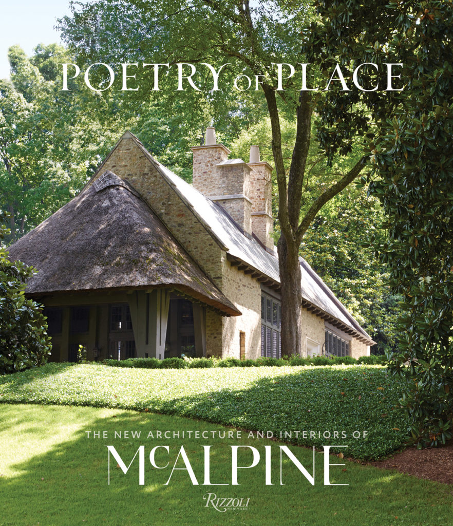
Bobby McAlpine’s Poetry of Place. Photo: Courtesy of Rizzoli
In esteemed architect Bobby McAlpine’s new book, Poetry of Place (Rizzoli, $55), his ability to create homes as elegant as they are timeless is on full display. Pulling from regional materials and references, most often dreamy locales in the American South, the creations of his firm, McALPINE, are extraordinarily lyrical and, as the book’s title promises, poetic. Whether his design borrows elements from a Tuscan villa or a Cape Dutch house, they reflect a timeless quality that McAlpine calls “a dedication to authenticity and correctness.”
It should come as no surprise, then, that McAlpine is also a master at conjuring gorgeous kitchens, a room that sometimes expires as quickly as a gallon of milk. For the architect, “beautiful” is the number one thing a kitchen should be. “Of course,” he adds, “it has to be functional—but that’s not the leader. A kitchen has to be a place that makes you feel good.”
Balanced proportions and enduring materials, he finds, are key. “I’m not a slave to symmetry in my work, except in kitchens and baths.” Since kitchens are prone to chaos, order in the architecture provides a stable host to whatever messes arise. His palette of materials for these designs are fashioned out of the classic elements—limestone, white marble, slate, and soapstone. “These things have always been a part of service areas of houses, so they’re hard to date.”
Another trick to creating his eminently livable kitchens is actually a feature he prefers to not include: cabinetry. In looking for any opportunity to remove cabinets from the design, McAlpine prefers adding a butler’s pantry, adjacent galleries, or any type of other walk-in device. “I don’t put a lot of faith in cabinetry, as their style proves to be extremely short-lived,” he remarks. “I don’t want my houses changed, so I avoid cabinetry.”
Here, McAlpine shares how he created some of the amazing kitchens featured in the book.
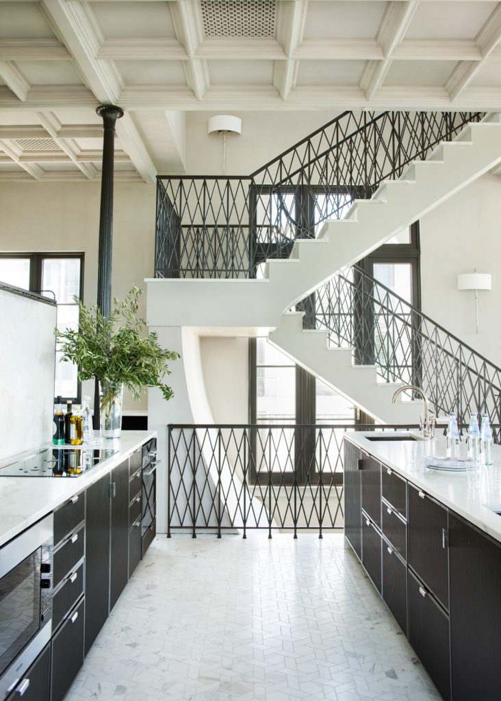
“The whole interior of this beach house takes its cues from a Parisian department store. The stair rail is X-ing from old elevator doors. This kitchen didn’t need kitchen language, so we kept it low and sleek to be quiet.” Photo: Courtesy of Rizzoli
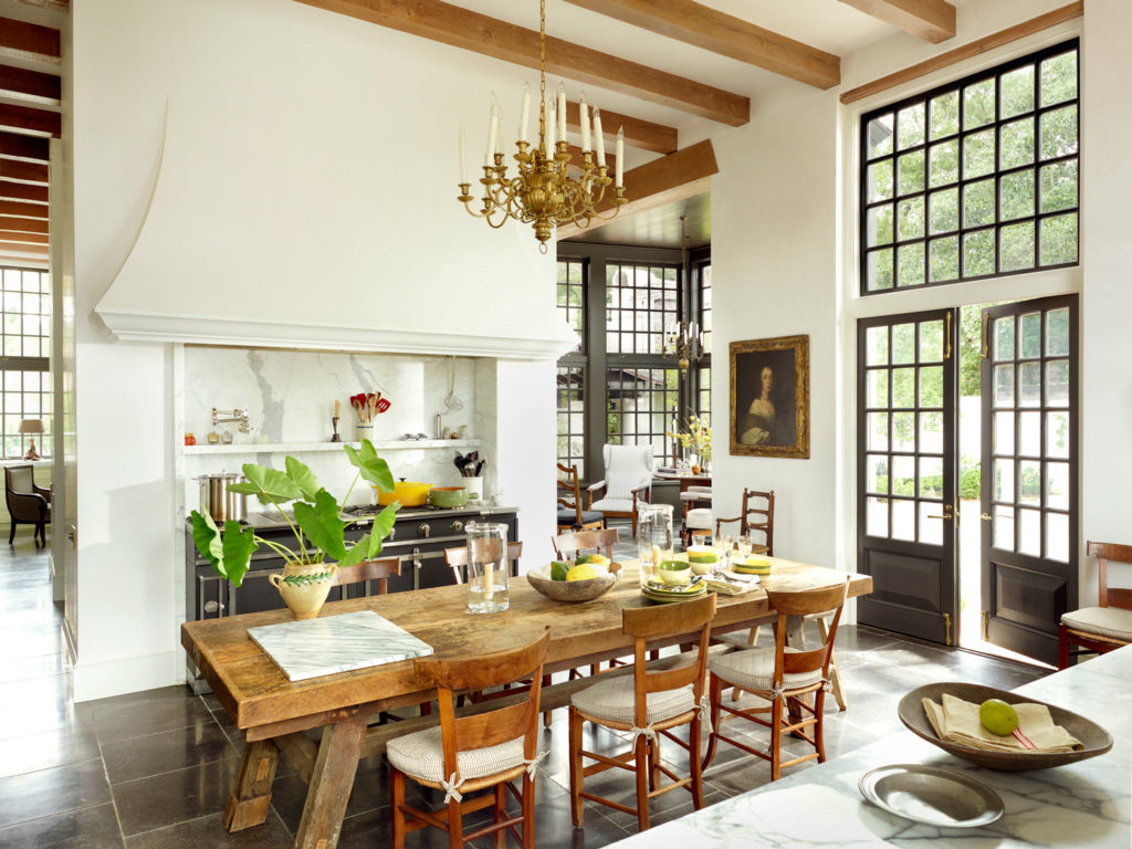
“The quality of light was so important to this Dutch-inspired house. I wanted everywhere you turned your head to be like a Vermeer painting, a place you could have your portrait made. There’s a working pantry, a work room, and a butler’s pantry all beyond the fireplace and out of site.” Photo: Courtesy of Rizzoli
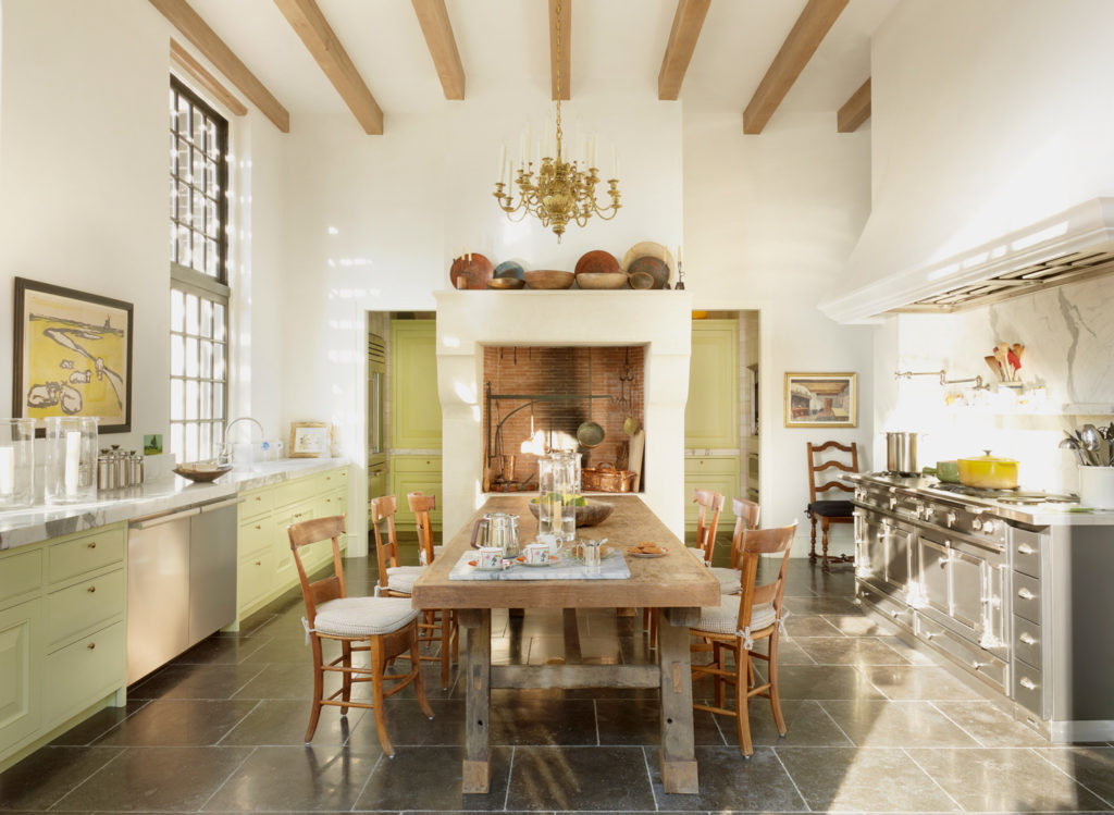
“The scale of the stove is quite large, but it’s sized the way you would a credenza in a room. It’s not about how much you cook but what the room needs.” Photo: Courtesy of Rizzoli
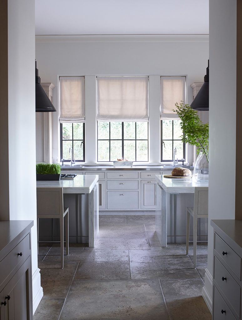
“This house is very still and cerebral in its tone. Those island pairs are almost quite modern in an otherwise classic house. The symmetry is very visible here with a pair of islands, pair of sinks, pair of light fixtures. A walkthrough pantry eliminates the need for so much cabinetry and allows the space to stay extremely refined and clean.” Photo: Courtesy of Rizzoli
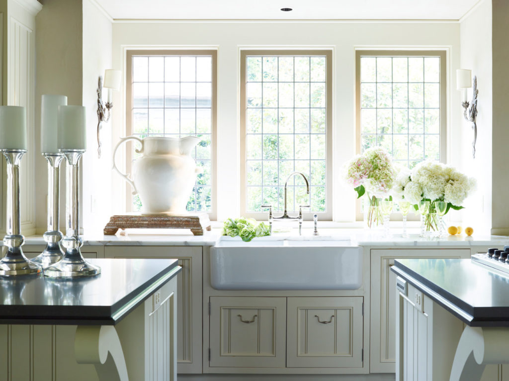
“This intimate cottage has a small kitchen to match. Since it’s more of a country house, we designed the cabinetry to look like a local carpenter made it. It’s also very old school to have the sink at the window, a reminder of times when someone would cook in the kitchen alone instead of the room being a social hub of activity. Designer Susan Ferrier added that huge pitcher as a stroke of genius to make the occupant feel even smaller and cozier.” Photo: Courtesy of Rizzoli

“The space itself comes across more here than the fact that it’s a kitchen. The kitchen aesthetic didn’t take over; it’s more of a church sanctuary. The scale of the hood itself is up to par with the Tudor arch opposite it. The wooden floor is dark, and growing up in the lumber business I was used to kitchens and baths with wood rather than stone floors.” Photo: Courtesy of Rizzoli
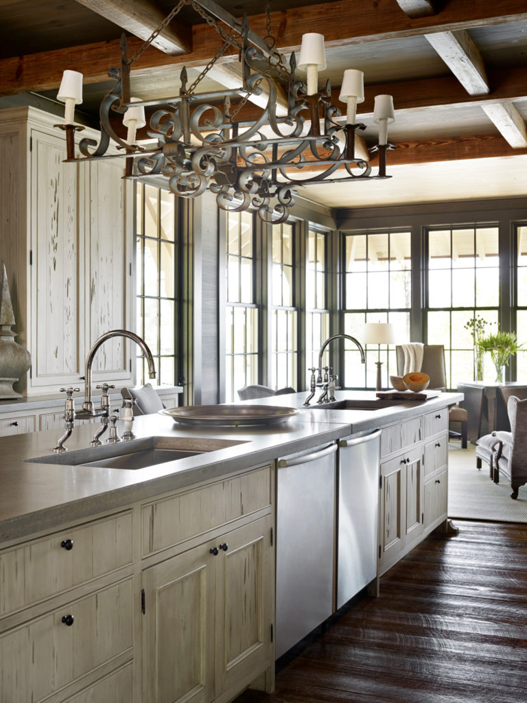
“This is a camp, so rustic materials, such as concrete countertops and reclaimed antique wood and resewn beams from old warehouses, create the language of the space. Since it’s in the country I thought about how a carpenter would build a cabin in a rural location, keeping the number of materials used and their sourcing quite local.” Photo: Courtesy of Rizzoli
Cover: A Baton Rouge kitchen designed by Bobby McAlpine.