Suzanne Lovell’s Masterful Art and Design Tips
The acclaimed interior designer and architect divulges her favorite ways to enliven a space

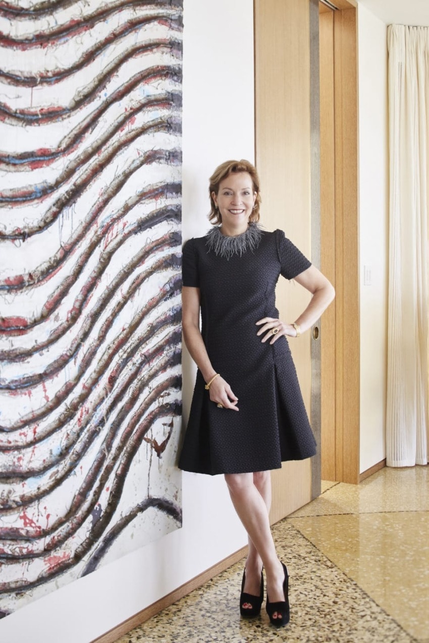
Suzanne Lovell’s eponymous Chicago-based firm isn’t just about architecture and design. She’s also created an art consulting business that integrates a client’s collection into the design process. For Lovell, art is just as critical in creating an ideal three-dimensional experience as the architecture, furnishings, and fabrics.
As the creator of beautifully layered homes, Lovell understands that what she’s really offering her clients isn’t just a place to live; she says the story is critical to the space as well. As part of that, the designer offers a vision for each of the firm’s clients to grow their collections with pieces from both the primary and secondary markets of fine art, design furniture, and objects.
“The second a furniture plan happens I highlight moments for the fine art to happen,” Lovell tells Galerie. “I talk to each of those groups in my studio—architecture, interiors, and art—at the same time because they need to understand who is doing what. Architecture, for instance, has to know where a large work will be hung in order to integrate the lighting.”
For the clients, the process doesn’t end when the project is complete. “Our past clients know that I’m going to call them when I find something at auction or an art fair, and have an idea of where it could go,” she says. “Since these are longstanding relationships, we’re always looking for the right piece for the right client.”
Here, Lovell shares how art and design work together in some of her most incredible projects.

“Artwork has the ability to transform space into a more current understanding. This room would be so lost without the Kara Walker. I think it’s important to appreciate the historic details here in the St. Regis Hotel. You can’t get rid of the Beaux Arts details, but how do you transform them? The biggest dilemma was the size and that it’s on a wooden panel. It made it up the panels by ¾ of an inch.”
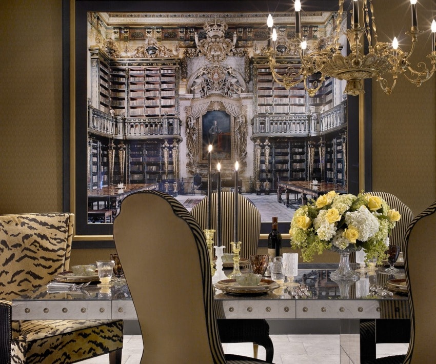
“This client didn’t have an art collection at all, and we were building a large house. Since she didn’t know what kind of art she wanted we took her to a wonderful dealer with etchings and lithographs to see what she gravitated toward. Without realizing it, everything she pulled out was a portrait. This Candida Höfer of the Biblioteca Geral da Universidade de Coimbra doesn’t seem to fit that description at first, but the large back wall of the room in the photo has an enormous portrait.”

“This client already owned a lot of art, so it was really about getting it right. The architect of the building was Howard Van Doren Shaw, who was a leader of the American Craftsman movement. The paneling is fun to work with but changes the artwork you can consider.” Here, Lovell installed a work by Kenzo Okada above a rosewood console by Paolo Buffa with a chair by Maurice Jallot.
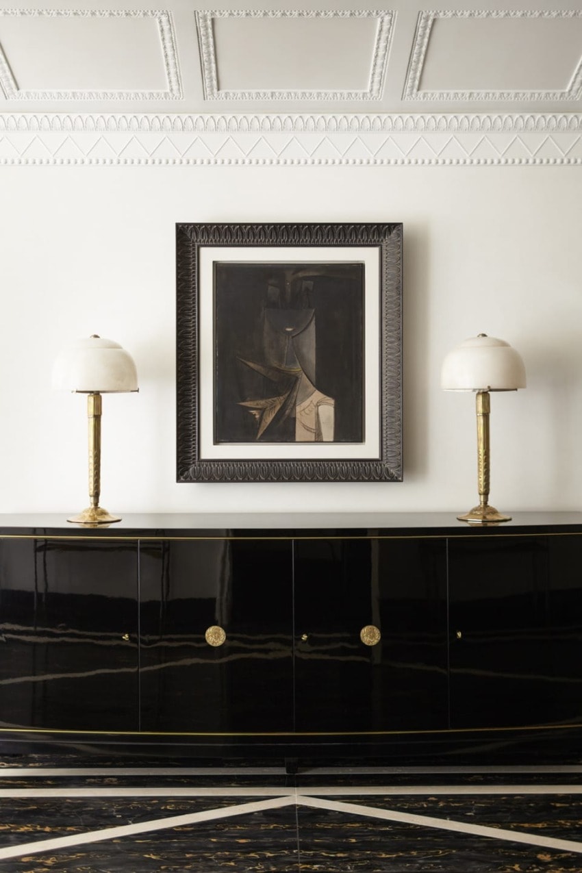
For a hallway in the same residence, Lovell hung a Wifredo Lam painting above a De Coene Frères lacquer sideboard from the 1930s. The firm decided to reframe the artwork. “When it comes to framing, it’s all about the piece. Very often, we have to tame the frame down.”
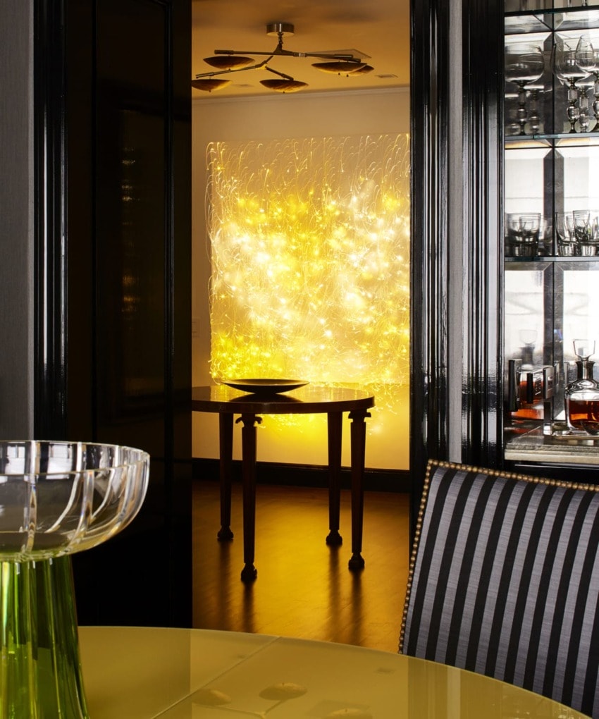
“My client came across this fiber-optic wall sculpture by Astrid Krogh at Galerie Maria Wettegren in Paris. Since it’s constantly changing colors, it would be a disaster in a the living room or dining room, but we thought it was fabulous for the entry foyer of the Fifth Avenue pied-a-terre. Here, it adds a breath of contemporary experience to the entry, especially with the Lindsey Adelman fixture above.”
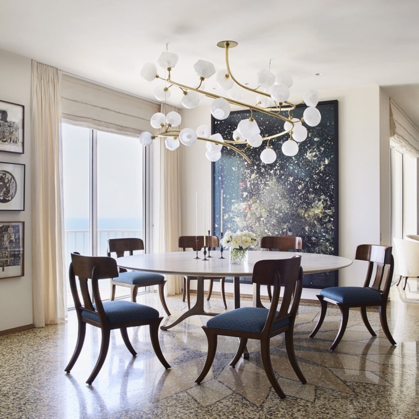
“This Ori Grischt C-print is perfect in this dining area. The artist makes flowers in porcelain then explodes the flower arrangement with nitrous oxide and captures the moment. The movement works well with the Jeff Zimmerman fixture above the table.”
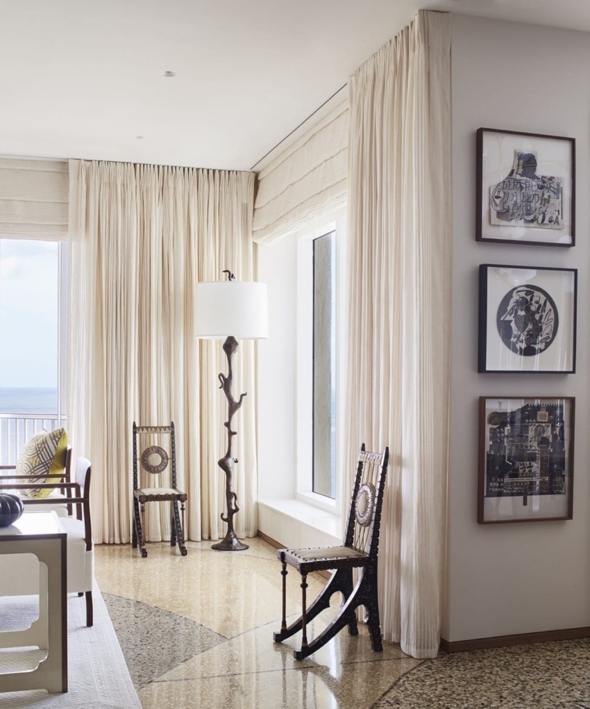
In the same penthouse in Naples, Lovell took the seaside moment to create a patterned terrazzo floor. She paired sculptural Bugatti chairs with a series by Ray Johnson. Of the space, she says, “It feels natural and not like someone tried to decorate.”
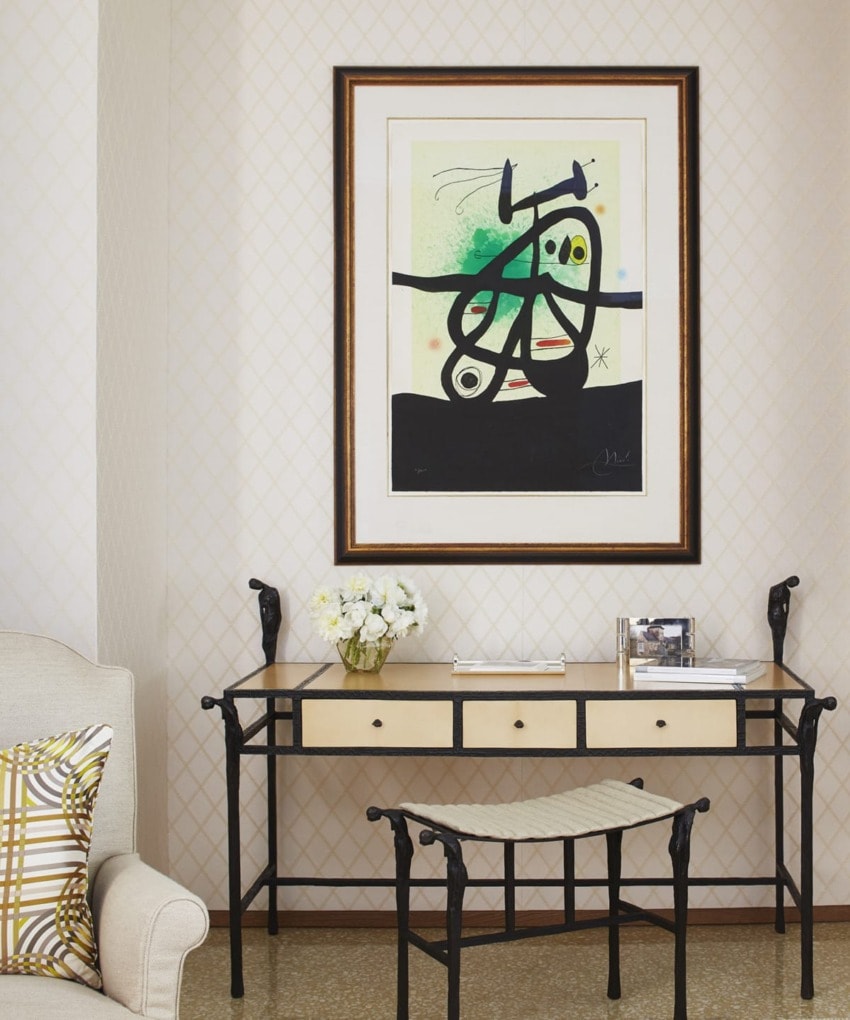
“The client wanted a desk, and we were creating one for her but it just felt like nothing special. Instead, we opted for this Ingrid Donat table and bench that really makes a statement, especially with the Joan Miró painting above. Sometimes it’s not right yet and you have to keep looking.”
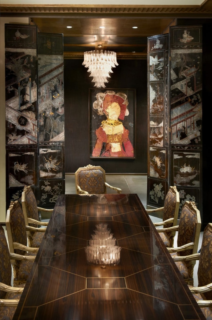
“Because the dining and living rooms are one huge room, the resident wanted to be able to close off the dining area when it’s being prepared by caterers. We used these beautiful Coromandel screens with two sides to cordon off the architecture while allowing for the open plan. A pair of paintings by Manolo Valdés, Queen, seen here, and Antonio del Pollaiulo, preside over the foyer area, which is painted in a dark brown lacquer.”