What Your Kimono Color Says About You
An updated edition of Katsumi Yumioka’s Kimono and the Colors of Japan explores the significance of color for the traditional Japanese garment

When we break the word “kimono” into two parts, we’re left with ki, meaning “wear,” and mono, meaning “thing.” A kimono, then, is a “thing to wear,” a matter-of-fact translation for a symbolic garment, loaded with a complex, extensive history and frequently associated with politeness and formality. The silken, long-sleeved robes are admired the world over for their beautiful prints and vibrant colors—flashy geranium reds, vibrant fuchsia pinks, and deep salvia blues.

Despite their popularity around the world, there are cultural sensitivities regarding who can and should wear the outfits. In fact, a set of rules, called kitsuke, govern how kimonos and yukatas—the kimono’s casual counterpart—should always be worn. When unpacking the question of cultural appropriation versus appreciation, it’s important to examine the traditions and symbolism behind the garment’s famous array of colors.
Enter Kimono and the Colors of Japan, from Japanese publisher PIE International. Originally published in 2005, an updated edition was released last month that explores the cultural and historical significance of the colors of kimonos and obis, or sashes, through the lens of a rare antique collection. Written by noted Tokyo-based stylist Katsumi Yumioka, who began his career in the fashion industry, participating in such high-profile shows as Christian Dior, the book explores what the author calls “Japanese Kokoro no Iro,” or “colors of the Japanese heart,” presenting an image of what Japanese people understand individual colors to express or symbolize.
See below for a crash course on the meaning behind five kimono colors.
Hana asagi (Blue)

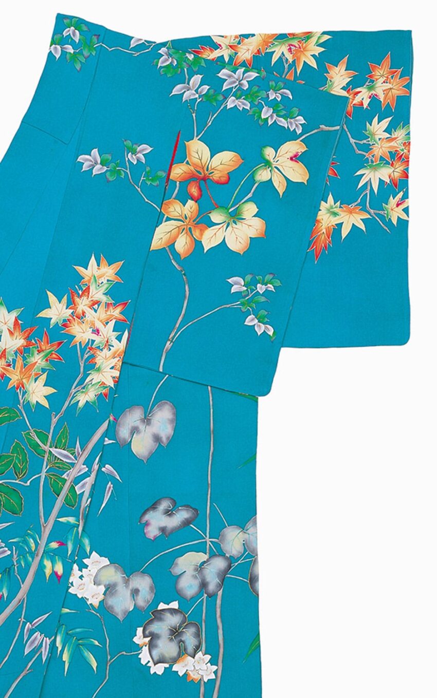
Blue evokes elements of the natural world: the sky and the ocean. The name for this particular shade of blue denotes a pale green-blue enhanced by flowers, pointing to the process through which it is achieved. Developed towards the end of the Edo period, the dye is mixed with juices squeezed from blue dayflowers.
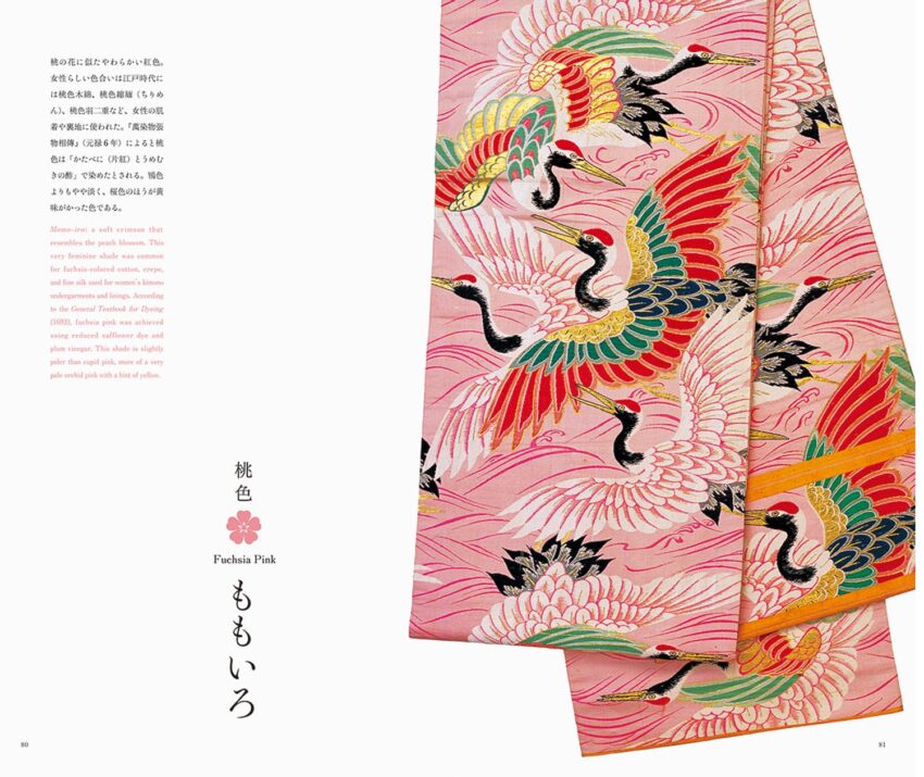
Momo-iro (Pink)

In Japan, pink is a color associated with springtime. However, because the price of the plant used to create pink dyes was historically high, lighter shades and peaches were more common, as dyers diluted the base materials. Named for its resemblance to the peach blossom, this fuchsia hue—pale with a hint of yellow—is realized through a combination of plum vinegar and reduced safflower dye.
Shōjōhi (Red)

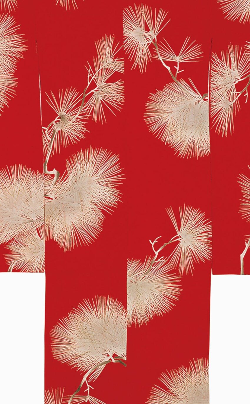
Known as a sacred color, red represents life’s vitals: the dawn, fire, and blood. Taking its name from a mythological ape-like sea spirit with a red face and a taste for wine, this vivid vermillion is derived from the cacti-chomping cochineal bug. The same pigment is still used in many of today’s makeups and food coloring.
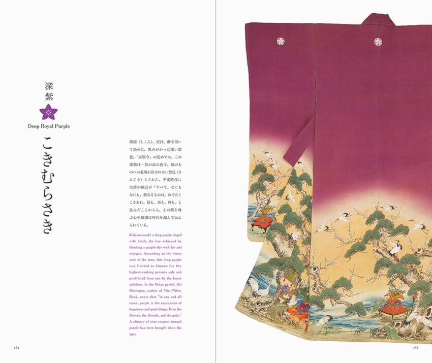
Koki-murasaki (Purple)

Since ancient times purple has been a color of royalty in many parts of the world, and Japan is no different. This shade of deep purple, tinged with black, is created through a blend of purple dye with vinegar and lye. It was reserved for the kimonos worn by Japan’s highest-ranking individuals and denied to lower classes.
Kihada (Green-Yellow)

The pigment behind this shade of bright greenish-yellow is created from a liquid extracted from the inner-bark of mandarin orange trees, then combined with lye to produce a tint. The extract was also an effective insect repellant and frequently used to dye paper scrolls, enhancing the look of ink. The hue connotes the harvest season and is regarded as a noble color.