Christie’s Teams Up with Rafael de Cárdenas for New Auction
The visionary designer created elegant vignettes showcasing the 18th- and 19th-century antiques featured in the Collector Sale

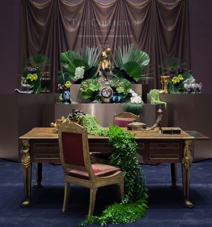
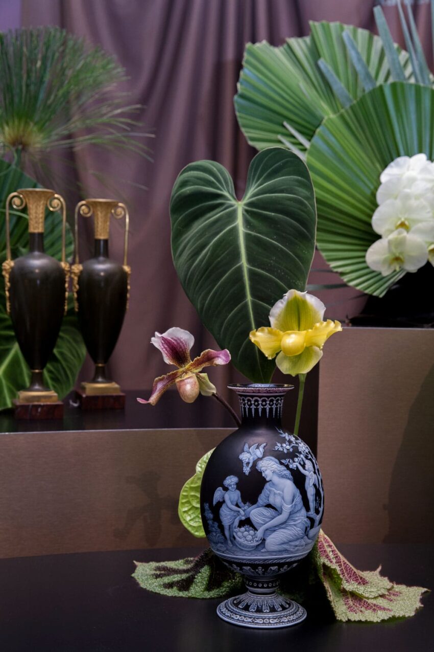
To showcase the lots up for sale in the Spring installment of the Collector sales, Christie’s tapped designer Rafael de Cárdenas to create vignettes based on the pieces. A surprising choice for auctions filled with 18th- and 19th-century antiques, de Cárdenas is known for his high-concept architecture, residential and commercial interiors featuring cutting-edge art, and ’80s inspirations.
Touting NikeLab stores and the Asia de Cuba restaurant among his many projects, his firm, Rafael de Cárdenas/Architecture at Large, recently celebrated its 10th anniversary and published a monograph with Rizzoli featuring a decade of the firm’s work. The vignettes will be on display at the Rockefeller Center location from April 6th through 10th, with the sales happening on the 10th.
Here, de Cárdenas shares how the partnership came to be and what influenced his choices for the displays.
Galerie: How did you get involved with this sale at Christie’s?
Rafael de Cárdenas: I was invited by Christie’s to showcase the continued resonance of these extraordinary 18th- and 19th-century pieces. In my work, we use historical objects, though in many cases not as old as these lots, so it was a wonderful opportunity to experience them in depth.
What were your inspirations for the vignettes?
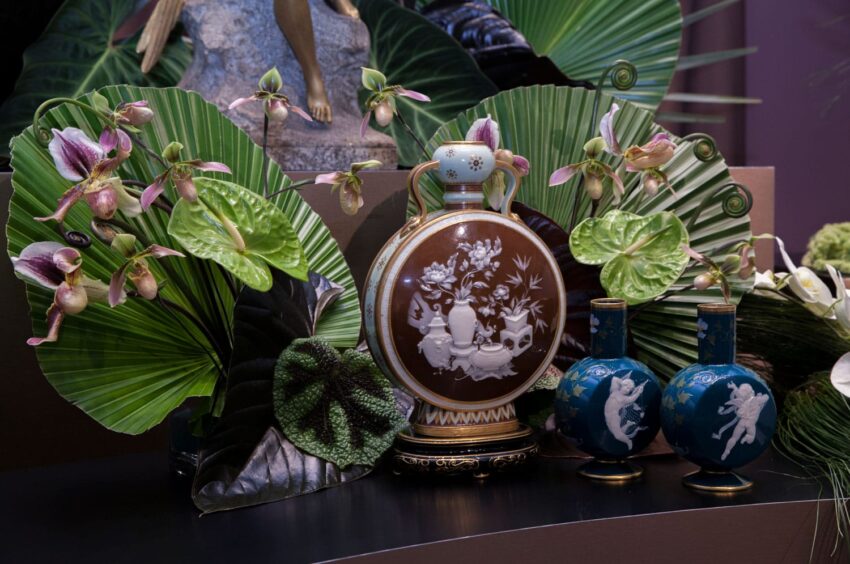
Our inspiration came from the objects themselves, not from their intricate detailing, but from their material transcendence into the sublime. Many of the smaller fragile works are so atmospheric almost to the point of no other function.
What from your retail experience did you use to turn these vignettes into merchandised spaces?
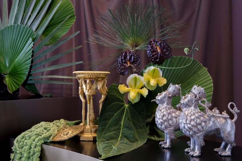
The installation addresses how best to view these objects and further tease out their moody sublimity. We decided to isolate each piece, giving them more attention and breathing room than they might normally have. The semi-rounded tiered plinths we designed to host the lots are quite clean and machined and in sharp contrast to the baroque quality of most of the works. It is this interaction with minimal surface and Meta Flora’s lush and monochromatic weaving landscape that helps make the objects feel more contemporary.
What can we learn from the artisanship of these pieces from past centuries?
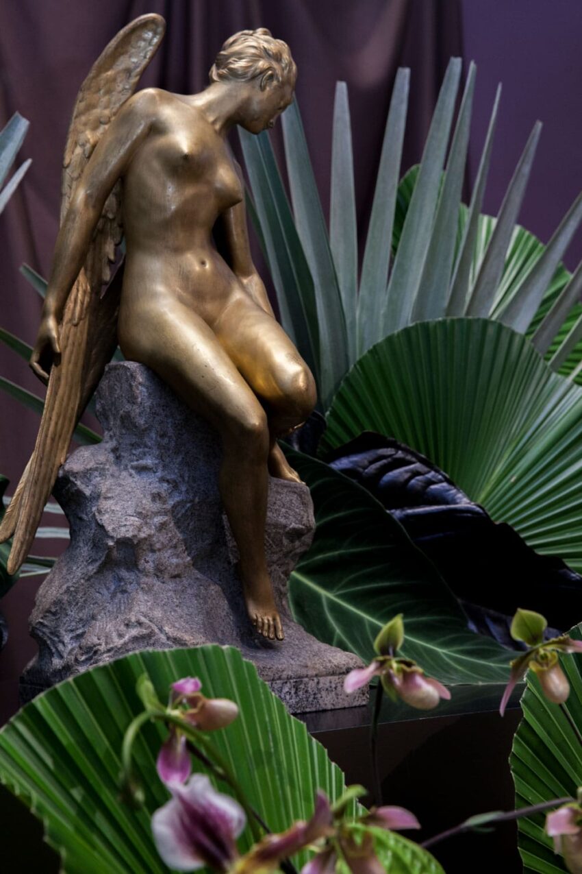
I’m interested in how the artistic attentiveness of fetishized objects of centuries past can create conversation with atmospheric experience. In ways, both are equally ornate. Finding balance is key.
What one piece would you want to bring home for yourself?
My favorite piece is the Luigi Cervone parcel-gilt silver model of a centaur with a gilt cherub on its back. The whole thing is pretty Rococo, yet it feels oddly contemporary.
